Python ile Plotly'ye Giriş: Veri Görselleştirme
Alex Scriven
Data Scientist
$$

add_trace() kullan$$
$$
add_trace() kullan
$$
$$
$$

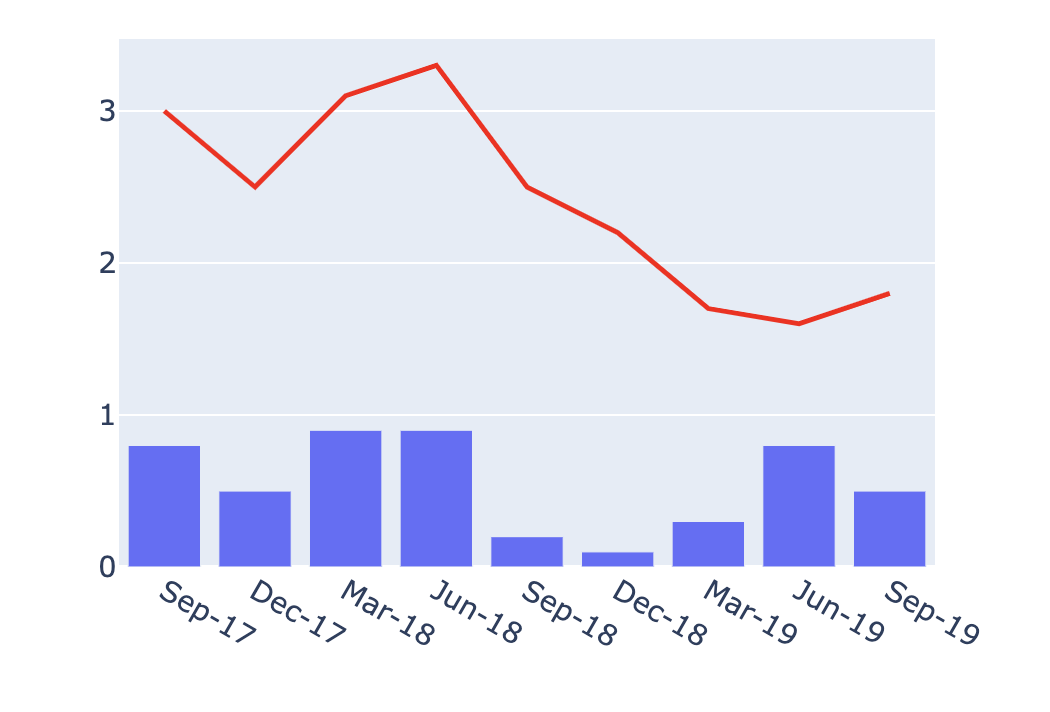
from plotly.graph_objects import Figure layered_fig = Figure()bar_fig = px.bar(df, x='Date' , y='Quarterly Growth (%)')line_fig = px.line(df, x='Date' , y='Rolling YTD Growth (%)' , color_discrete_sequence=['red'])layered_fig = Figure(data= [*bar_fig.data, *line_fig.data]) layered_fig.show()

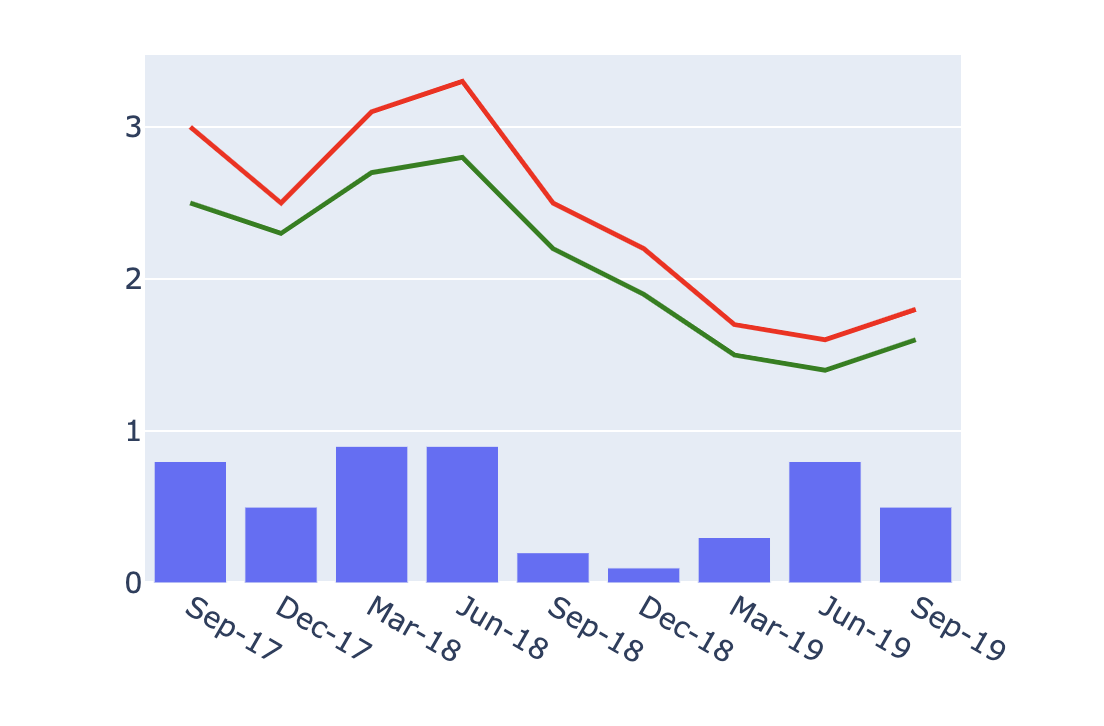
# Aynı bar_fig, line_fig'i yaz line_fig2 = px.line(df, x='Date' , y='OECD Average GDP Growth (%)' , color_discrete_sequence=['green'])layered_fig = Figure(data= [*bar_fig.data , *line_fig.data, *line_fig2.data]) layered_fig.show()

# 2 şekille oluştur layered_fig = Figure(data=[*bar_fig.data, *line_fig.data])# Son çizgiyi ekle layered_fig.add_trace(line_fig2.data[0])
Python ile Plotly'ye Giriş: Veri Görselleştirme