資料視覺化的藝術

在 Excel 進行資料視覺化

Agata Bak-Geerinck

Senior Data Analyst, Telenet

少即是多

White space

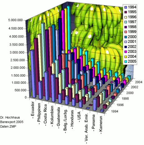
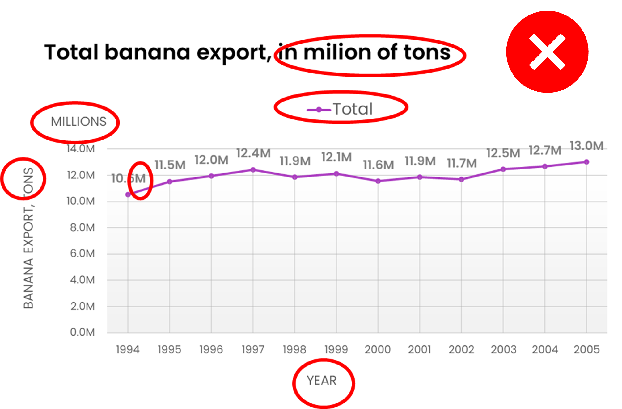
Banana export 1994-2005, version 1

An example of a really bad chart presenting banana export between 1994 and 2005

White space

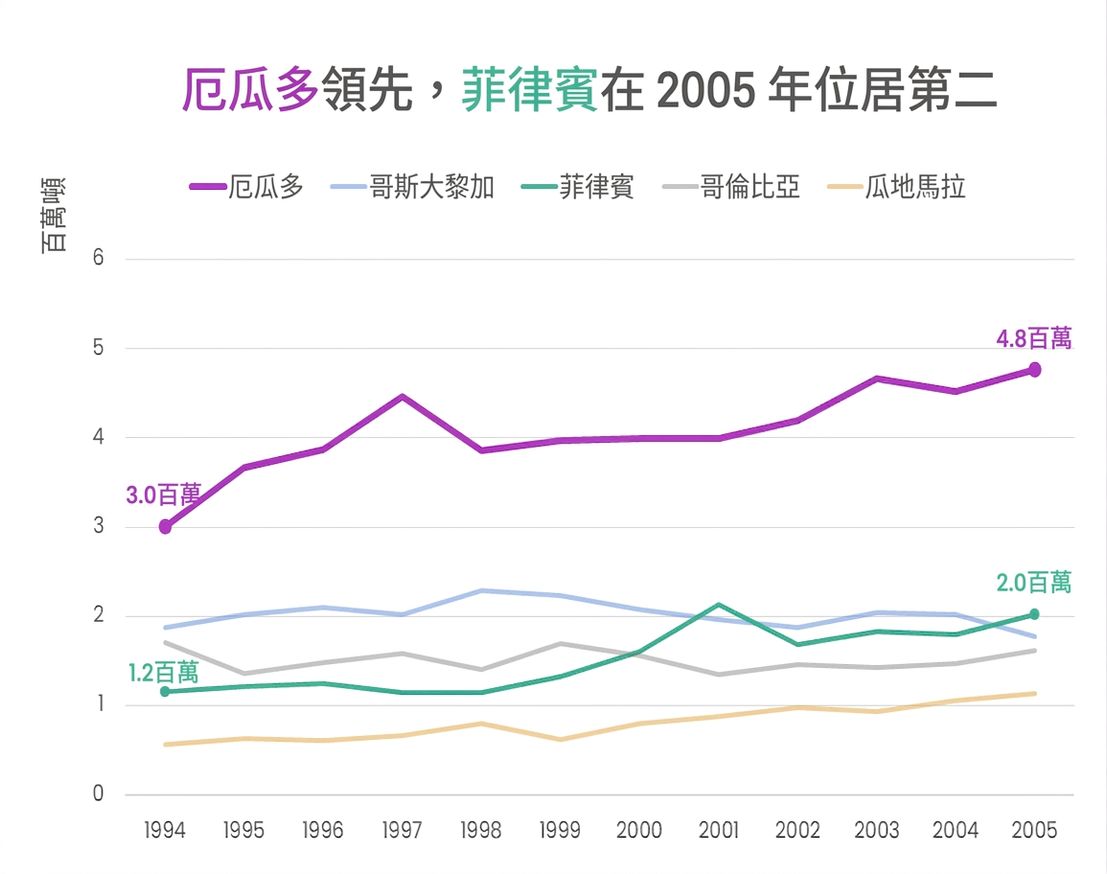
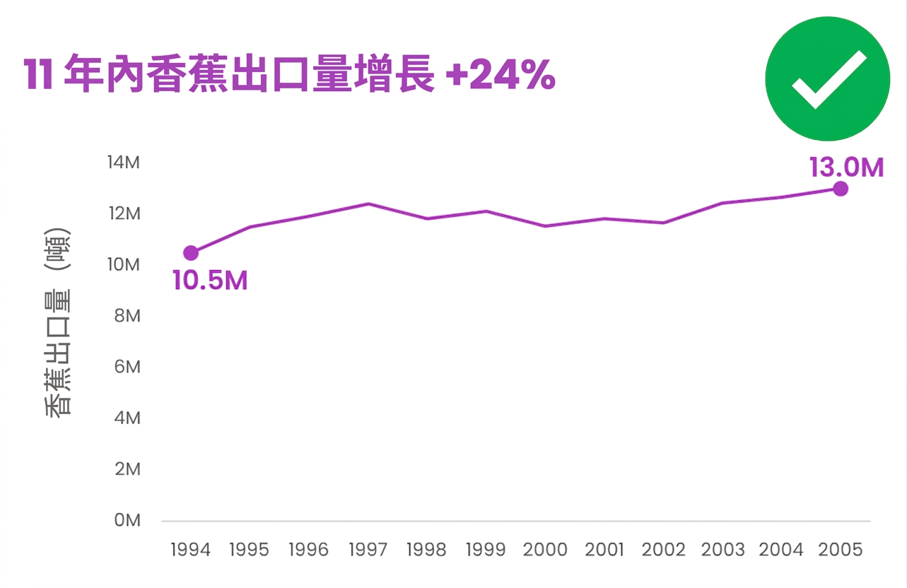
Banana export 1994-2005, version 2

Improved version of the same chart

在 Excel 進行資料視覺化

2D 還是 3D?

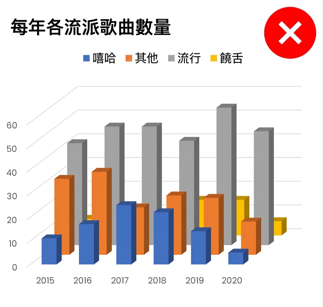
An example of a 3D chart

  • 難以讀出正確數值
  • 透視造成扭曲,易誤導視覺

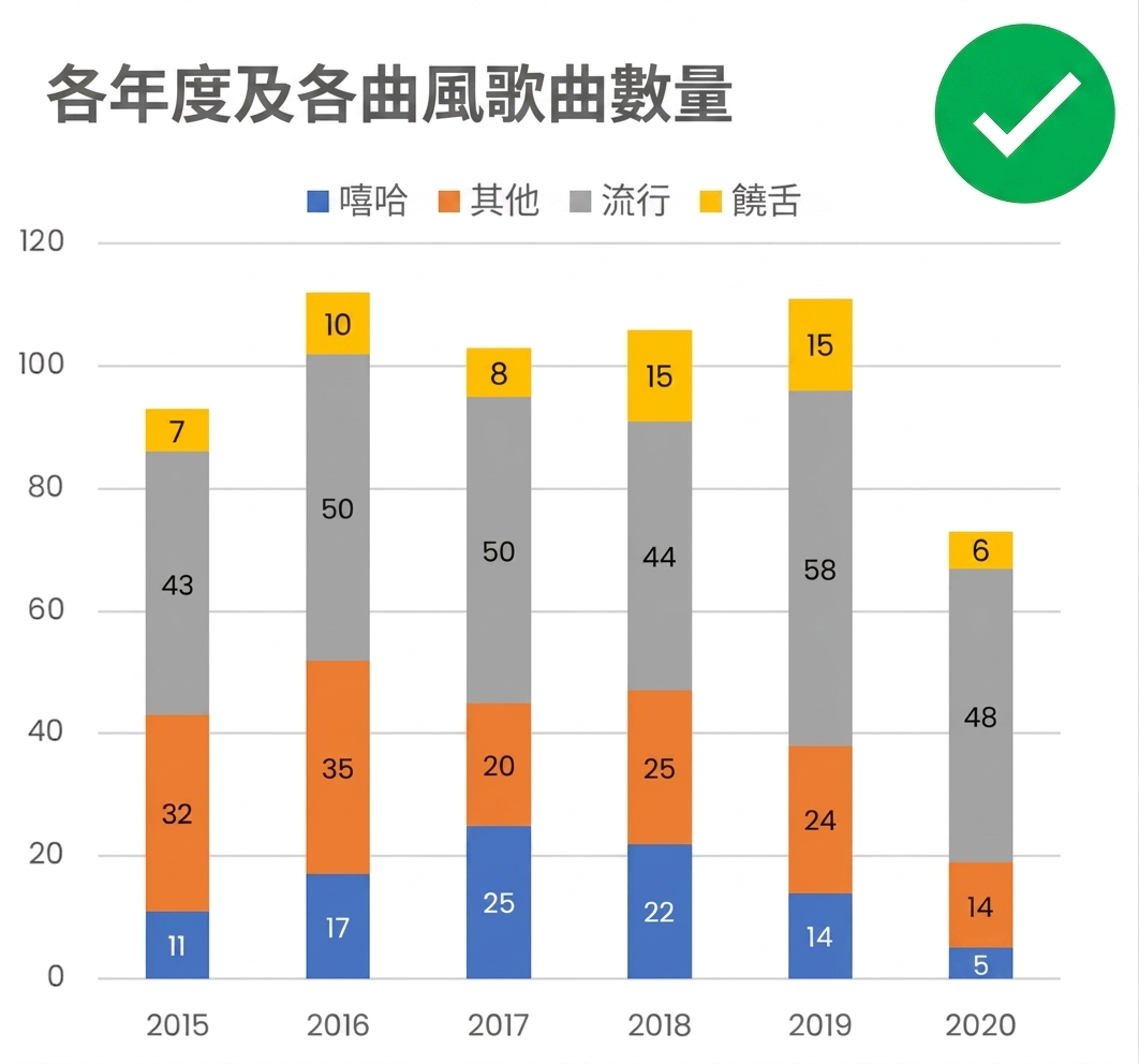
An example of a 2D chart

  • 易於解讀
  • 通用、不分心
在 Excel 進行資料視覺化

標籤、圖例與標題

White space

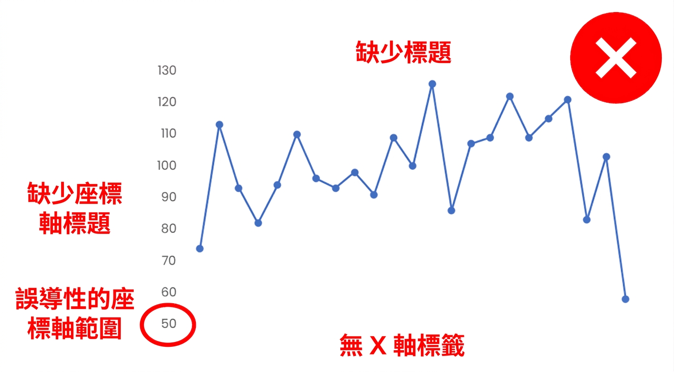
An example of a chart with no axis names, legends, data labels nor a clear title

White space

  • 無法自我說明
  • 座標軸未從 0 起,易誤導

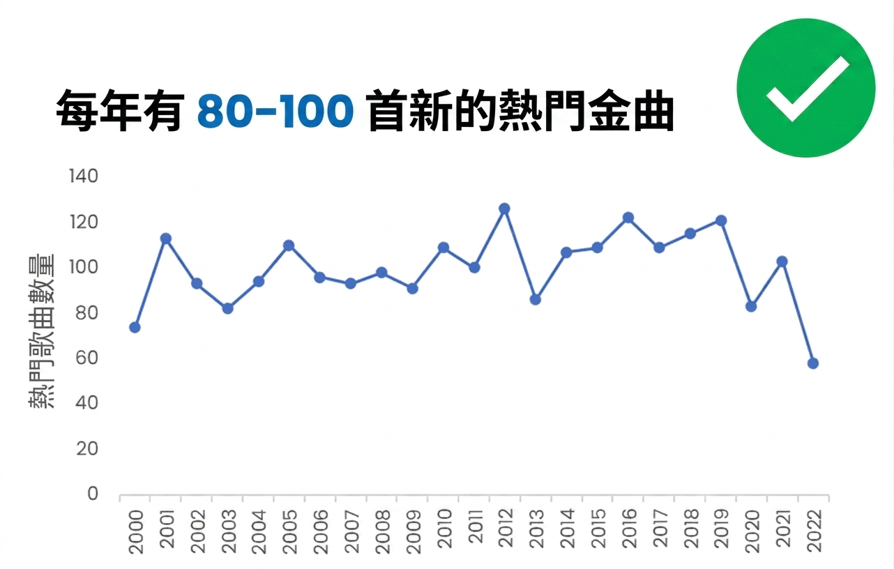
An example of a chart with axis names and a clear title

  • 軸、標籤清楚,標題具資訊性
  • Y 軸從 0 起為最佳實務
在 Excel 進行資料視覺化

色彩:助攻還是阻礙?

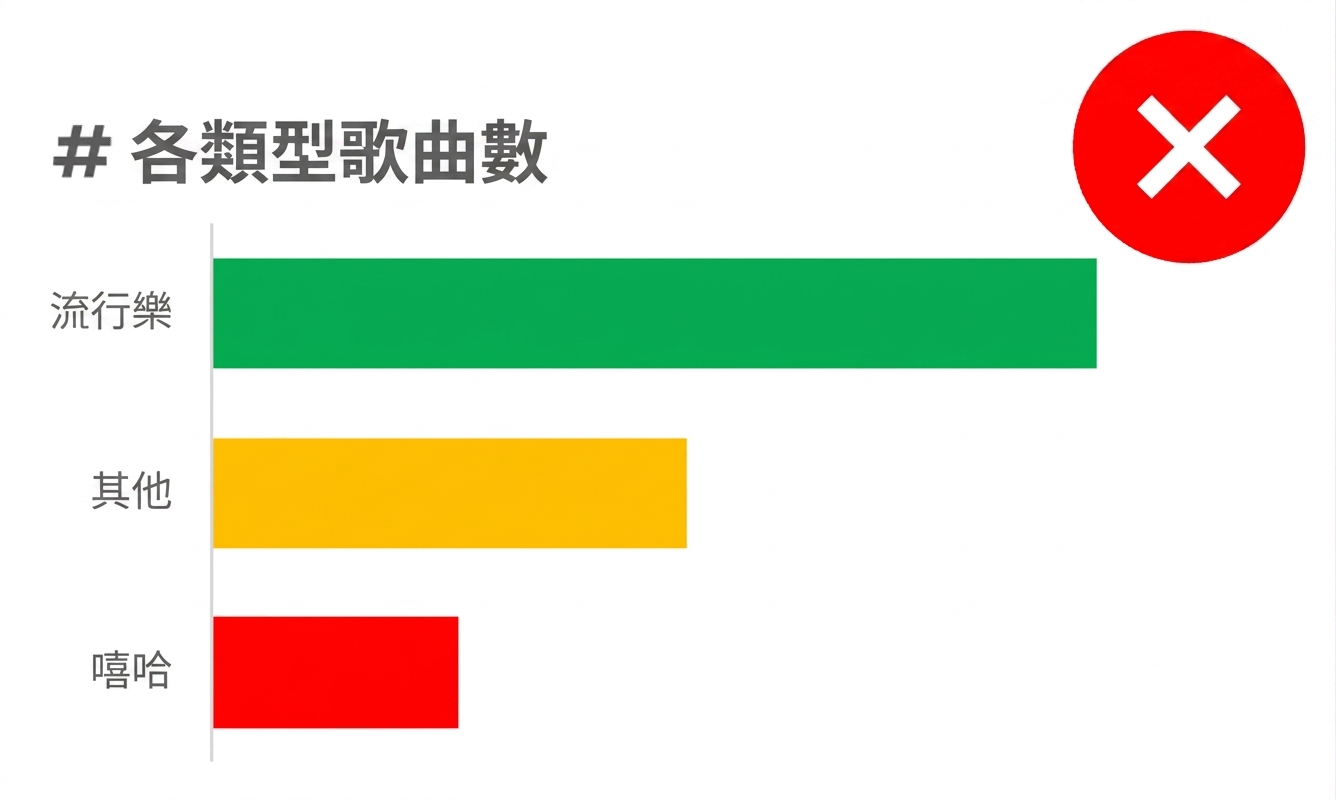
An example of a bar chart where each bar is colored differently

  • 「彩虹」圖:顏色沒有帶來價值
  • 分類圖例避免用紅/黃/綠

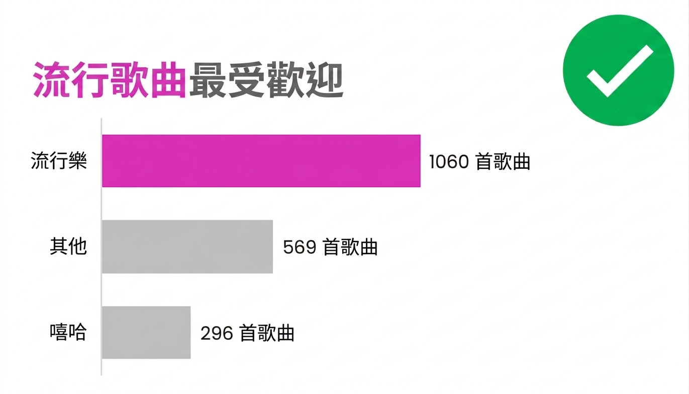
An example of the correct use of colors

  • 用色彩聚焦關鍵資料點
  • 標題重覆色彩強調,訊息更有力
在 Excel 進行資料視覺化

圖表大掃除:去雜化

An example of a chart with redundant labels, legends, and other unnecessary elements

  • 多餘的座標軸與標題
  • 不必要的圖例

An example of a decluttered chart with no redundant labels, legends, and other unnecessary elements

  • 檢視每個圖表元素
  • 「少即是多」
在 Excel 進行資料視覺化

像專家一樣強化主訊息

White space

Improved version of the bannana export chart

An icon representing a go - green circle with a white tick on it

  • 聚焦於選定的圖表元素
  • 用標題與色彩強調主訊息
  • 標籤少量使用,凸顯重點資料
  • 次要資料可轉灰或調高透明度
在 Excel 進行資料視覺化

選圖的學問:找到最適合的圖表

White space

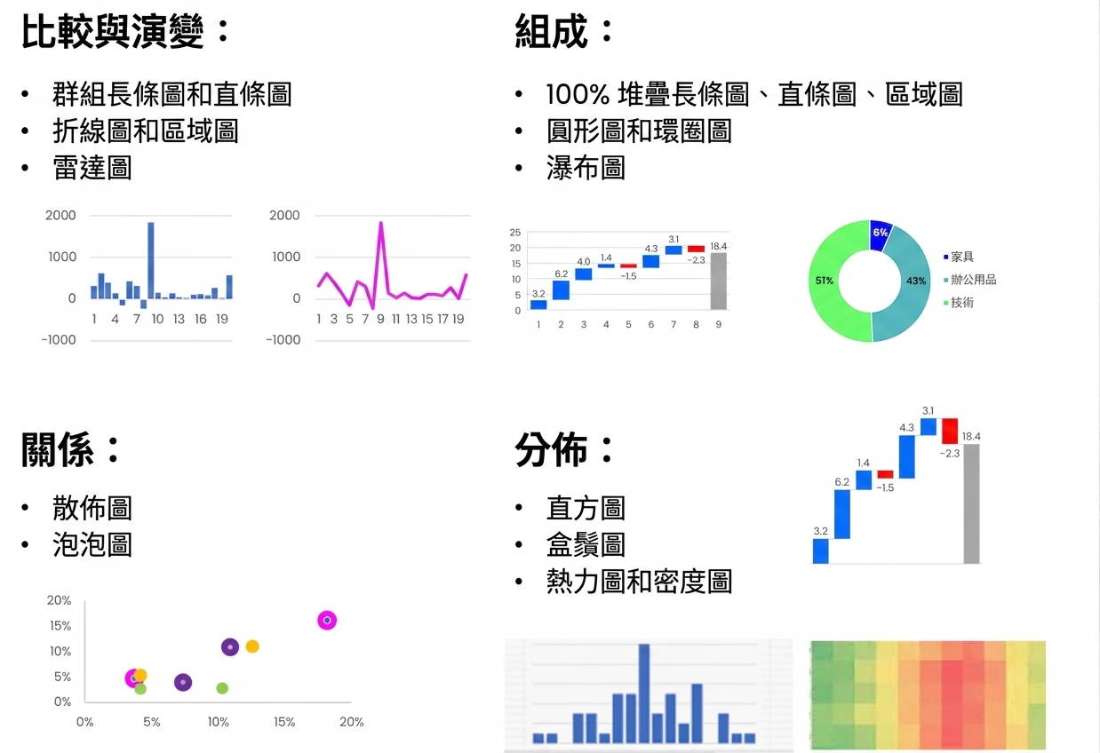
Various chart types and chart use cases

An icon representing a go - green circle with a white tick on it

  • 各情境對應 1–2 種圖表
  • 多嘗試,直到圖表順眼
  • 考慮圖表變體
  • 靈感來源:
    • DataCamp data viz cheat sheet
    • Storytelling with Data 部落格與書籍
1 https://www.datacamp.com/cheat-sheet/data-viz-cheat-sheet and https://www.storytellingwithdata.com/
在 Excel 進行資料視覺化

一起來練習吧!

在 Excel 進行資料視覺化

Preparing Video For Download...