Python 金融入門
Adina Howe
Professor
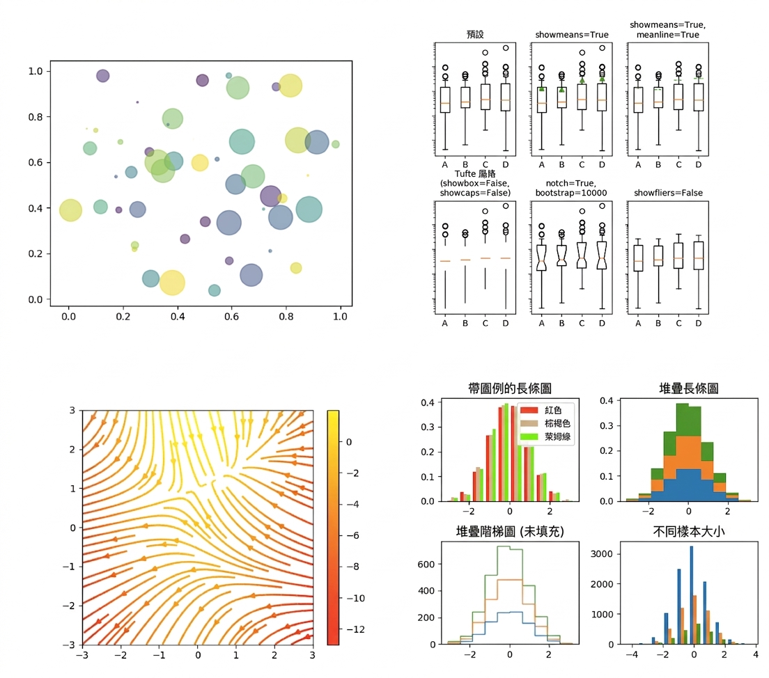
點擊此連結查看更多 Matplotlib 圖庫。
import matplotlib.pyplot as plt
plt.plot()
plt.show()
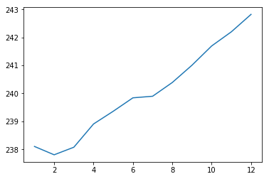
import matplotlib.pyplot as plt
plt.plot(months, prices)
plt.show()
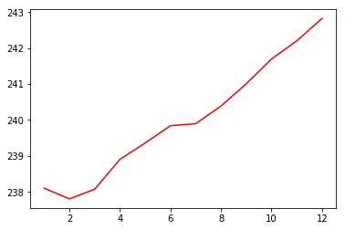
import matplotlib.pyplot as plt
plt.plot(months, prices, color = 'red')
plt.show()
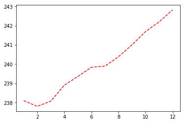
import matplotlib.pyplot as plt
plt.plot(months, prices, color = 'red', linestyle = '--')
plt.show()
更多關於色彩與線型的說明見此處。
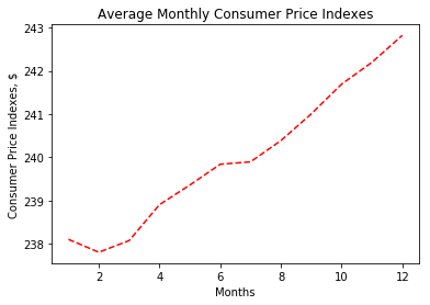
import matplotlib.pyplot as plt
plt.plot(months, prices, color = 'red', linestyle = '--')

# Add labels
plt.xlabel('Months')
plt.ylabel('Consumer Price Indexes, $')
plt.title('Average Monthly Consumer Price Indexes')

# Show plot
plt.show()
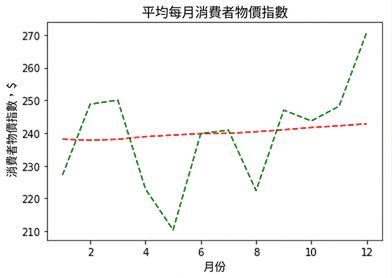
import matplotlib.pyplot as plt
plt.plot(months, prices, color = 'red', linestyle = '--')

# adding an additional line
plt.plot(months, prices_new, color = 'green', linestyle = '--')

plt.xlabel('Months')
plt.ylabel('Consumer Price Indexes, $')
plt.title('Average Monthly Consumer Price Indexes')
plt.show()
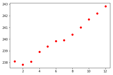
import matplotlib.pyplot as plt
plt.scatter(x = months, y = prices, color = 'red')
plt.show()