Python 的資料科學入門
Hillary Green-Lerman
Lead Data Scientist, Looker
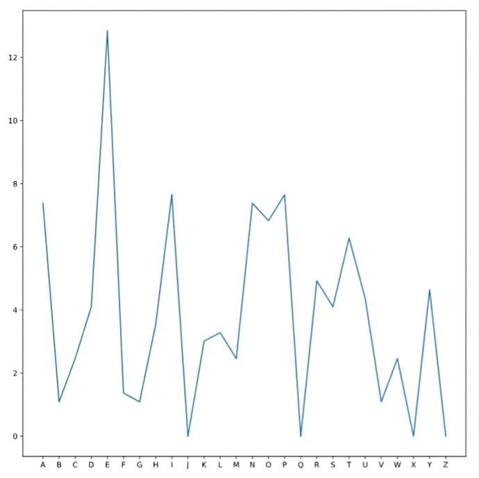
from matplotlib import pyplot as plt

plt.plot(ransom.letter,
         ransom.frequency)

plt.show()
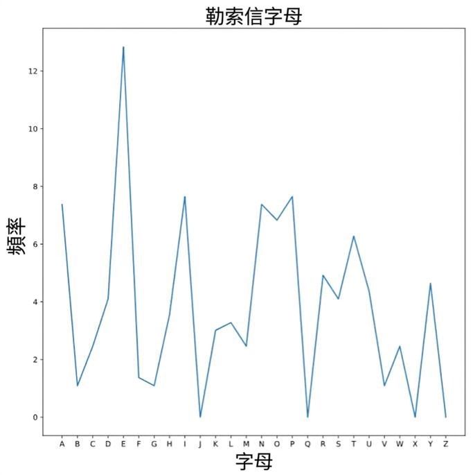
plt.xlabel("Letter")
plt.ylabel("Frequency")
plt.title("Ransom Note Letters")
在 plt.show() 之前設定標籤皆可
plt.show()
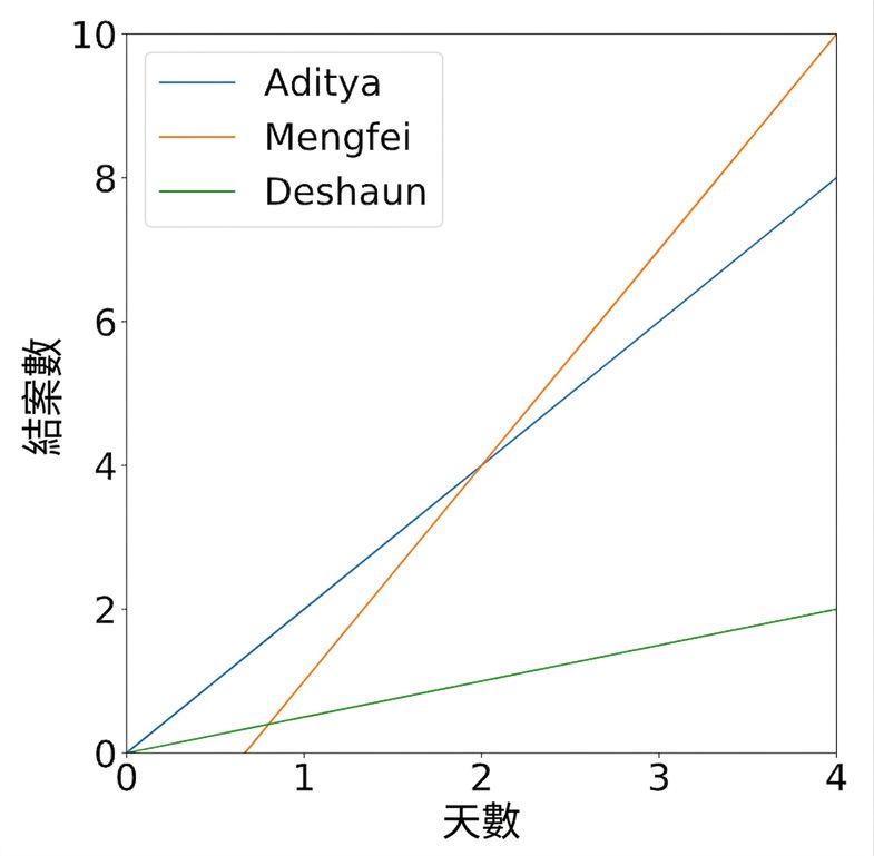
plt.plot(aditya.days,
         aditya.cases,
         label="Aditya")
plt.plot(deshaun.days,
         deshaun.cases,
         label="Deshaun")
plt.plot(mengfei.days,
         mengfei.cases,
         label="Mengfei")
plt.legend()
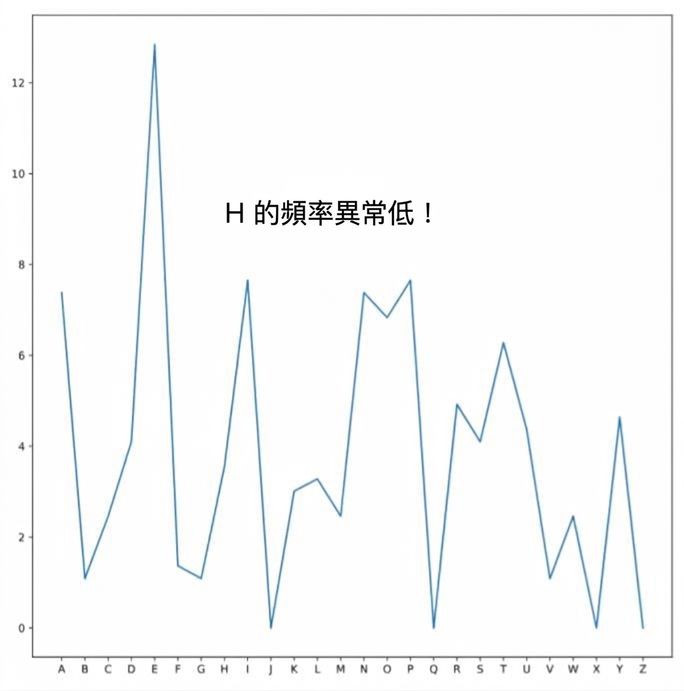
plt.text(xcoord,
    ycoord,
    "Text Message")
plt.text(5,
    9,
    "Unusually low H frequency!")
plt.title("Plot title", fontsize=20)
plt.legend(color="green")
https://en.wikipedia.org/wiki/Web_colors