Visually Inspecting Data

Feature Engineering with PySpark

John Hogue

Lead Data Scientist, General Mills

Getting Descriptive with DataFrame.describe()

df.describe(['LISTPRICE']).show()
+-------+------------------+
|summary|         LISTPRICE|
+-------+------------------+
|  count|              5000|
|   mean|        263419.365|
| stddev|143944.10818036905|
|    min|            100000|
|    max|             99999|
+-------+------------------+
Feature Engineering with PySpark

Many descriptive functions are already available

  • Mean
    • pyspark.sql.functions.mean(col)
  • Skewness
    • pyspark.sql.functions.skewness(col)
  • Minimum
    • pyspark.sql.functions.min(col)
  • Covariance
    • cov(col1, col2)
  • Correlation
    • corr(col1, col2)
Feature Engineering with PySpark

Example with mean()

  • mean(col)
  • Aggregate function: returns the average (mean) of the values in a group.
df.agg({'SALESCLOSEPRICE': 'mean'}).collect()
[Row(avg(SALESCLOSEPRICE)=262804.4668)]
Feature Engineering with PySpark

Example with cov()

  • cov(col1, col2)
  • Parameters:
    • col1 – first column
    • col2 – second column
df.cov('SALESCLOSEPRICE', 'YEARBUILT')
1281910.3840634783
Feature Engineering with PySpark

seaborn: statistical data visualization

Seaborn

Feature Engineering with PySpark

Notes on plotting

Plotting PySpark DataFrames using standard libraries like Seaborn require conversion to Pandas

WARNING: Sample PySpark DataFrames before converting to Pandas!

  • sample(withReplacement, fraction, seed=None)
    • withReplacement allow repeats in sample
    • fraction % of records to keep
    • seed random seed for reproducibility
# Sample 50% of the PySpark DataFrame and count rows
df.sample(False, 0.5, 42).count()
2504
Feature Engineering with PySpark

Prepping for plotting a distribution

Seaborn distplot()

  • seaborn.distplot(a)
  • a : Series, 1d-array, or list. Observed data.
# Import your favorite visualization library
import seaborn as sns

# Sample the dataframe sample_df = df.select(['SALESCLOSEPRICE']).sample(False, 0.5, 42)
# Convert the sample to a Pandas DataFrame pandas_df = sample_df.toPandas()
# Plot it sns.distplot(pandas_df)
Feature Engineering with PySpark

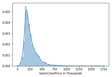
Distribution plot of sales closing price

Displot

Feature Engineering with PySpark

Relationship plotting

Seaborn lmplot()

  • seaborn.lmplot(x, y, data)
  • x, y : strings, Input variables; these should be column names in data.
  • data : Pandas DataFrame
# Import your favorite visualization library
import seaborn as sns

# Select columns s_df = df.select(['SALESCLOSEPRICE', 'SQFTABOVEGROUND']) # Sample dataframe s_df = s_df.sample(False, 0.5, 42)
# Convert to Pandas DataFrame pandas_df = s_df.toPandas()
# Plot it sns.lmplot(x='SQFTABOVEGROUND', y='SALESCLOSEPRICE', data=pandas_df)
Feature Engineering with PySpark

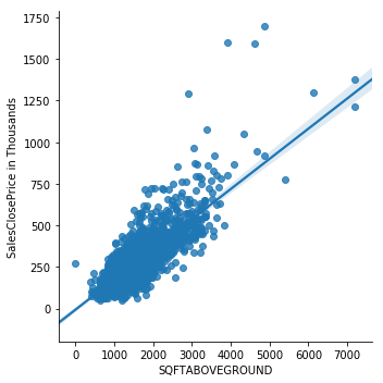
Linear model plot between SQFT above ground and sales price

Linear Model Plot

Feature Engineering with PySpark

Let's practice!

Feature Engineering with PySpark

Preparing Video For Download...