自訂 ggplot2 主題

在 Tidyverse 中以資料溝通

Timo Grossenbacher

Data Journalist

自訂外觀的優點

在 Tidyverse 中以資料溝通

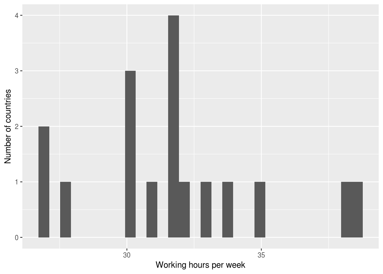
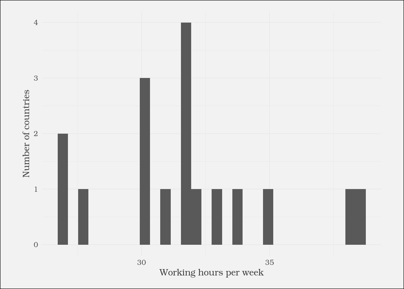
theme() 函式

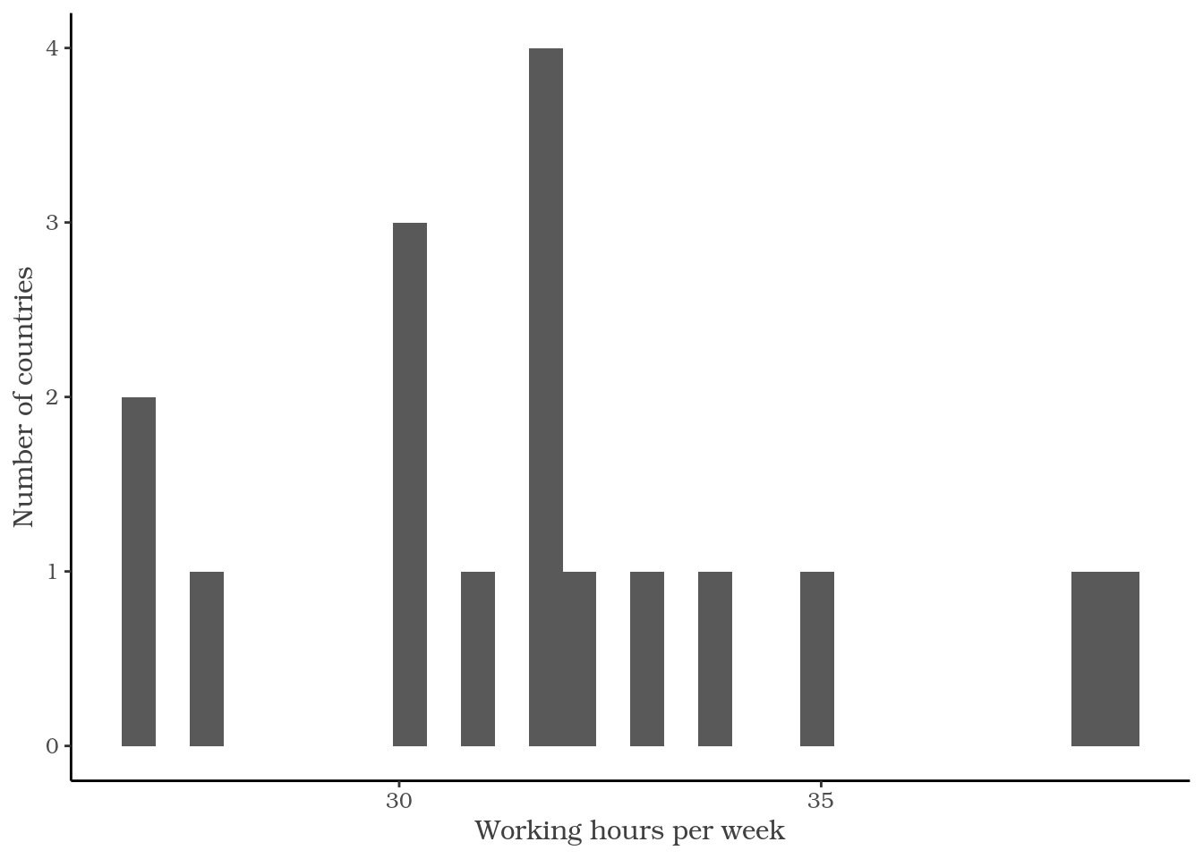
ggplot(plot_data) +
  geom_histogram(aes(
    x = working_hours)) +
  labs(x = "Working hours per week",
       y = "Number of countries") +
  theme(
    text = element_text(
      family = "Bookman",
      color = "gray25")
  )

在 Tidyverse 中以資料溝通

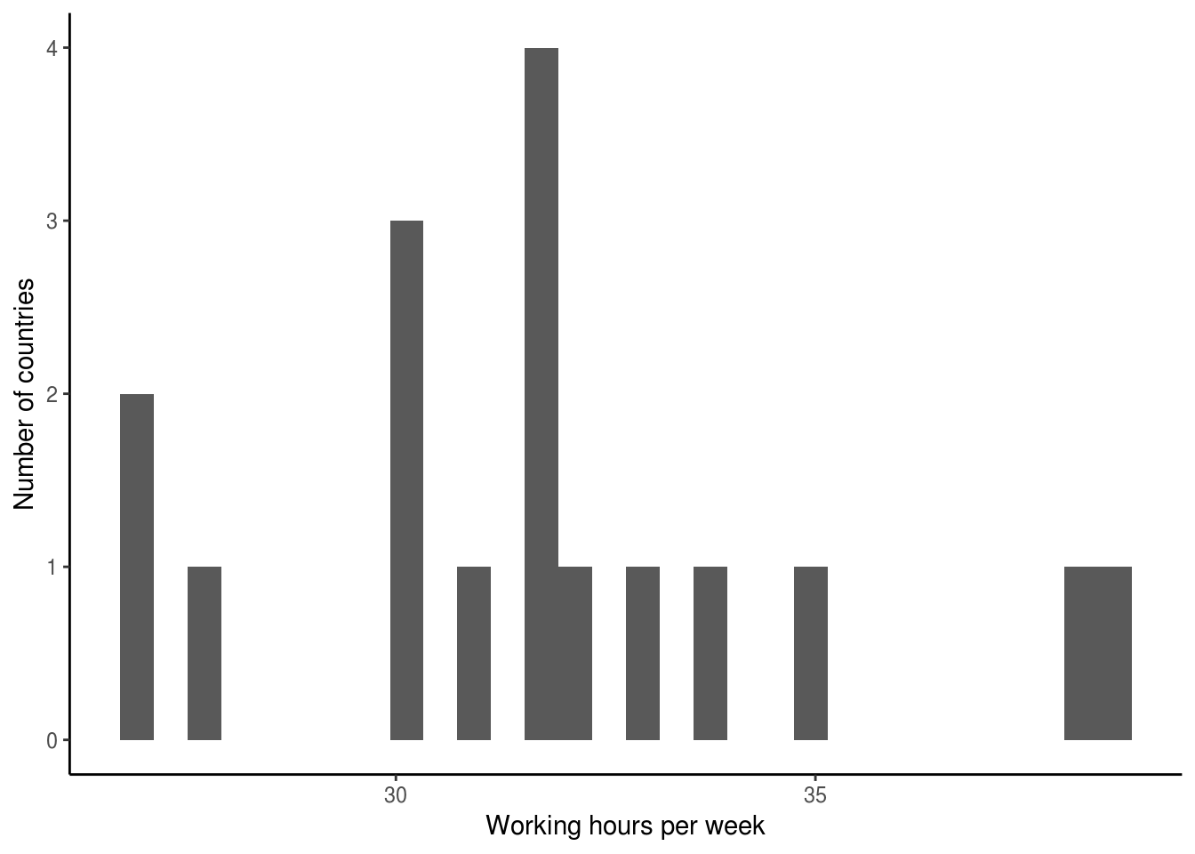
ggplot2 預設主題

ggplot(plot_data) +
  geom_histogram(aes(
    x = working_hours)) +
  labs(x = "Working hours per week",
       y = "Number of countries") +

  theme_classic()

在 Tidyverse 中以資料溝通

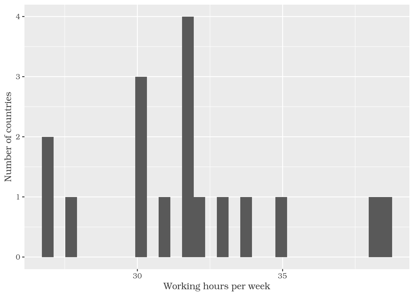
串接多個 theme() 呼叫

ggplot(plot_data) +
  geom_histogram(aes(
    x = working_hours)) +
  labs(x = "Working hours per week",
       y = "Number of countries") +

  theme_classic() +
  theme(
    text = element_text(
      family = "Bookman",
      color = "gray25")
  )

在 Tidyverse 中以資料溝通

Theme 設定選項

?theme

axis.title
座標軸標題(element_text;繼承自 text)

axis.title.x
x 軸標題(element_text;繼承自 axis.title)

axis.title.x.top
上方 x 軸標題(element_text;繼承自 axis.title.x)

axis.title.x.bottom
下方 x 軸標題(element_text;繼承自 axis.title.x)

在 Tidyverse 中以資料溝通

element_* 函式家族

element_text()
element_rect()
element_line()
element_blank()
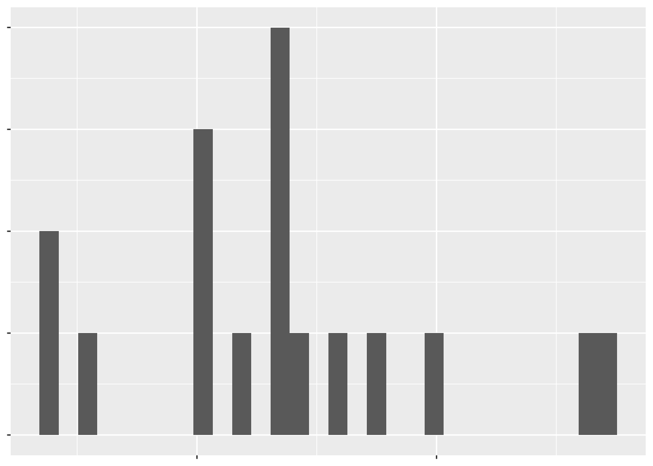
ggplot(plot_data) +
  geom_histogram(aes(
    x = working_hours)) +
  labs(x = "Working hours per week",
       y = "Number of countries") +
  theme(
    text = element_blank()
  )

在 Tidyverse 中以資料溝通

來試試主題吧!

在 Tidyverse 中以資料溝通

Preparing Video For Download...