Python 的實驗設計
James Chapman
Curriculum Manager, DataCamp
$$ {z} = \frac{x-\mu}{\sigma}$$
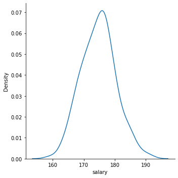
sns.displot(data=salaries,
            x='salary',
            kind="kde")
plt.show()
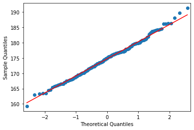
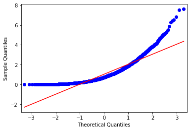
QQ 圖:將資料與特定分配比較
from statsmodels.graphics.gofplots import qqplot
from scipy.stats.distributions import norm
qqplot(salaries['salary'],
       line='s',
       dist=norm)
plt.show()
$H_0$ = 「資料來自常態分配」
from scipy.stats import shapiro
alpha = 0.05

stat, p = shapiro(salaries['salary'])
print(f"p: {round(p,4)} test stat: {round(stat,4)}")
from scipy.stats import shapiro alpha = 0.05
stat, p = shapiro(salaries['salary']) print(f"p: {round(p,4)} test stat: {round(stat,4)}")
p: 0.8293 test stat: 0.9956
p
alpha
from scipy.stats import anderson
result = anderson(x=salaries['salary'], dist="norm")
print(round(result.statistic,4))
print(result.significance_level)
print(result.critical_values)
0.2748
[15.  10.   5.   2.5  1. ]
[0.572 0.651 0.781 0.911 1.084]
0.2748
[0.572 0.651 0.781 0.911 1.084]