Python 中的叢集分析
Shaumik Daityari
Business Analyst
seaborn
matplotlib
hue
from matplotlib import pyplot as plt
df = pd.DataFrame({'x': [2, 3, 5, 6, 2],
                   'y': [1, 1, 5, 5, 2],
                   'labels': ['A', 'A', 'B', 'B', 'A']})

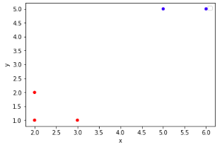
colors = {'A':'red', 'B':'blue'}

df.plot.scatter(x='x',
                y='y',
                c=df['labels'].apply(lambda x: colors[x]))
plt.show()
df = pd.DataFrame({'x': [2, 3, 5, 6, 2], 'y': [1, 1, 5, 5, 2], 'labels': ['A', 'A', 'B', 'B', 'A']})
colors = {'A':'red', 'B':'blue'}
df.plot.scatter(x='x', y='y', c=df['labels'].apply(lambda x: colors[x])) plt.show()
from matplotlib import pyplot as plt
import seaborn as sns
df = pd.DataFrame({'x': [2, 3, 5, 6, 2],
                   'y': [1, 1, 5, 5, 2],
                   'labels': ['A', 'A', 'B', 'B', 'A']})

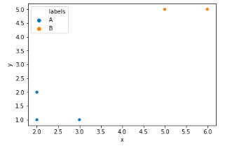
sns.scatterplot(x='x',
                y='y',
                hue='labels',
                data=df)
plt.show()
sns.scatterplot(x='x', y='y', hue='labels', data=df) plt.show()