Seaborn 入門
Seaborn 資料視覺化中級

Chris Moffitt
Instructor
Python 視覺化生態
- Python 視覺化生態複雜,容易讓人不知從何下手
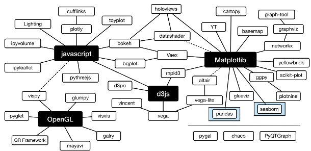
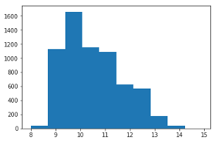
Matplotlib
matplotlib提供 Seaborn 視覺化的基礎元件- 也能獨立用來繪圖
import matplotlib.pyplot as plt import pandas as pddf = pd.read_csv("wines.csv")fig, ax = plt.subplots() ax.hist(df['alcohol'])
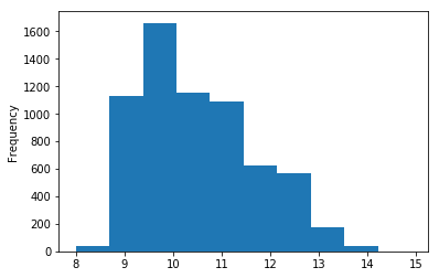
Pandas
pandas是用來分析資料的基礎函式庫- 也支援基礎繪圖功能
import pandas as pddf = pd.read_csv("wines.csv") df['alcohol'].plot.hist()
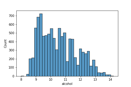
Seaborn histplot
histplot類似前面範例的直方圖- 預設產生直方圖,也可繪製其他較複雜的圖
import seaborn as snssns.histplot(df['alcohol'])
Seaborn displot
displot整合histplot與其他函式來做分佈圖- 預設產生直方圖,也能切換成其他圖形
import seaborn as snssns.displot(df['alcohol'], kind='kde')
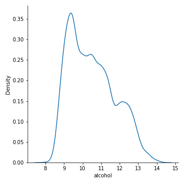
pandas 直方圖 vs. displot
- Pandas 直方圖
df['alcohol'].plot.hist()- 顯示實際觀測頻率
- 長條無外框
- 分箱較寬
- 無 x 軸標籤
- Seaborn displot
sns.displot(df['alcohol'])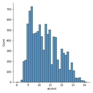
- 自動加上 x 軸標籤
- 柔和色盤
- 圖面更乾淨

