使用 JointGrid 與 jointplot

Seaborn 資料視覺化中級

Chris Moffitt

Instructor

JointGrid() 概觀
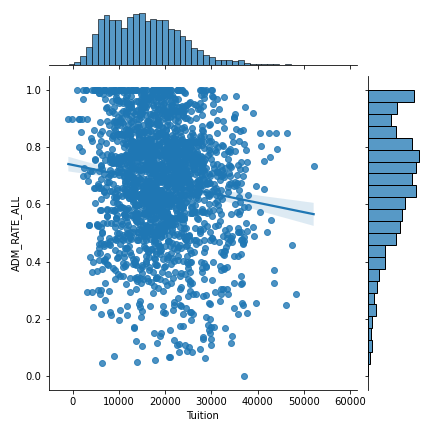
JointGrid 概觀

Seaborn 資料視覺化中級

基本 JointGrid

g = sns.JointGrid(data=df, x="Tuition", y="ADM_RATE_ALL") 
g.plot(sns.regplot, sns.histplot)

JointGrid 範例

Seaborn 資料視覺化中級

進階 JointGrid

g = sns.JointGrid(data=df, x="Tuition", y="ADM_RATE_ALL") 
g = g.plot_joint(sns.kdeplot)
g = g.plot_marginals(sns.kdeplot, shade=True)

標註的 JointGrid 範例

Seaborn 資料視覺化中級

jointplot()

sns.jointplot(data=df, x="Tuition", y="ADM_RATE_ALL", kind='hex')
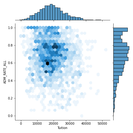
jointplot 範例

Seaborn 資料視覺化中級

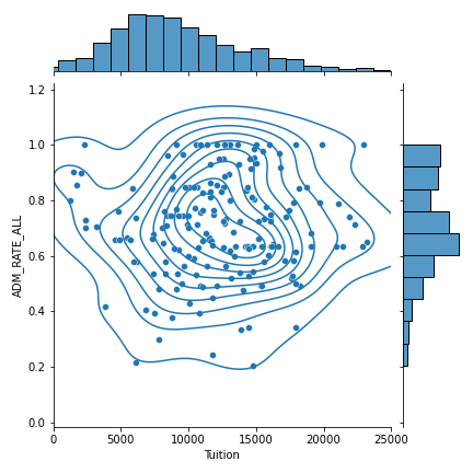
自訂 jointplot

g = (sns.jointplot(x="Tuition",
                   y="ADM_RATE_ALL",
                   kind="scatter",
                   xlim=(0, 25000),
                   data=df.query('UG < 2500 &
                   Ownership == "Public"'))
    .plot_joint(sns.kdeplot))
Seaborn 資料視覺化中級

自訂 jointplot

jointplot

Seaborn 資料視覺化中級

一起來練習吧!

Seaborn 資料視覺化中級

Preparing Video For Download...