Seaborn 的色彩
Seaborn 資料視覺化中級

Chris Moffitt
Instructor
為圖表指定顏色
- Seaborn 可用
matplotlib色碼為圖表指定顏色
sns.set(color_codes=True)
sns.displot(df['Tuition'], color='g')
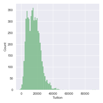
調色盤
- Seaborn 使用
set_palette()設定調色盤
palettes = ['deep', 'muted', 'pastel', 'bright', 'dark','colorblind']
for p in palettes:
    sns.set_palette(p)
    sns.displot(df['Tuition'])
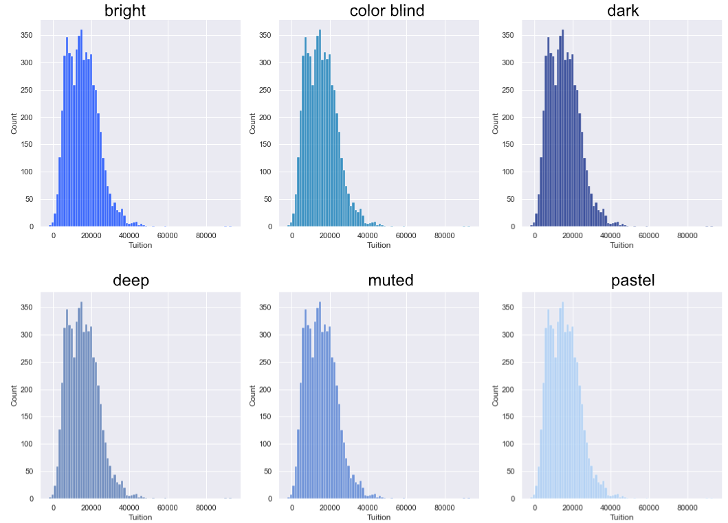
顯示調色盤
sns.palplot()會顯示調色盤sns.color_palette()會回傳目前的調色盤
palettes = ['deep', 'muted', 'pastel', 'bright','dark','colorblind']
for p in palettes:
    sns.set_palette(p)
    sns.palplot(sns.color_palette())
    plt.show()

自訂調色盤
- 圓環色系:資料無序時使用
sns.palplot(sns.color_palette("Paired", 12))

- 連續色系:資料有固定高低範圍時使用
sns.palplot(sns.color_palette("Blues", 12))

- 發散色系:同時關注高值與低值時使用
sns.palplot(sns.color_palette("BrBG", 12))


