使用分佈圖
Seaborn 資料視覺化中級

Chris Moffitt
Instructor
建立長條圖
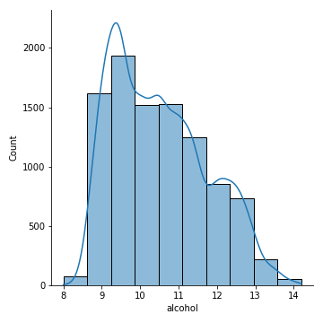
displot函式有多個可選參數。- 你可以在長條圖上疊加 KDE 曲線,並指定桶數。
sns.displot(df['alcohol'], kde=True, bins=10)
替代的資料分佈
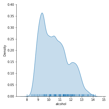
- rug 圖是在 x 軸上以短刻度呈現資料分佈的替代方式。
- 可以同時顯示 kde 曲線與 rug 圖。
sns.displot(df['alcohol'], kind='kde', rug=True, fill=True)
更多圖形類型
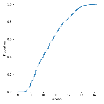
displot會呼叫多種函式,如kdeplot、rugplot與ecdfplot。ecdfplot顯示資料的累積分佈。
sns.displot(df['alcohol'], kind='ecdf')