矩陣圖
Seaborn 資料視覺化中級

Chris Moffitt
Instructor
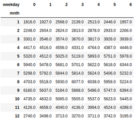
取得正確的資料格式
- Seaborn 的
heatmap()需要網格格式的資料。 - 常用 pandas 的
crosstab()來整理資料。
pd.crosstab(df["mnth"], df["weekday"],
values=df["total_rentals"],aggfunc="mean").round(0)
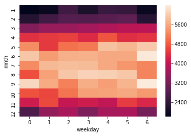
建立熱度圖
sns.heatmap(pd.crosstab(df["mnth"], df["weekday"],
            values=df["total_rentals"], aggfunc="mean")
)
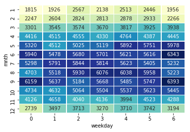
自訂熱度圖
sns.heatmap(df_crosstab, annot=True, fmt="d",
            cmap="YlGnBu", cbar=False, linewidths=.5)
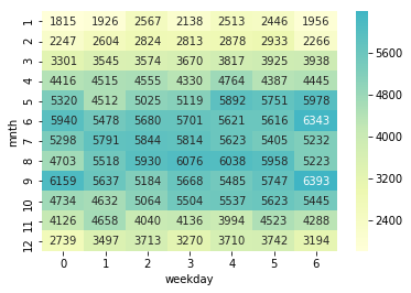
將熱度圖置中
- Seaborn 支援將色彩置中於特定數值。
sns.heatmap(df_crosstab, annot=True, fmt="d",
            cmap="YlGnBu", cbar=True,
            center=df_crosstab.loc[9, 6])
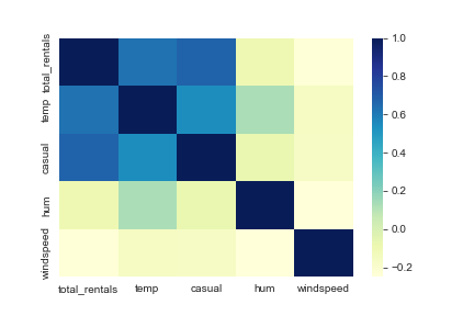
繪製相關矩陣
- pandas 的
corr會計算 DataFrame 欄之間的相關性。 - 輸出可用 seaborn 繪製為熱度圖。
cols = ['total_rentals', 'temp', 'casual', 'hum', 'windspeed']
sns.heatmap(df[cols].corr(), cmap='YlGnBu')