使用 matplotlib 自訂
Seaborn 資料視覺化中級

Chris Moffitt
Instructor
Matplotlib 的 Axes
- 透過
matplotlib的Axes物件可進行大多數自訂 - 可將
Axes傳入 seaborn 函式
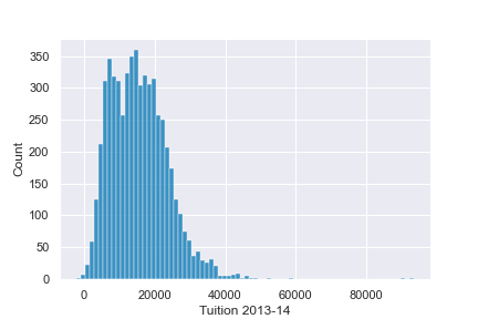
fig, ax = plt.subplots()
sns.histplot(df['Tuition'], ax=ax)
ax.set(xlabel='Tuition 2013-14')
進一步自訂
axes物件支援多種常見自訂
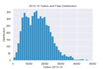
fig, ax = plt.subplots()
sns.histplot(df['Tuition'], ax=ax)
ax.set(xlabel="Tuition 2013-14",
       ylabel="Distribution", xlim=(0, 50000),
title="2013-14 Tuition and Fees Distribution")
結合圖表