編輯圖軸

Python 的 Plotly 資料視覺化入門

Alex Scriven

Data Scientist

我們的資料集

$$

  • 企鵝彙總資料集:
spec av_flip_length
Adelie 189.953642
Chinstrap 195.823529
Gentoo 217.186992


  • 🚫 specav_flip_length 欄位
Python 的 Plotly 資料視覺化入門

預設軸標題

$$

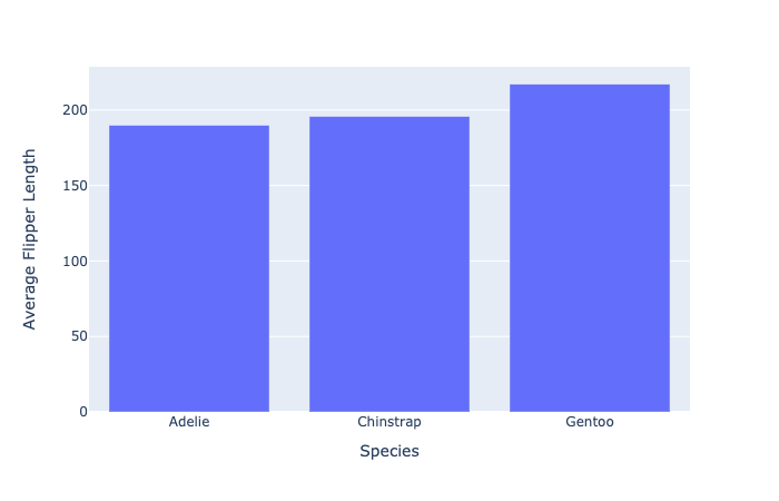
fig = px.bar(penguin_flippers, 
            x="spec", 
            y="av_flip_length")
fig.show()


依物種顯示企鵝翼長的簡單長條圖

Python 的 Plotly 資料視覺化入門

編輯軸標題

  • plotly 的「捷徑」函式:
fig.update_xaxes(title_text="Species")
fig.update_yaxes(title_text="Average Flipper Length")

$$

  • update_layout() 實作
fig.update_layout(dict(
    xaxis=dict(title=dict(text="Species")),
    yaxis=dict(title=dict(text="Average Flipper Length"))
))
Python 的 Plotly 資料視覺化入門

清理圖表外觀

更新軸標題的簡單長條圖

Python 的 Plotly 資料視覺化入門

該用哪種方法?


  • ⭐ 基本更新用「捷徑」方法

$$

  • ⭐⭐ 需要更多控制時用 update_layout()
    • 可調字型大小、樣式、顏色、角度

$$

$$

更多請見 Plotly 文件

Python 的 Plotly 資料視覺化入門

編輯軸範圍

更新軸標題的簡單長條圖

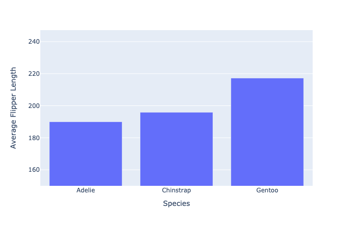
  • 將 y 軸設為從 150 到最大值(再留一點緩衝)
fig.update_layout(dict(
    yaxis=dict(range=[150, penguin_flippers["av_flip_length"].max() + 30]
    )))
Python 的 Plotly 資料視覺化入門

新的軸範圍

設定較短範圍的簡單長條圖

Python 的 Plotly 資料視覺化入門

資料尺度問題

當部分資料點比其他點大「很多」時會怎樣?

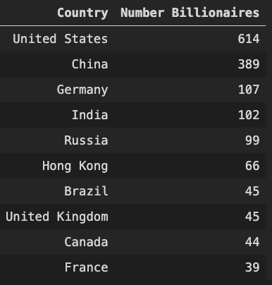
  • 以億萬富翁人數排名的前 10 個國家

各國億萬富翁人數表

Python 的 Plotly 資料視覺化入門

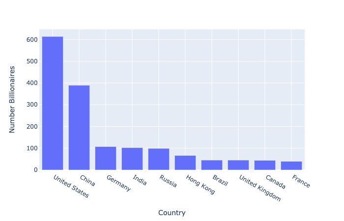
我們的尺度問題


fig = px.bar(billionaire_data, 
            x="Country", 
            y="Number Billionaires")
fig.show()

億萬富翁人數的基本長條圖

Python 的 Plotly 資料視覺化入門

對數尺度

  • 用於繪製差異很大的數值

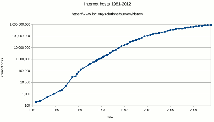
對數刻度範例

  • 每個刻度是前一個的 10 倍(10、100、1000 等)
Python 的 Plotly 資料視覺化入門

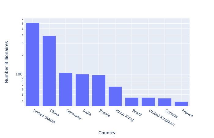
在資料上使用對數尺度

$$

  • Plotly 提供 log_ylog_x 參數
fig = px.bar(billionaire_data, 
            x="Country", 
            y="Number Billionaires",
            log_y=True)

fig.show()

$$

對數尺度的億萬富翁長條圖

Python 的 Plotly 資料視覺化入門

對數尺度:使用提醒

💡 視覺化方式要以受眾為先

向觀眾展示圖表

Python 的 Plotly 資料視覺化入門

一起來練習吧!

Python 的 Plotly 資料視覺化入門

Preparing Video For Download...