Python 的 Plotly 資料視覺化入門
Alex Scriven
Data Scientist
如何自訂圖表:
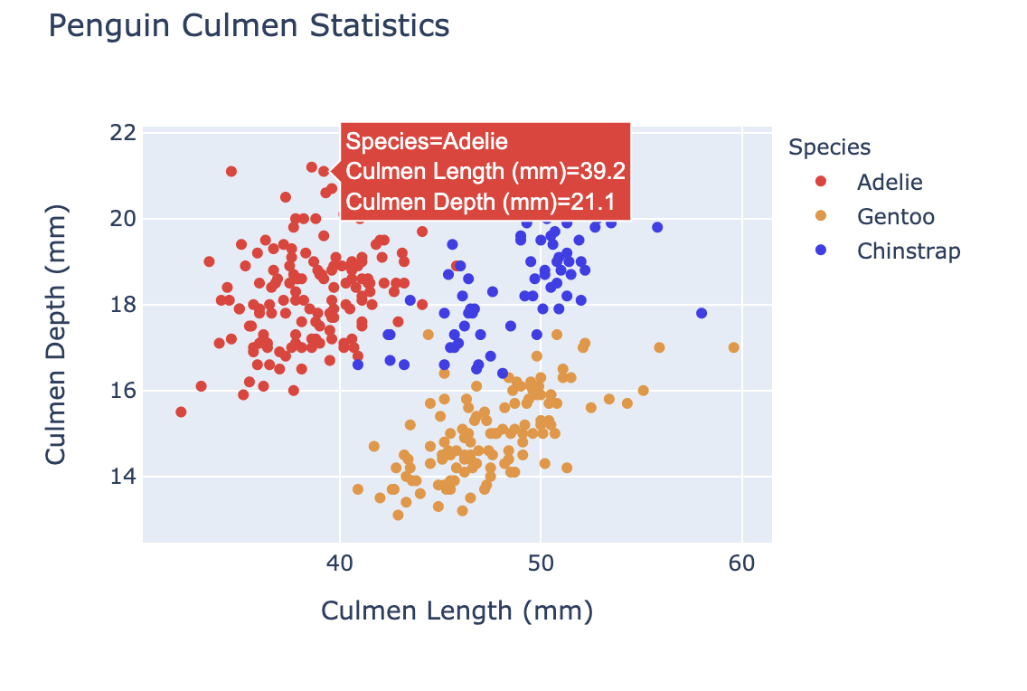
color
update_layout()
fig.update_layout({"title":{"text":"A New Title"}})
自訂顏色可以:
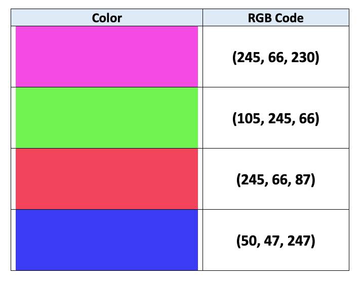
電腦用 RGB 編碼指定顏色:
$$
詳見這篇[文章](https://en.wikipedia.org/wiki/Web_colors)
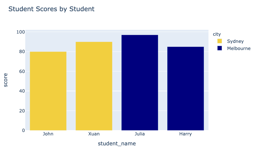
fig = px.bar(data_frame=student_scores,
      x="student_name",
      y="score",
      title="Student Scores by Student"
      color="city")
fig.show()
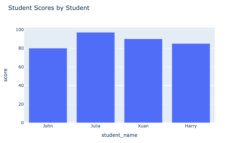
之前的圖:
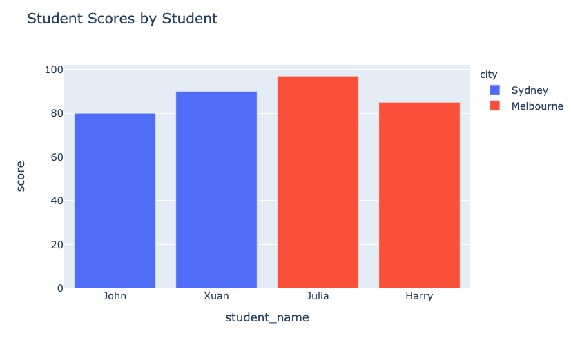
加色後的圖:
在單變量(長條圖、直方圖)中使用 plotly.express 的 color 參數:
plotly.express
color_discrete_map
"red"
"green"
fig = px.bar(
    data_frame=student_scores,
    x="student_name", y="score",
    title="Student Scores by Student",

    color_discrete_map={
    "Melbourne": "rgb(0,0,128)",
    "Sydney": "rgb(235, 207, 52)"},

    color="city")
fig = px.bar( data_frame=student_scores, x="student_name", y="score", title="Student Scores by Student",
color_discrete_map={ "Melbourne": "rgb(0,0,128)", "Sydney": "rgb(235, 207, 52)"},
color="city")
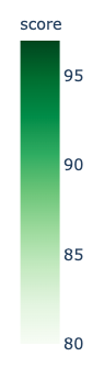
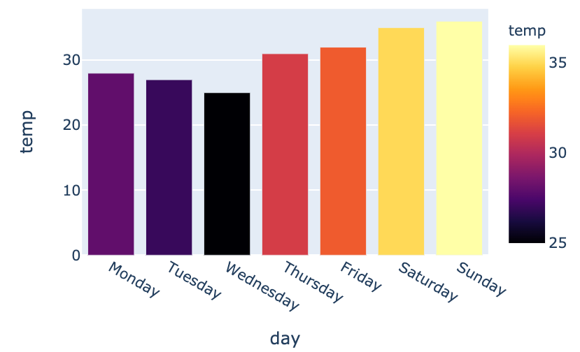
color_continuous_scale
fig = px.bar(data_frame=weekly_temps,
    x="day", y="temp",
    color="temp",
    color_continuous_scale="inferno")
fig.show()
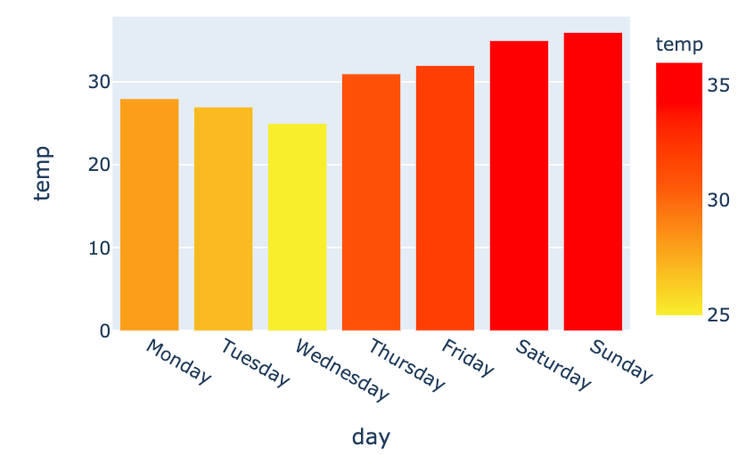
my_scale=[("rgb(242, 238, 10)"),
          ("rgb(242, 95, 10)"),
          ("rgb(255,0,0)")]

fig = px.bar(data_frame=weekly_temps,
    x="day", y="temp",

    color_continuous_scale=my_scale,
    color="temp")
my_scale=[("rgb(242, 238, 10)"), ("rgb(242, 95, 10)"), ("rgb(255,0,0)")]
fig = px.bar(data_frame=weekly_temps, x="day", y="temp",
color_continuous_scale=my_scale, color="temp")