Python 的 Plotly 資料視覺化入門
Alex Scriven
Data Scientist
包含幾個關鍵元素的字典:
label
count
step
'month'
'year'
'day'
stepmode
'backward'
'todate'
count=6
step='month'
stepmode='backward'
stepmode='todate'
date_buttons = [
{'count': 6, 'step': "month", 'stepmode': "todate", 'label': "6MTD"},

{'count': 14, 'step': "day", 'stepmode': "todate", 'label': "2WTD"}
]
date_buttons = [ {'count': 6, 'step': "month", 'stepmode': "todate", 'label': "6MTD"},
{'count': 14, 'step': "day", 'stepmode': "todate", 'label': "2WTD"} ]
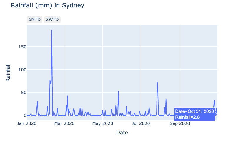
fig = px.line(data_frame=rain, x='Date',
        y='Rainfall',
        title="Rainfall (mm) in Sydney")


fig.update_layout(dict(
    xaxis=dict(
    rangeselector=dict(buttons=date_buttons)
    )))

fig.show()
fig = px.line(data_frame=rain, x='Date', y='Rainfall', title="Rainfall (mm) in Sydney")
fig.update_layout(dict( xaxis=dict( rangeselector=dict(buttons=date_buttons) ))) fig.show()
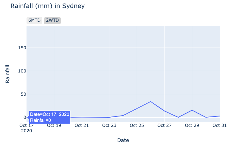
點擊 2WTD 按鈕:
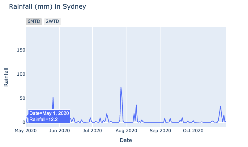
點擊 6MTD 按鈕: