Python 的 Plotly 資料視覺化入門
Alex Scriven
Data Scientist

Plotly 的優勢:
plotly.express 低程式碼、低門檻
建立 Plotly 圖表的方式:
plotly.express 快速繪圖(縮寫 px)plotly.graph_objects(go)獲得更高自訂性$$
📈 我們多數時間會使用 px
基本的 plotly 圖表:
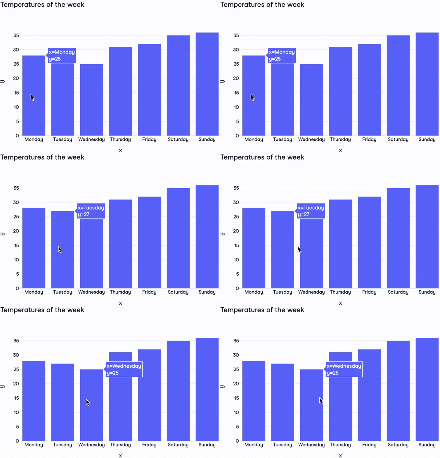
import plotly.express as pxdays = ["Monday", "Tuesday", "Wednesday", "Thursday", "Friday", "Saturday", "Sunday"] temperatures = [28, 27, 25, 31, 32, 35, 36]fig = px.bar( x=days, y=temperatures, title="Temperatures of the week")fig.show()

Plotly Figure 的組成:
layout:控制圖表樣式的字典layoutdata:設定圖形型態與資料的字典清單trace,類型超過 40 種!frames:用於動畫圖(本課不涵蓋)
print(fig)
Figure({'data': [{'type': 'bar',
'x': array(['Monday', 'Tuesday', 'Wednesday', 'Thursday', 'Friday'
, 'Saturday','Sunday'], dtype=object),
'y': {'bdata': 'HBsZHyAjJA==....'}],
'layout': {'title': {'text': 'Temperatures of the week'}}})
$$

Python 的 Plotly 資料視覺化入門