Python 的 Plotly 資料視覺化入門
Alex Scriven
Data Scientist
$$
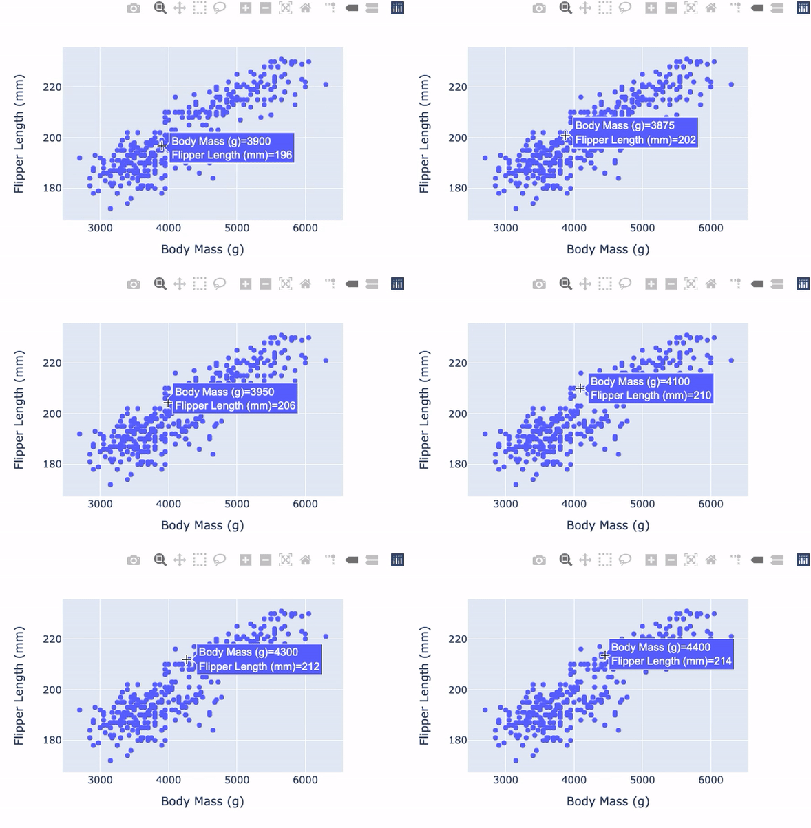
import plotly.express as px

fig = px.scatter(
        data_frame=penguins,
        x="Body Mass (g)",
        y="Flipper Length (mm)")
fig.show()
import plotly.express as px
fig = px.scatter( data_frame=penguins, x="Body Mass (g)", y="Flipper Length (mm)") fig.show()
實用的 plotly.express 散佈圖參數:
plotly.express
trendline
symbol
更多請見 文件
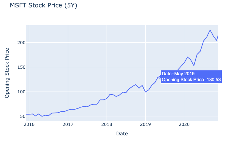
fig = px.line(
  data_frame=msft_stock,
  x="Date",
  y="Open",
  title="MSFT Stock Price (5Y)")
fig.show()
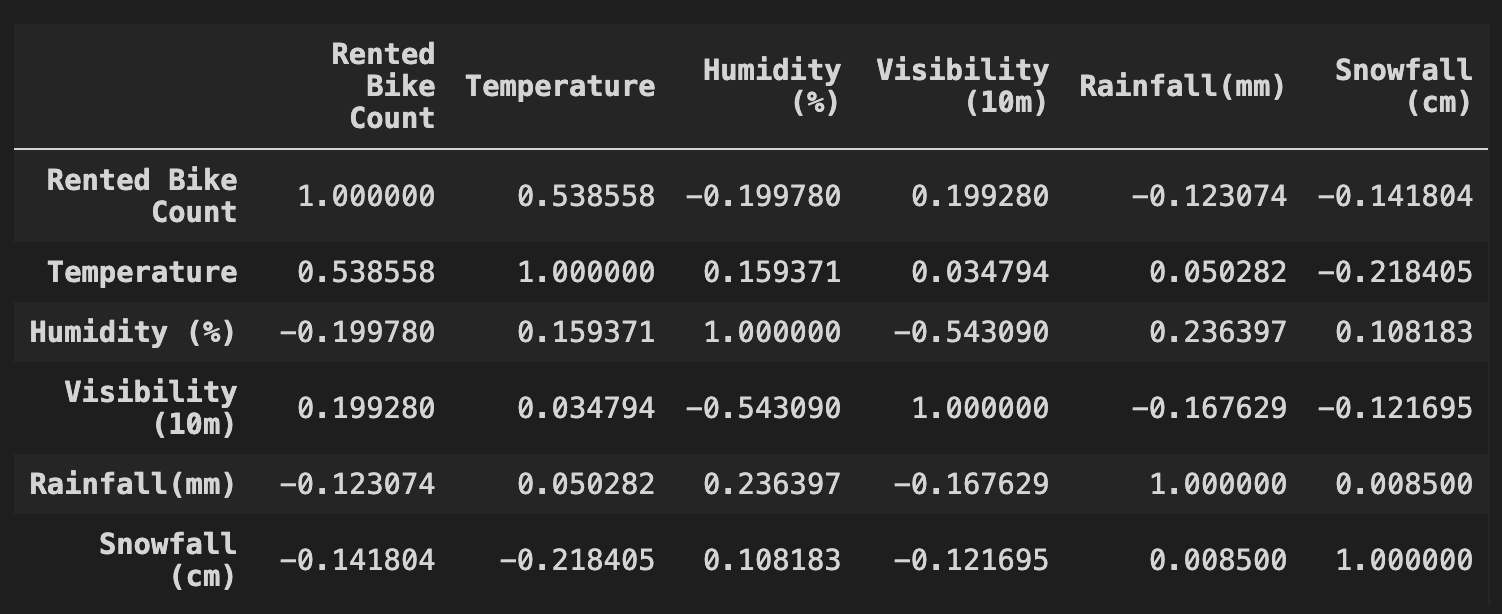
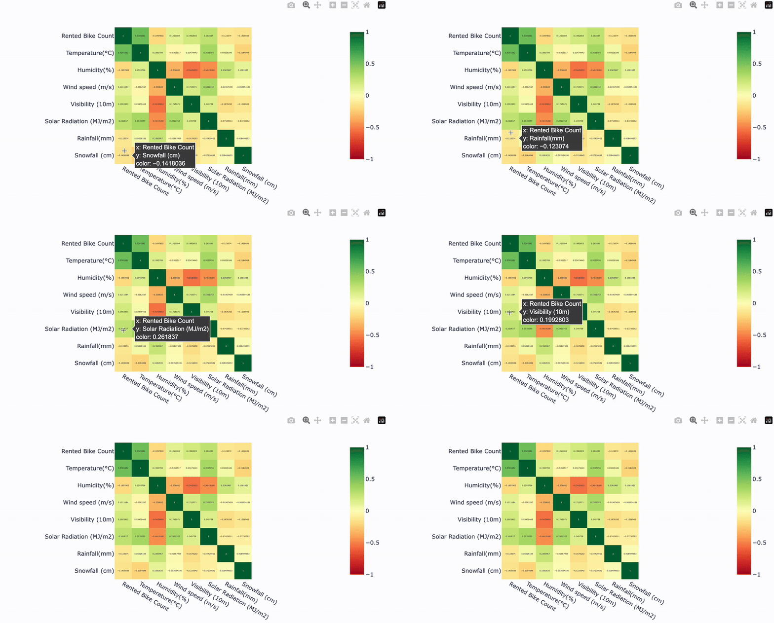
皮爾森相關係數:
df 包含單車租借量與天氣條件的資料
df
cr = df.corr(method="pearson")
print(cr)
fig = px.imshow(

        cr,

        text_auto=True,

        color_continuous_scale="RdYlGn",
        zmin=-1, zmax=1)


fig.show()
fig = px.imshow(
cr,
text_auto=True,
color_continuous_scale="RdYlGn", zmin=-1, zmax=1)
fig.show()