Python 的 Plotly 資料視覺化入門
Alex Scriven
Data Scientist
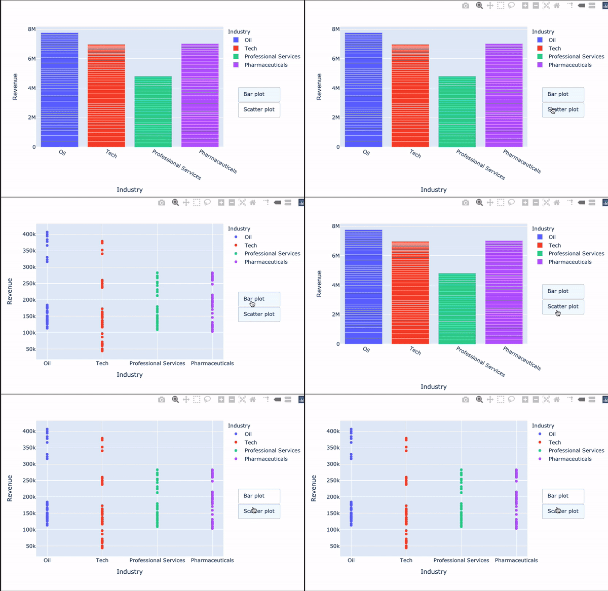
自訂按鈕可以:
更新圖表的資料或版面配置元素
update_layout() 的自訂都能放進按鈕裡!協助動畫(不在本課範圍內)
透過 updatemenus 參數加入,並設定:
type:buttons 或 dropdowndirection:按鈕方向left)或上下(down)擺放x/y:按鈕位置(浮點數)showactive:True/False 是否顯示被按下的 active(按鈕索引)。buttons:button 物件的清單$$
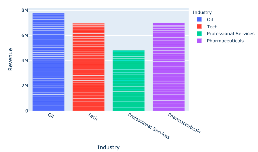
fig = px.bar(
data_frame=revenues,
x='Industry', y='Revenue',
color='Industry')
fig.show()

my_buttons = [{'label': "Bar plot",'method': "update",'args': [{"type": "bar"}]},{'label': "scatterplot",'method': "update",'args': [{"type": "scatter", 'mode': 'markers'}]}]
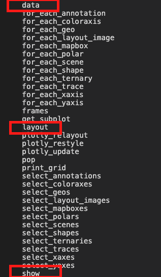
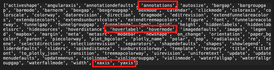
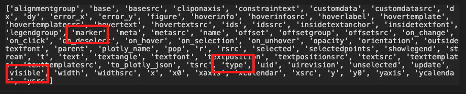
Plotly 中最容易讓人困惑的部分之一!
[{dictionary to send to data}, {dictionary to send to layout}]

dir(fig.layout)

'args' 更新任一參數dir(fig.data[0])

$$
fig.update_layout({ 'updatemenus': [{'type': "buttons",'direction': 'down', 'x': 1.3, 'y': 0.5,'showactive': True, 'active': 0,'buttons': my_buttons}] }) fig.show()
$$

Python 的 Plotly 資料視覺化入門