Python 的 Plotly 資料視覺化入門
Alex Scriven
Data Scientist
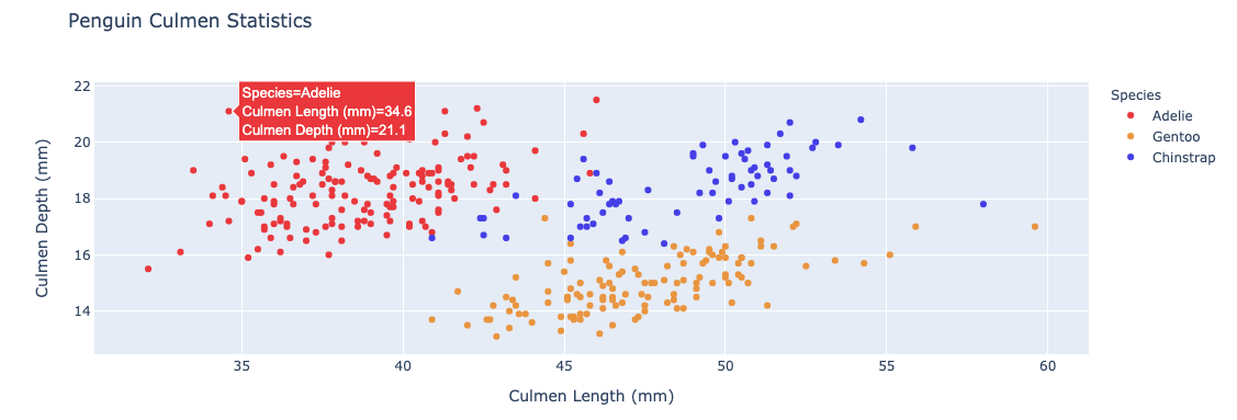
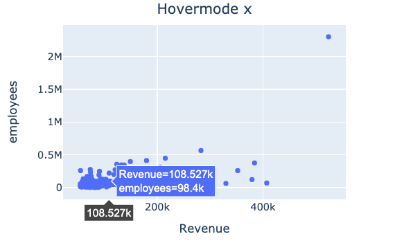
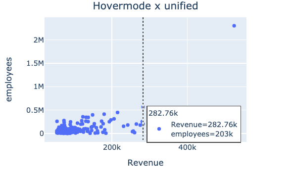
滑鼠懸停資訊:當滑鼠移到資料點上時顯示的文字與資料
$$

預設為 hovermode = "closest"
"x" 或 "y":在 x 或 y 軸加上突顯$$
"x unified"/"y unified":顯示一條線與懸停方塊,列出該 x 或 y 軸上的所有值

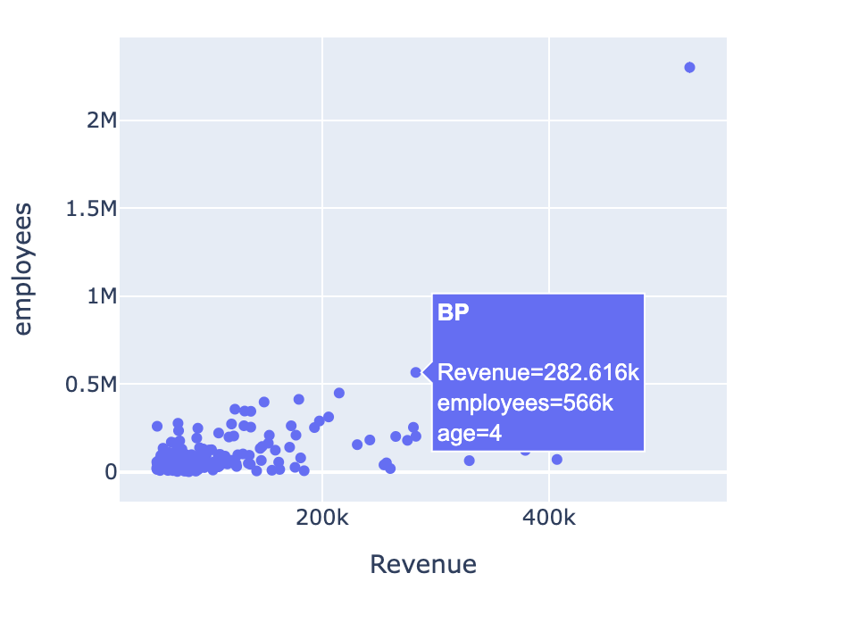
hover_name = 指定欄位,會以粗體顯示在懸停方塊頂端$$
hover_data = 要包含的欄位清單,或用字典指定要包含/排除的欄位{column_name: False}(將排除 column_name)💡 懸停欄位不一定要出現在圖上
$$
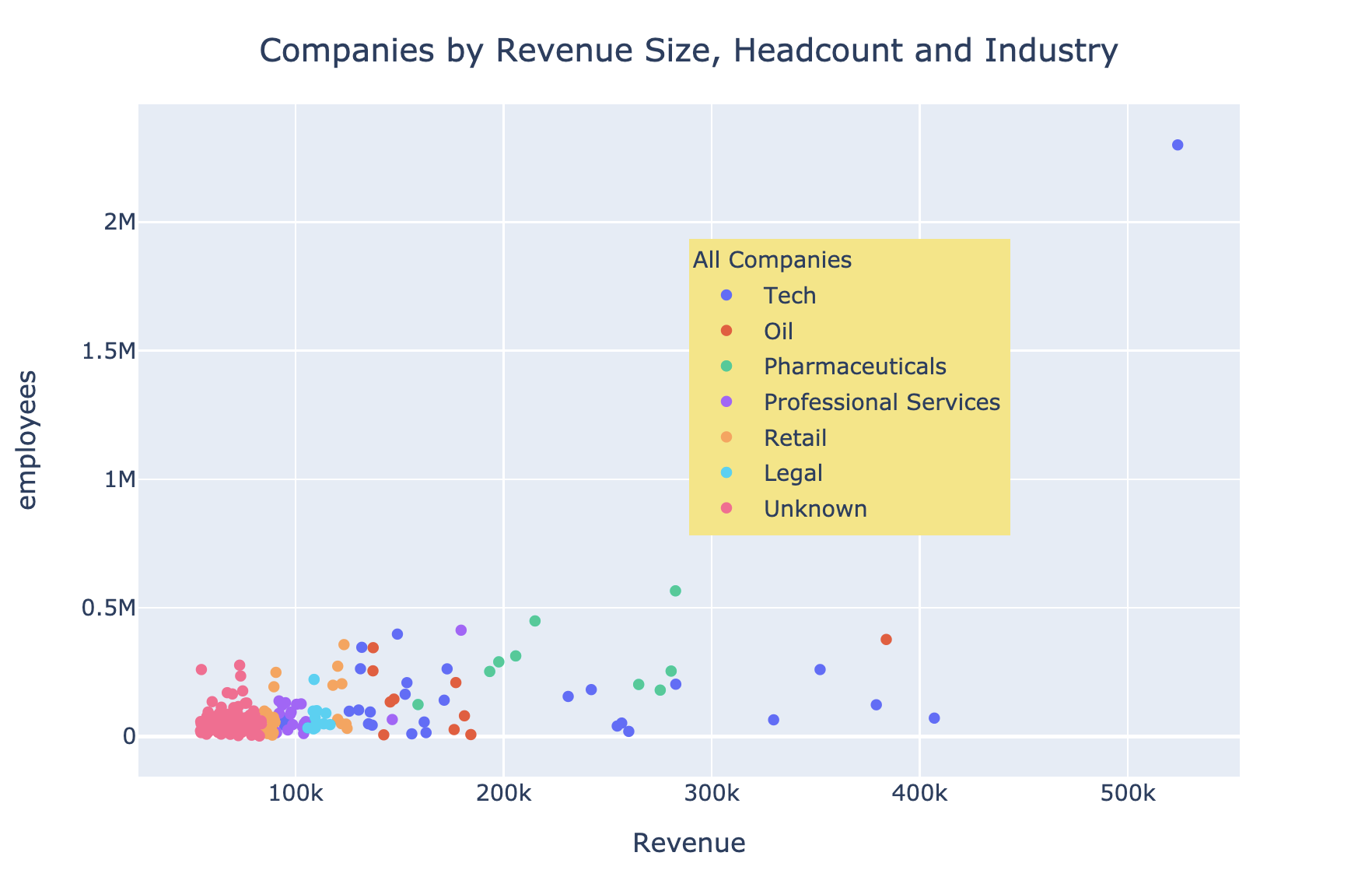
fig = px.scatter(revenues,
x="Revenue",
y="employees",
hover_name="Company",
hover_data=["age"])
fig.show()

hoverlabel$$
hovertemplate$$

$$
update_layout() 來控制圖例$$
showlegend = True 顯示預設圖例legend - 接受屬性的字典x、y 可將圖例放在繪圖區內(範圍 0 到 1)bgcolor(背景色)、borderwidth、font$$
更多請見文件
$$
$$
fig.update_layout( "showlegend": True,legend_title_text="All Companies"legend=dict( x=0.7, y=0.8, bgcolor="rgb(246,228,129)")) })

Python 的 Plotly 資料視覺化入門