統計:sum 與 quantile

ggplot2 中級資料視覺化

Rick Scavetta

Founder, Scavetta Academy

回顧課程 1

過度疊圖原因 解法
1. 資料集很大 半透明、空心圓、調整點大小
2. 值在同一軸對齊 同上,另可改變位置
3. 低精度資料 位置:jitter
4. 整數資料 位置:jitter
ggplot2 中級資料視覺化

用計數圖克服過度疊圖

過度疊圖原因 解法 此外…
1. 資料集很大 半透明、空心圓、調整點大小
2. 值在同一軸對齊 同上,另可改變位置
3. 低精度資料 位置:jitter geom_count()
4. 整數資料 位置:jitter geom_count()
ggplot2 中級資料視覺化

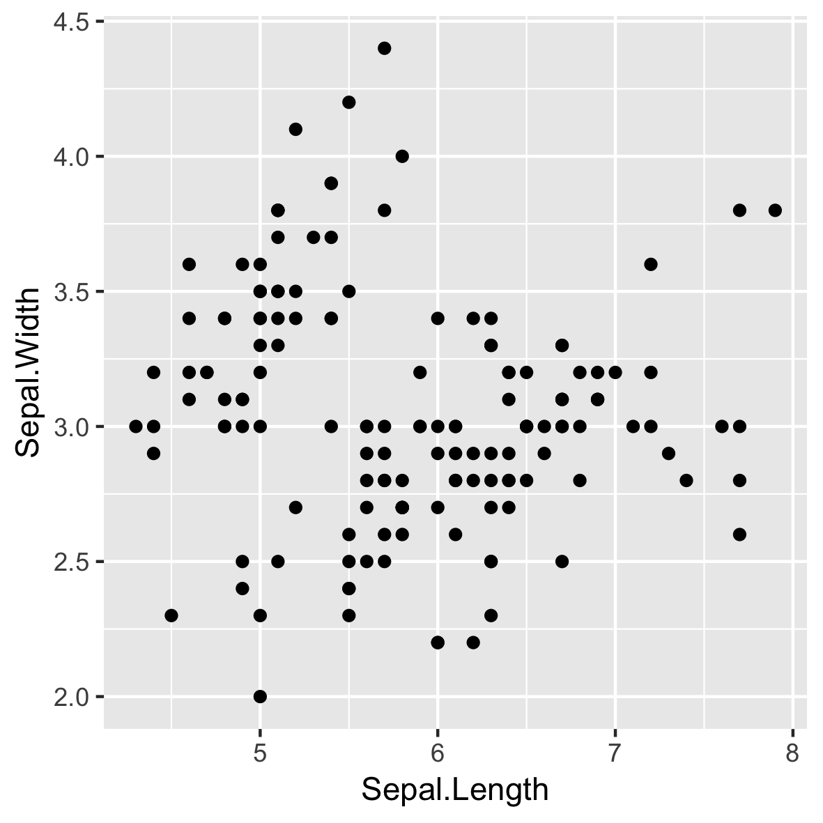
低精度(與整數)資料

p <- ggplot(iris, aes(Sepal.Length, 
                      Sepal.Width))

p + geom_point()

ggplot2 中級資料視覺化

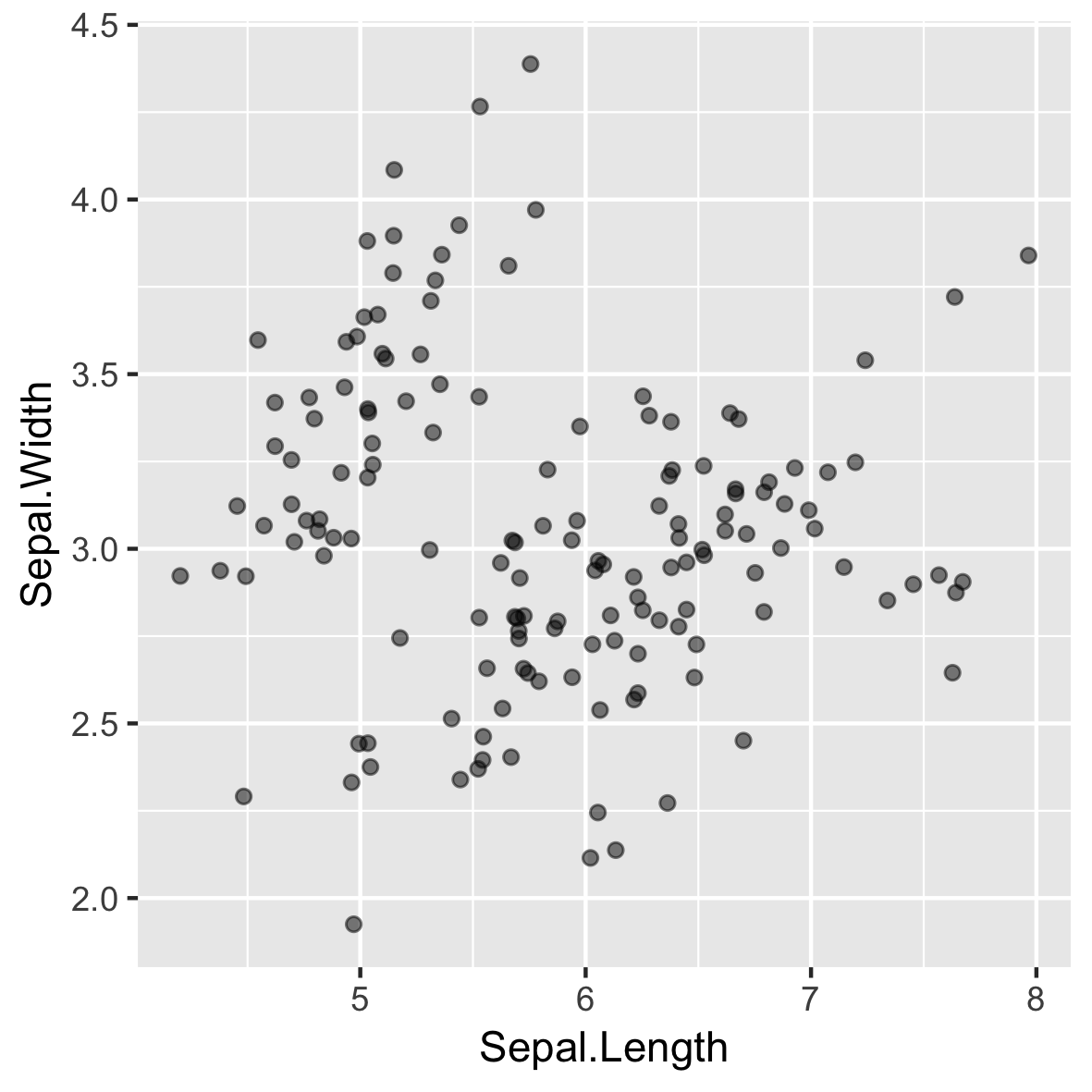
抖動可能造成錯覺

p + geom_jitter(alpha = 0.5,
                width = 0.1,
                height = 0.1)

ggplot2 中級資料視覺化

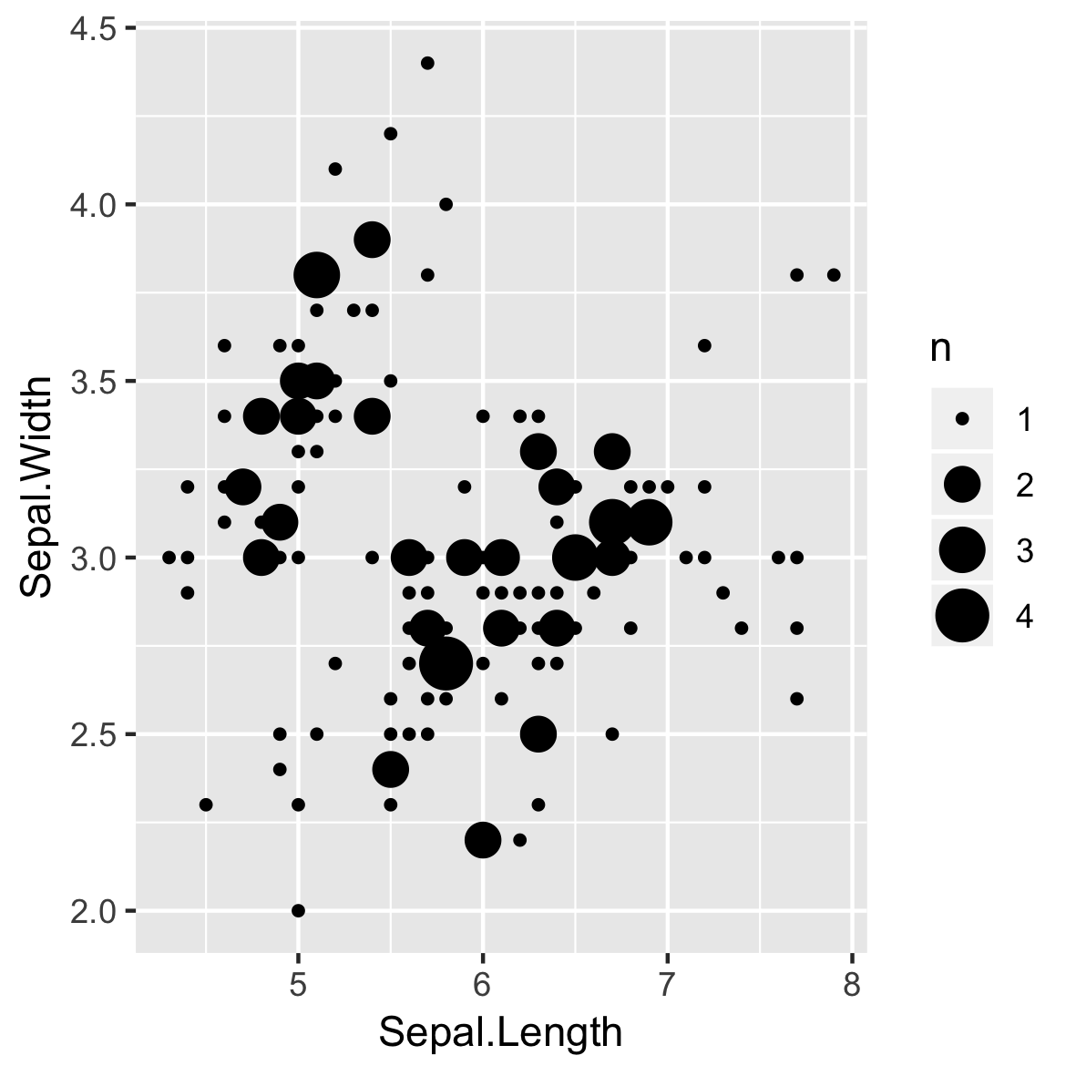
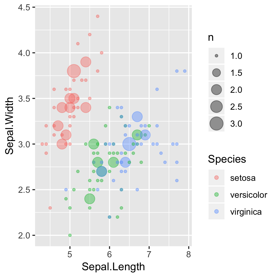
geom_count()

p + 
  geom_count()

ggplot2 中級資料視覺化

geom/stat 的關聯

geom_ stat_
geom_count() stat_sum()
ggplot2 中級資料視覺化

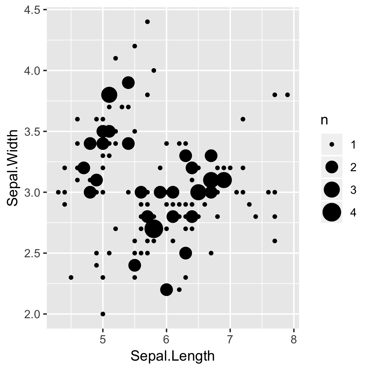
stat_sum()

p + 
  stat_sum()

ggplot2 中級資料視覺化

過度疊圖仍可能發生!

ggplot(iris, aes(Sepal.Length,
                 Sepal.Width, 
                 color = Species)) + 
  geom_count(alpha = 0.4)

ggplot2 中級資料視覺化

geom_quantile()

ggplot(iris, aes(Sepal.Length,
                 Sepal.Width, 
                 color = Species)) + 
  geom_count(alpha = 0.4)
ggplot2 中級資料視覺化

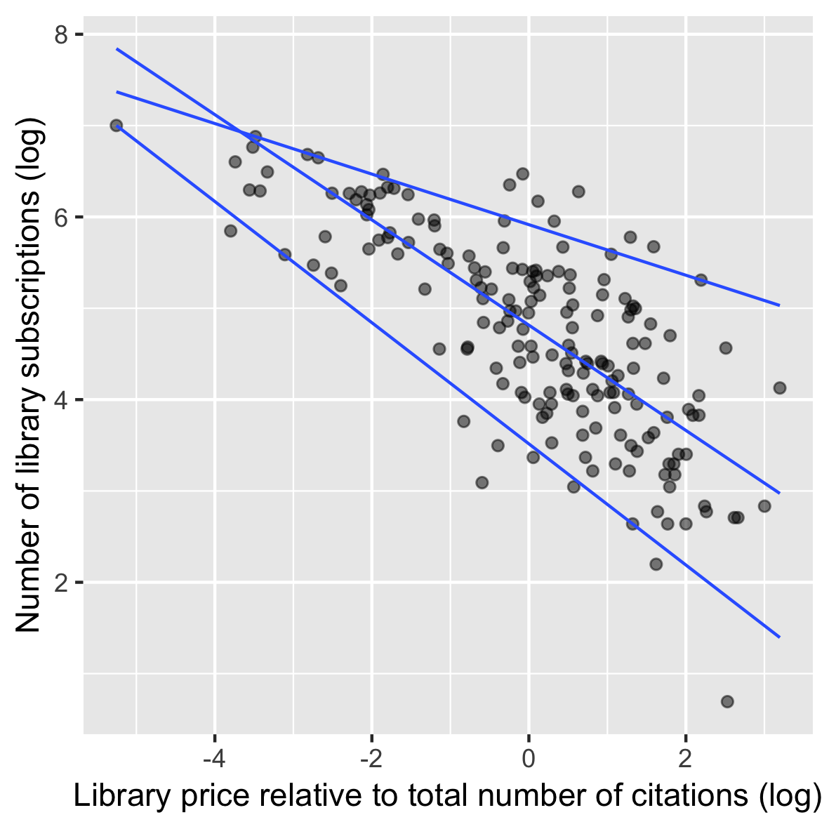
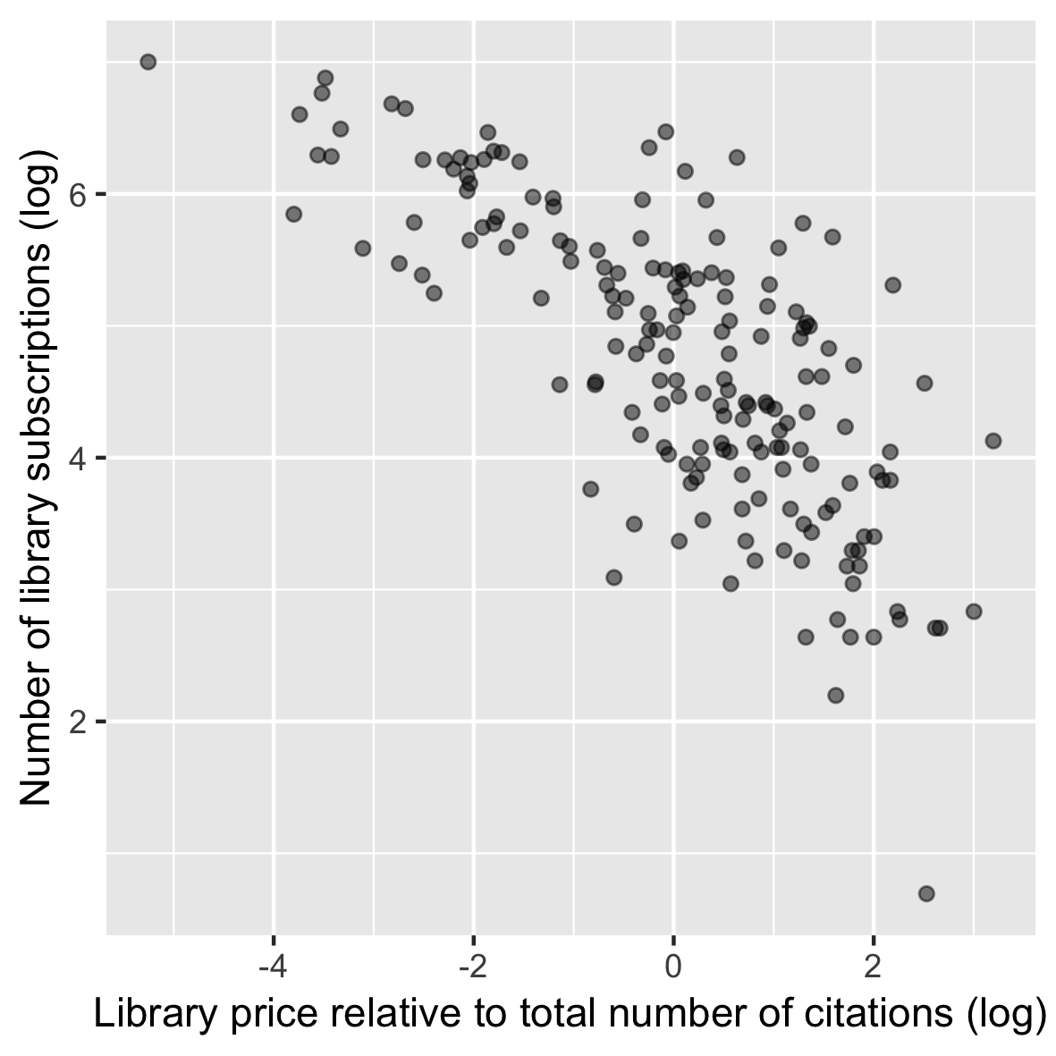
處理異質變異性

library(AER)
data(Journals)

p <- ggplot(Journals, 
            aes(log(price/citations), 
                log(subs))) +
  geom_point(alpha = 0.5) +
  labs(...)

p

ggplot2 中級資料視覺化

使用 geom_quantile

p +
  geom_quantile(quantiles = 
                c(0.05, 0.50, 0.95))

ggplot2 中級資料視覺化

geom/stat 的關聯

geom_ stat_
geom_count() stat_sum()
geom_quantile() stat_quantile()
ggplot2 中級資料視覺化

準備好做練習了!

ggplot2 中級資料視覺化

Preparing Video For Download...