使用 Seaborn 製作視覺化

Power BI 中的 Python 入門

Jacob H. Marquez

Data Scientist

使用 Seaborn 套件繪圖
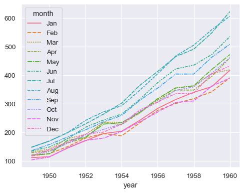
依年份顯示航班資料的折線圖,並以月份著色。

1 https://seaborn.pydata.org/generated/seaborn.lineplot.html
Power BI 中的 Python 入門

使用 Seaborn 套件繪圖

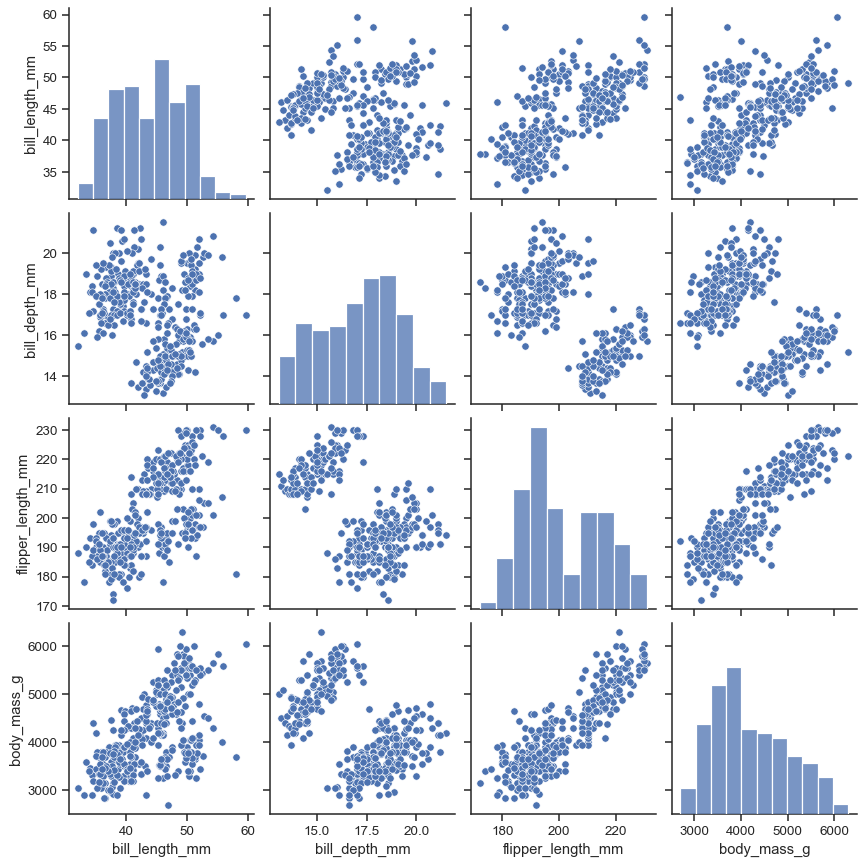
4 欄 4 列的 pair plot。

1 https://seaborn.pydata.org/generated/seaborn.pairplot.html
Power BI 中的 Python 入門

使用 Seaborn 套件繪圖

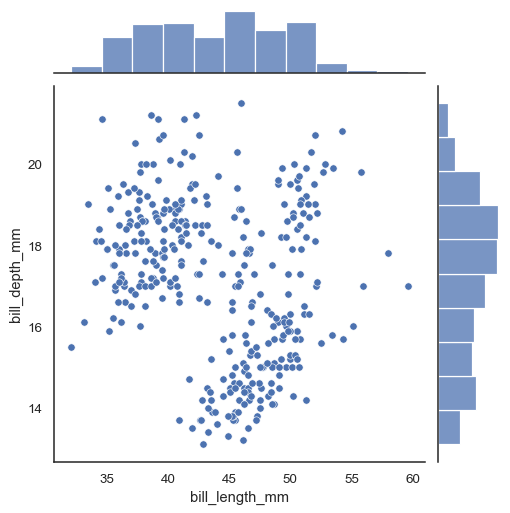
顯示喙長對喙深的 joint plot。

1 https://seaborn.pydata.org/generated/seaborn.jointplot.html
Power BI 中的 Python 入門

直方圖

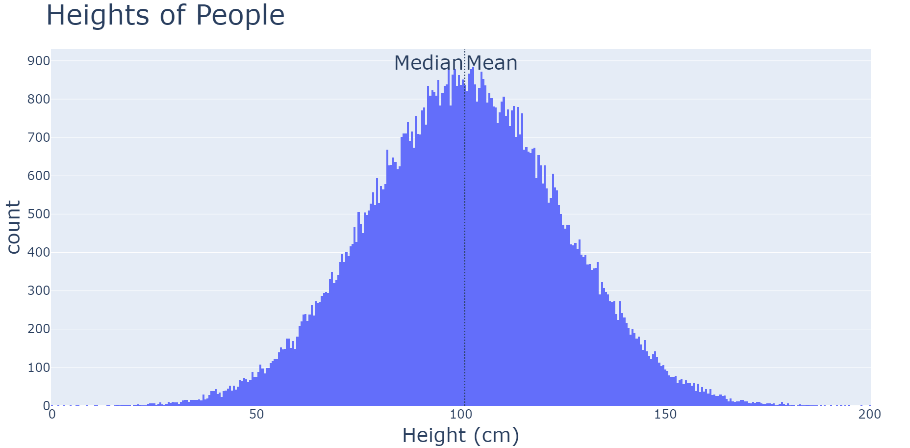
身高的直方圖,呈常態分佈。

1 https://seaborn.pydata.org/generated/seaborn.histplot.html
Power BI 中的 Python 入門

閱讀直方圖

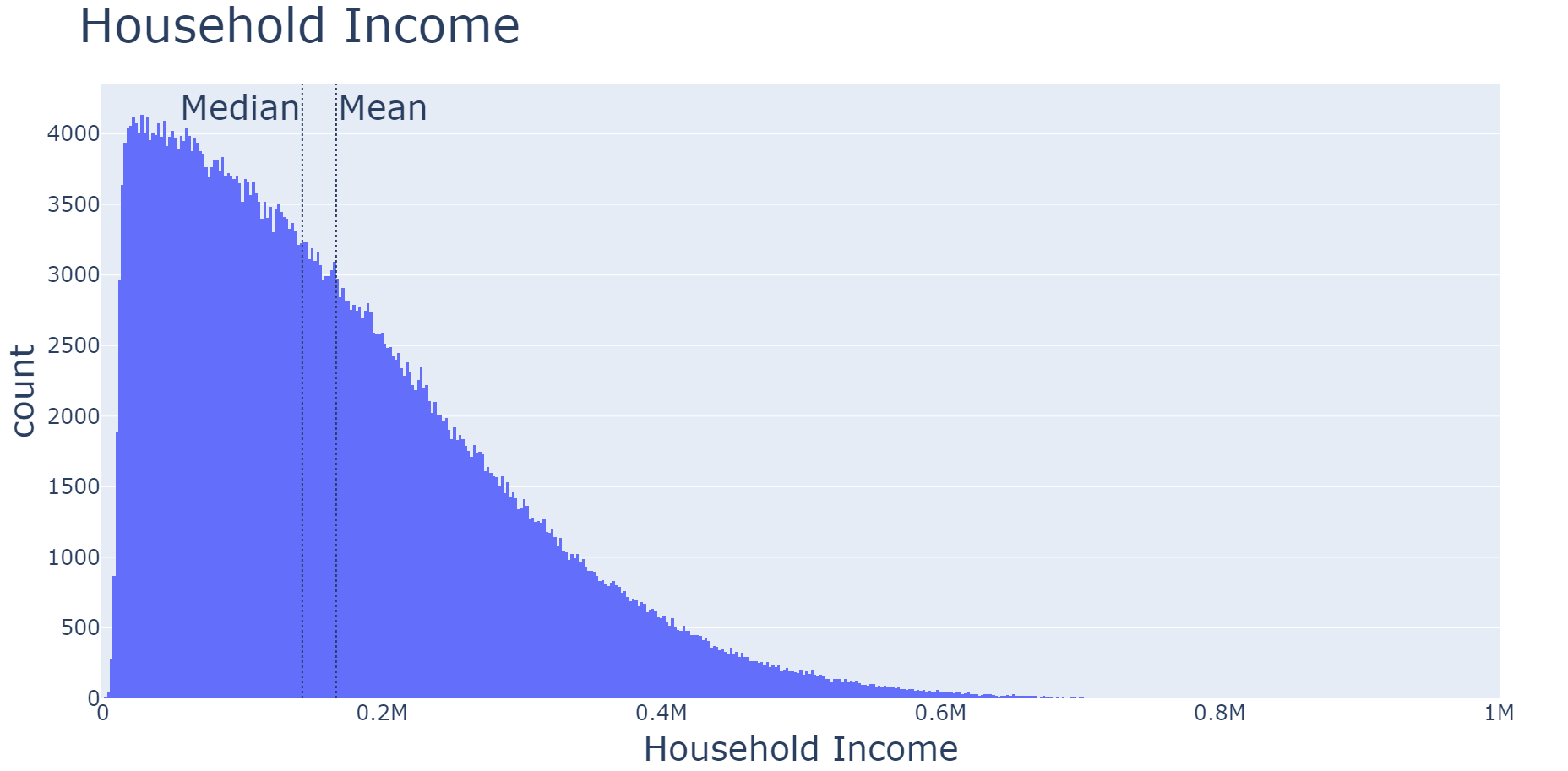
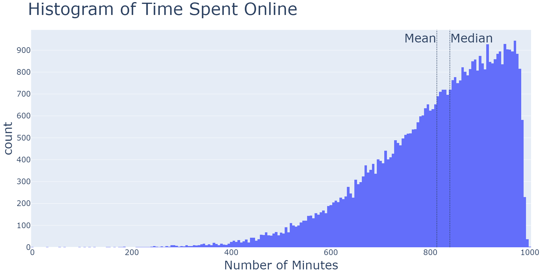
右偏的直方圖,多數觀測在左側。

Power BI 中的 Python 入門

閱讀直方圖

左偏的直方圖,多數觀測在右側。

Power BI 中的 Python 入門

閱讀直方圖

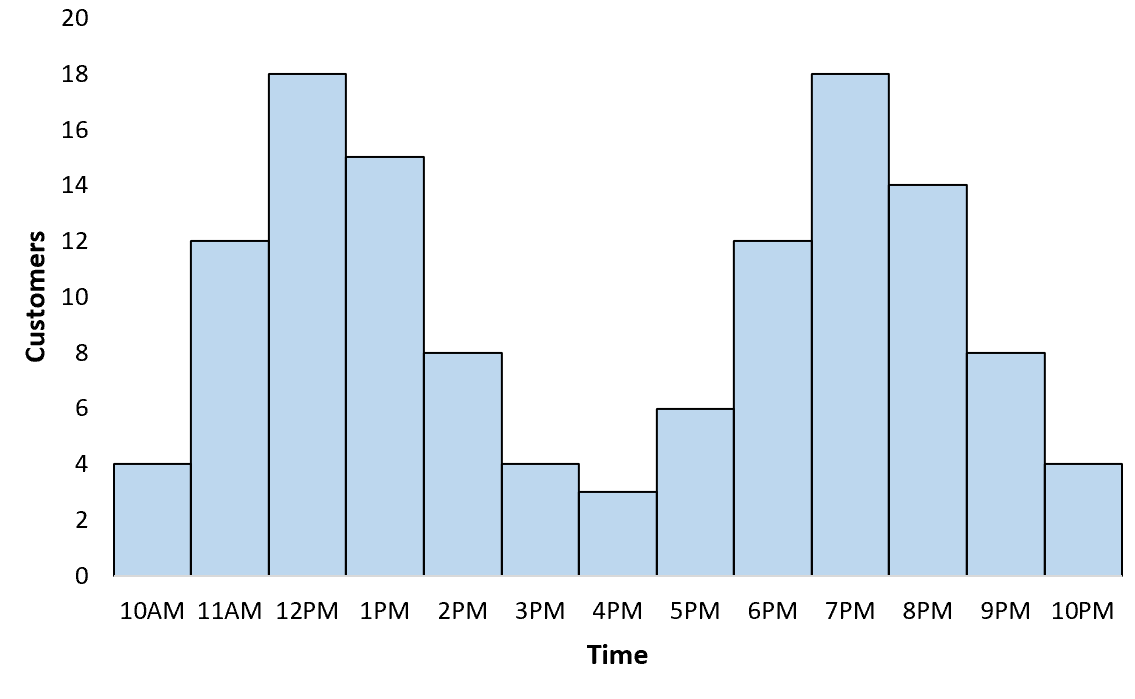
雙峰分佈的直方圖。

Power BI 中的 Python 入門

散佈圖

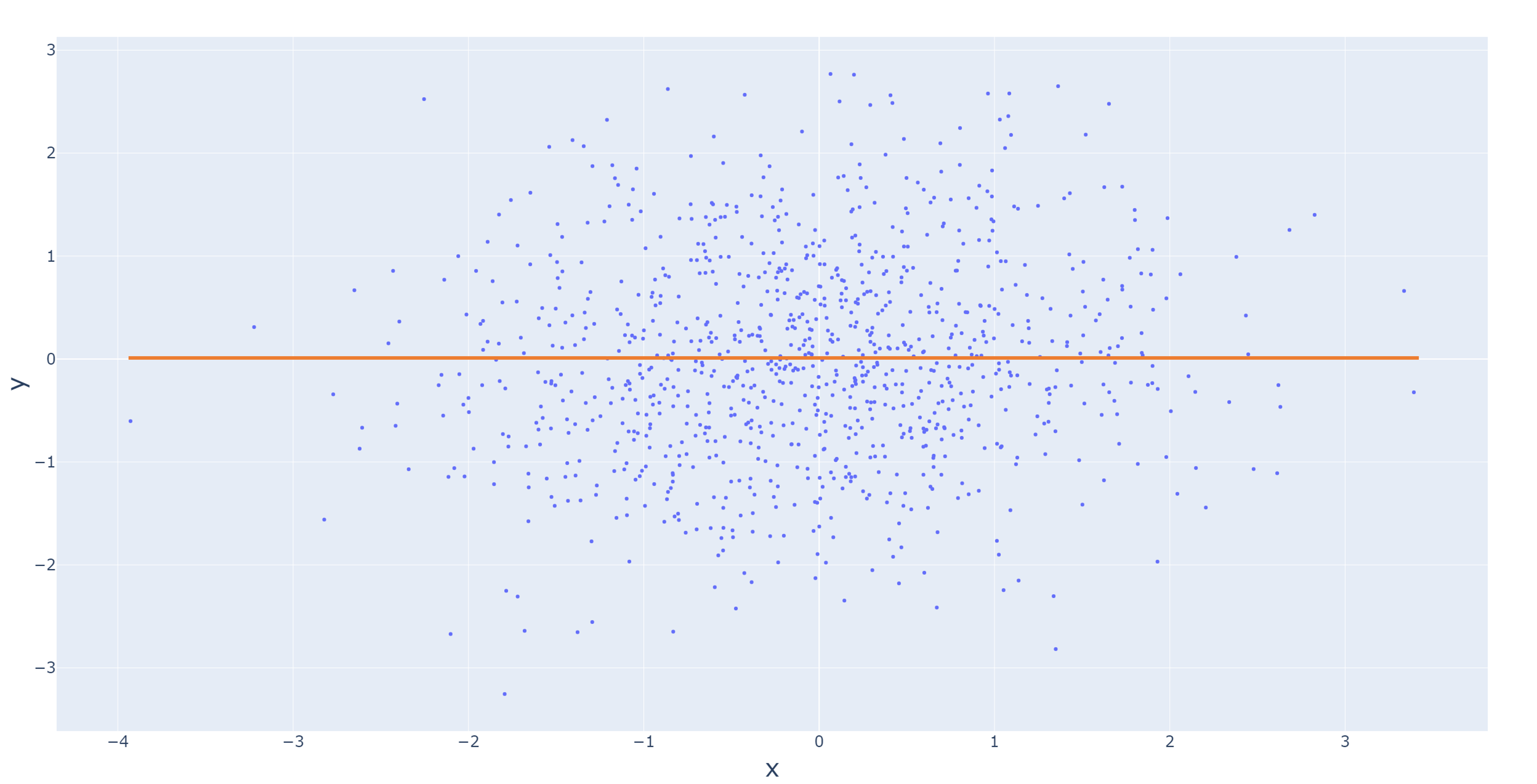
隨機散點,沒有關係。

Power BI 中的 Python 入門

閱讀散佈圖

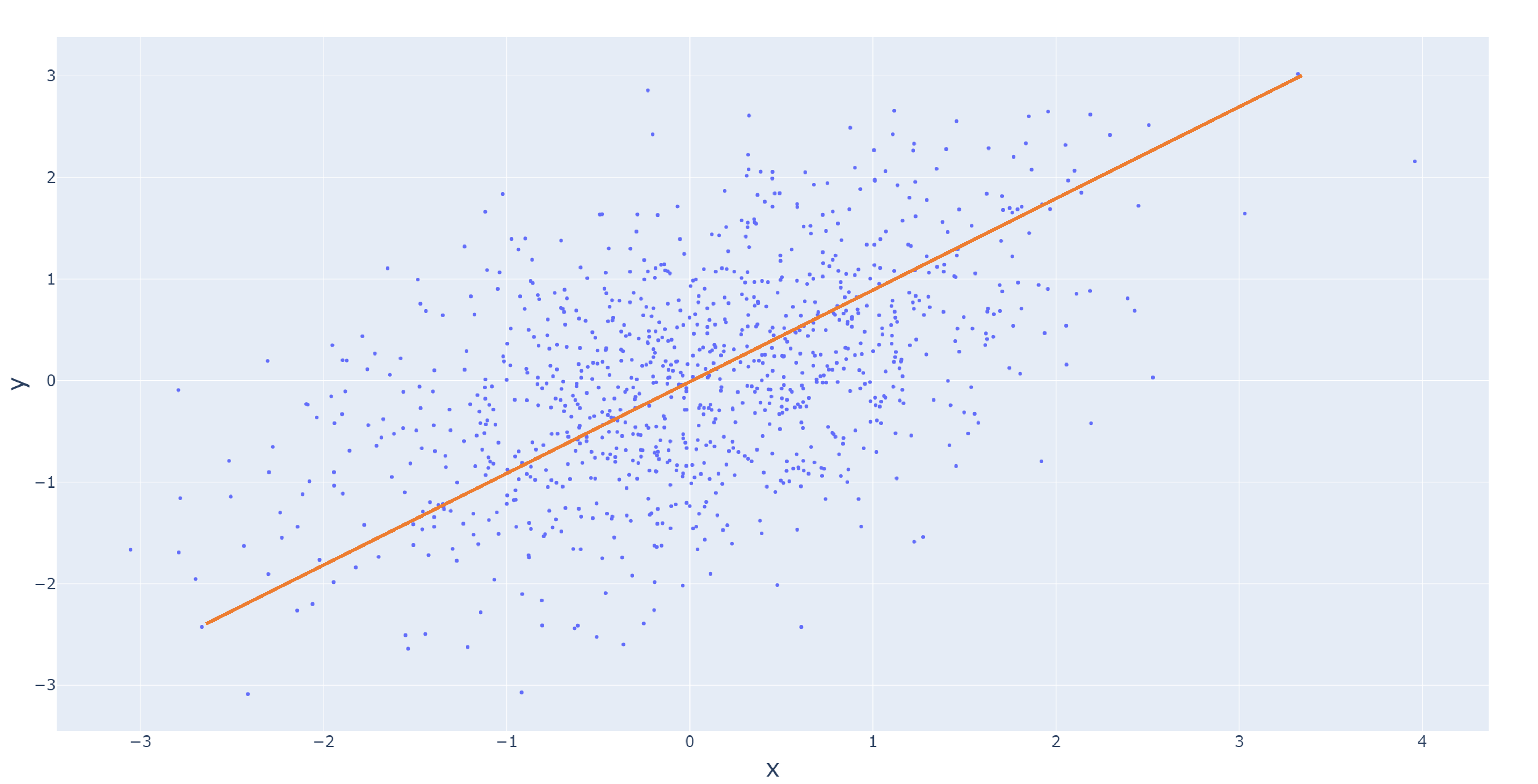
正相關的散佈圖,往右上移動。

Power BI 中的 Python 入門

閱讀散佈圖

負相關的散佈圖,往右下移動。

Power BI 中的 Python 入門

Joint plot

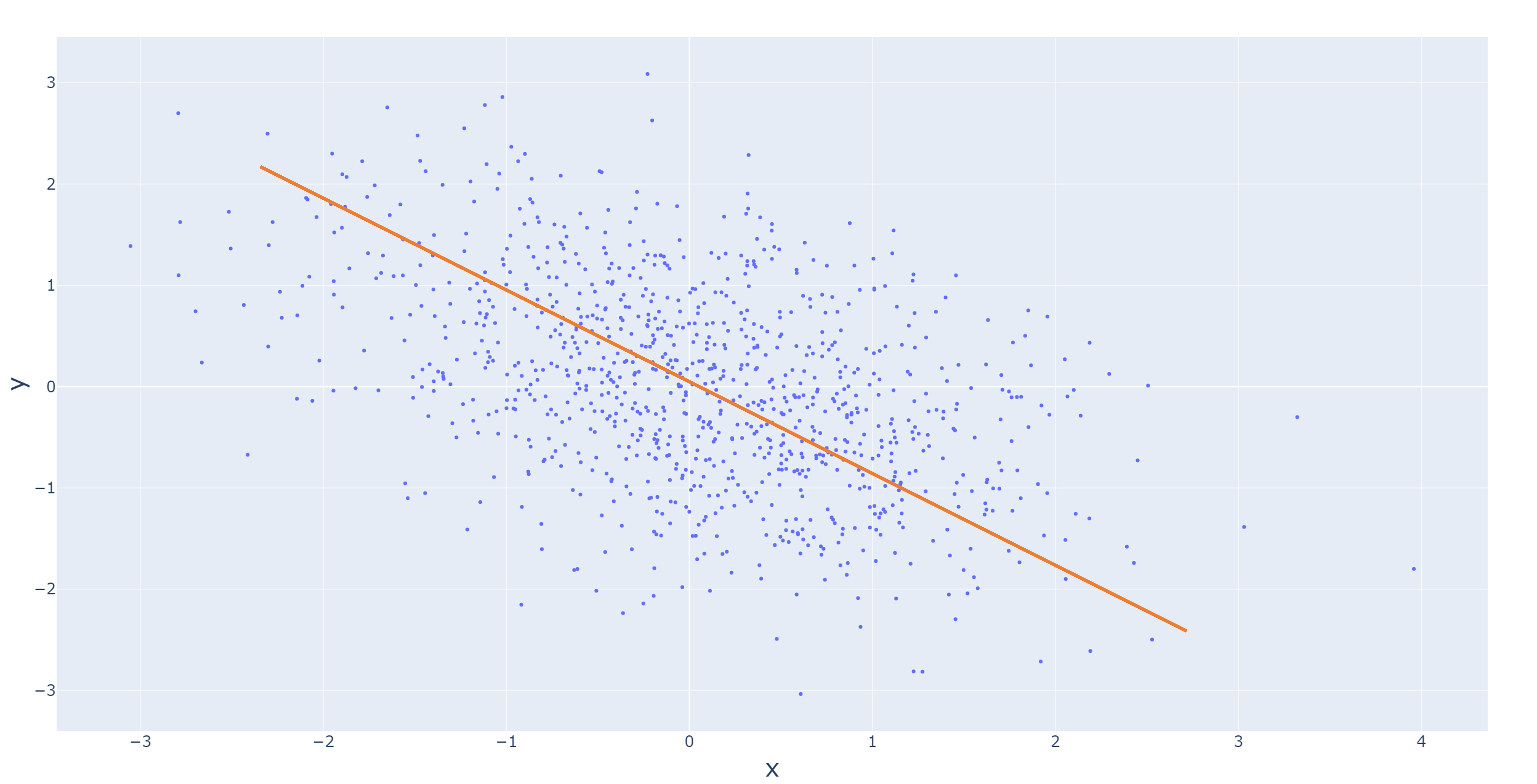
中間為散佈圖,頂端與右側各有一個直方圖的 joint plot。

seaborn.jointplot(
    x = "x",
    y = "y", 
    data = DataFrame
    )
Power BI 中的 Python 入門

Pair plot

4 欄 4 列的 pair plot。

seaborn.pairplot(
    data = DataFrame
    )
Power BI 中的 Python 入門

在 Power BI 建立圖表的步驟

import matplotlib.pyplot as plt
import seaborn as sns
# Data transformation steps
...
seaborn.___plot(
    data = DataFrame,
      ...
    )
plt.show()
Power BI 中的 Python 入門

一起來練習吧!

Power BI 中的 Python 入門

Preparing Video For Download...