使用 plotly 製作互動式圖表

使用 shinydashboard 建立儀表板

Png Kee Seng

Researcher

範例:倫敦的 Airbnb 房源

  • 想像你在倫敦的旅遊代理公司工作
  • 我們與 Airbnb 合作
    library(tidyverse)
    listings <- read_csv("../data/listings.csv")
    
...
 $ host_name                     : chr [1:69351] "Susie" "Alina" "Luca" "Simon" ...
 $ neighbourhood_group           : logi [1:69351] NA NA NA NA NA NA ...
 $ neighbourhood                 : chr [1:69351] "Tower Hamlets" "Islington" "Tower Hamlets" "Islington" ...
 $ latitude                      : num [1:69351] 51.5 51.6 51.5 51.5 51.5 ...
 $ longitude                     : num [1:69351] -0.054 -0.1127 -0.0743 -0.1048 -0.2 ...
 $ room_type                     : chr [1:69351] "Private room" "Private room" "Entire home/apt" "Private room" ...
 $ price                         : num [1:69351] 55 50 90 180 297 75 204 379 90 30 ...
 $ minimum_nights                : num [1:69351] 3 1 5 4 14 3 2 4 3 7 ...
 $ number_of_reviews             : num [1:69351] 65 30 42 493 6 89 581 51 104 32 ...
 $ last_review                   : Date[1:69351], format: "2016-06-10" "2022-07-15" "2022-01-04" "2022-09-02" ...
 $ reviews_per_month             : num [1:69351] 0.47 0.2 0.34 3.59 0.05 0.57 4.26 0.36 0.86 0.29 ...
 $ calculated_host_listings_count: num [1:69351] 1 2 1 5 1 1 1 5 1 1 ...
 $ availability_365              : num [1:69351] 74 343 222 236 180 70 193 249 318 251 ...
...
使用 shinydashboard 建立儀表板

plotly 起手式

  • 載入 plotly 函式庫

    library(plotly)
    
  • ggplotly() 中放入 ggplot 物件即可建立 plotly 物件

    ggplotly(<ggplot object>)
    
使用 shinydashboard 建立儀表板

用 ggplot 畫泡泡圖

  • 來做一張泡泡圖並存成 bubble
    • 顯示 price 平均值與 availability_365 的關係
    • room_type 上色
    • 泡泡大小與房源數成比例
    • 加上美化圖層
bubble <- listings %>%

group_by(room_type, neighbourhood) %>% summarise(avg_price = mean(price, na.rm=TRUE), avg_availability = mean(availability_365, na.rm=TRUE),
Count = n(), .groups = "drop") %>%
ggplot(aes(x = avg_price, y = avg_availability,
color = room_type,
size = Count)) +
geom_point() +
labs(x = "Average price", y = "Average availability", color = "Room type") + theme_classic()
使用 shinydashboard 建立儀表板

ggplot 泡泡圖:呈現結果

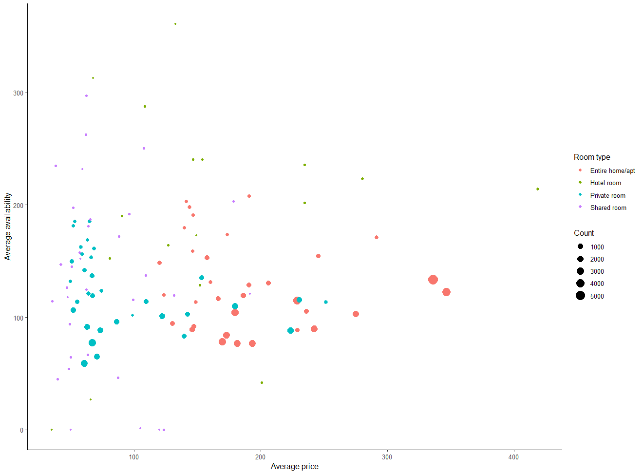
使用 ggplot 繪製的一般泡泡圖。

使用 shinydashboard 建立儀表板

使用 plotly 的互動式泡泡圖

  • bubble 包進 ggplotly()
ggplotly(bubble)

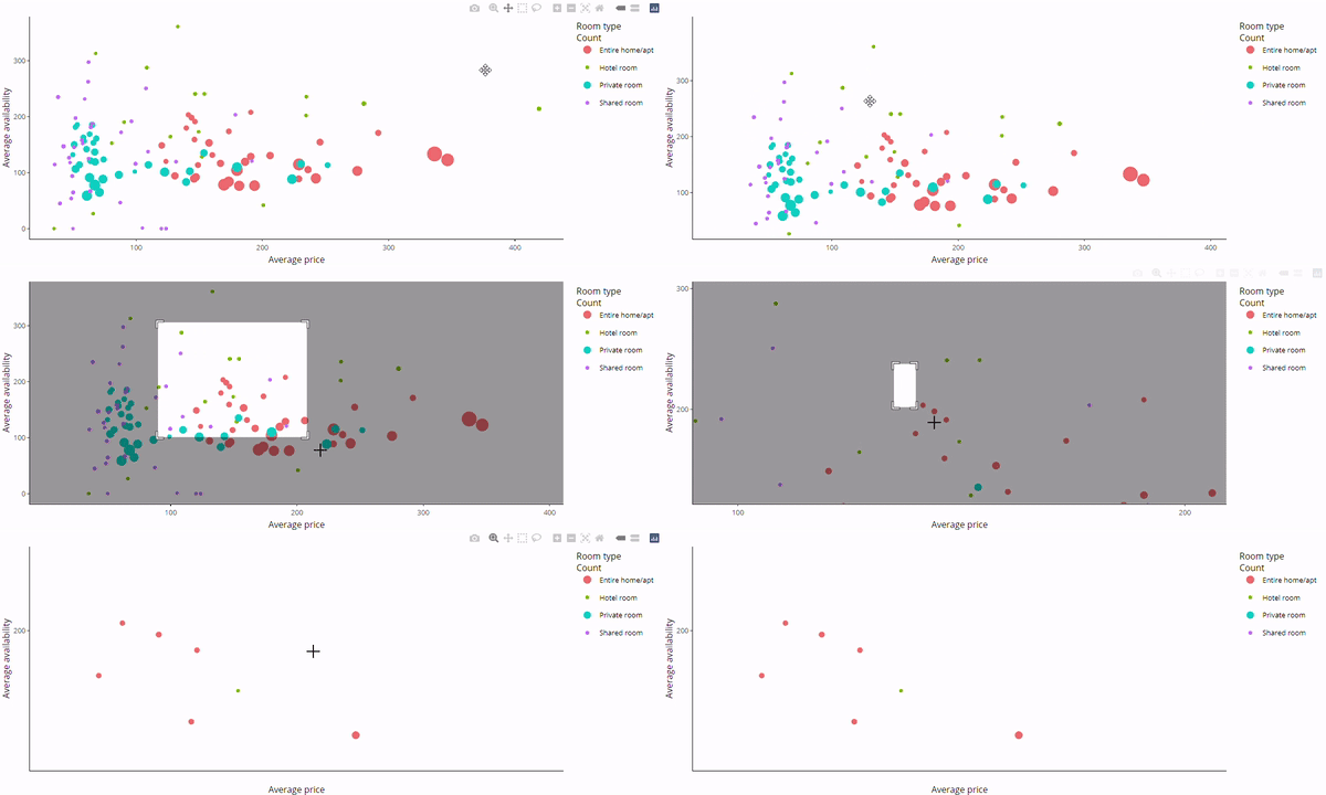
互動式的 plotly 泡泡圖。

使用 shinydashboard 建立儀表板

用 plotly 處理水平盒鬚圖

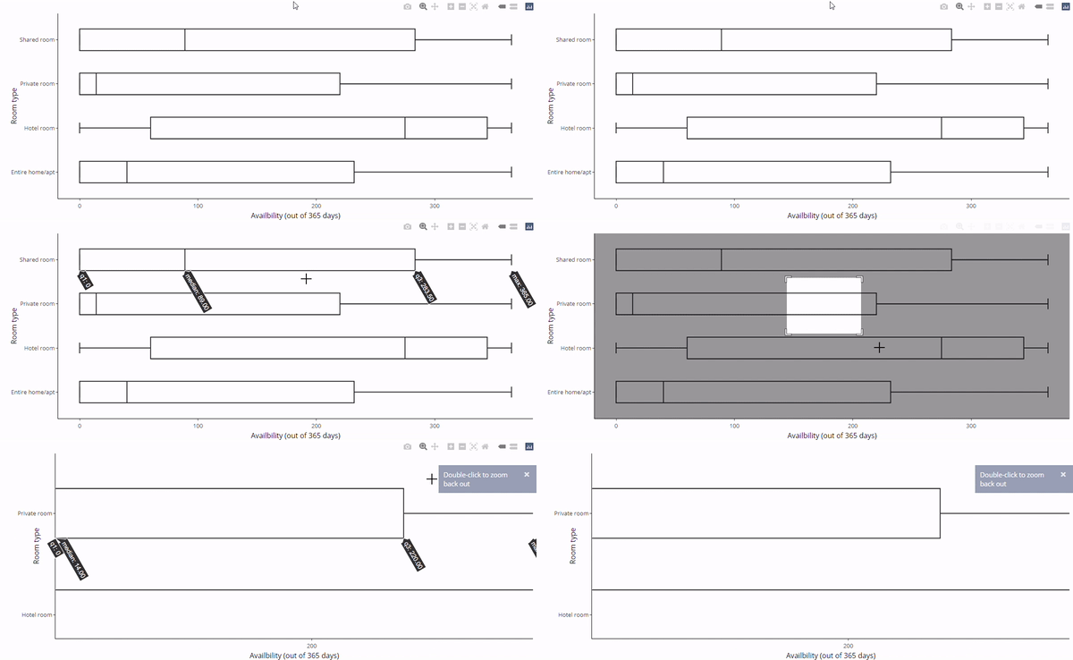
  • 有些圖無法正確轉換

  • 建立一系列「水平」盒鬚圖

    • room_type 說明 availability_365 的分布
  • ggplotly() 轉換會失敗
boxH <- listings %>%

ggplot(aes(x = availability_365, y=room_type)) +
geom_boxplot() +
labs(x="Availbility (out of 365 days)", y="Room type") + theme_classic()
ggplotly(boxH)

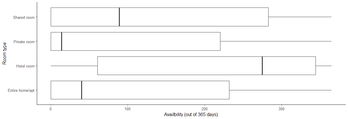
以 ggplot 建立的水平盒鬚圖。

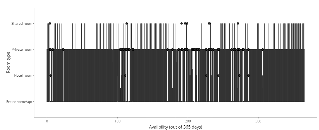
使用 ggplotly 轉換的水平盒鬚圖。

使用 shinydashboard 建立儀表板

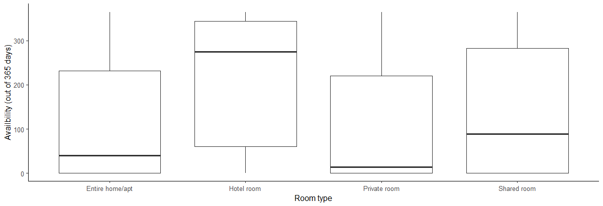
用 plotly 呈現垂直盒鬚圖

  • aes() 中對調 xy
  • 現在就能順利轉成 plotly
boxV <- listings %>%

ggplot(aes(y = availability_365, x=room_type)) + geom_boxplot() + labs(y="Availbility (out of 365 days)", x="Room type") + theme_classic()
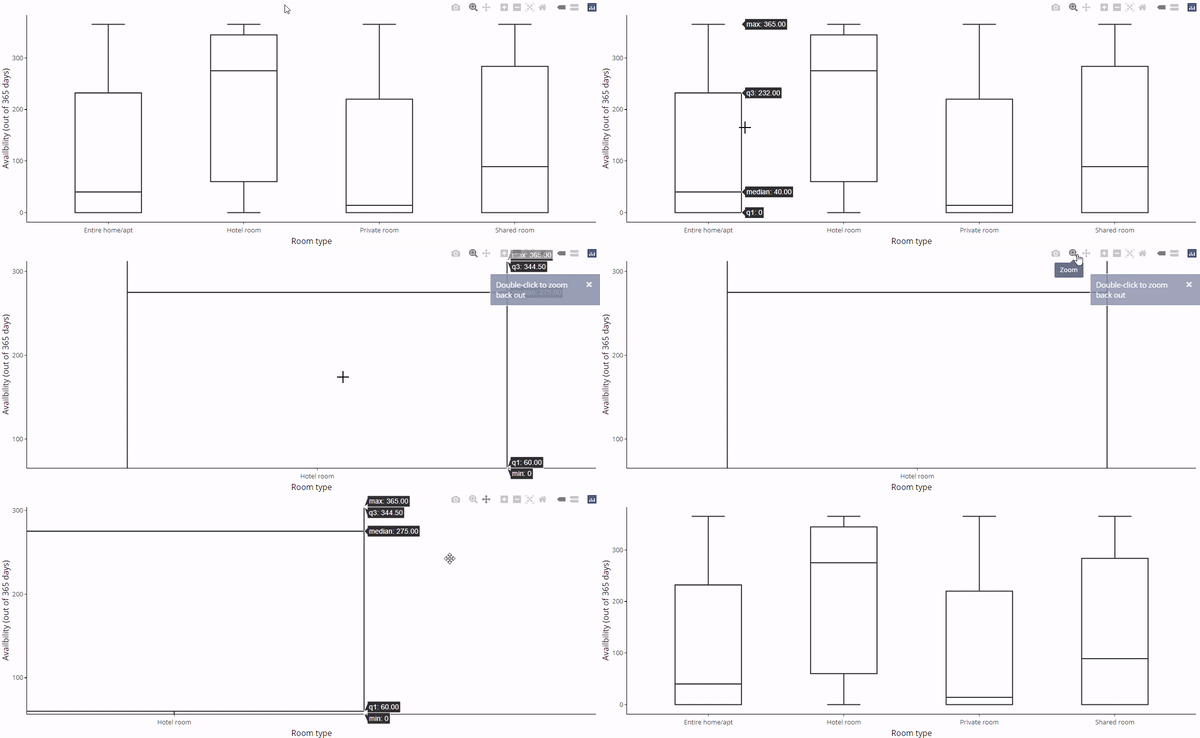
ggplotly(boxV)

以 ggplot 建立的垂直盒鬚圖。

使用 ggplotly 的垂直盒鬚圖。

使用 shinydashboard 建立儀表板

修正 plotly 的水平盒鬚圖

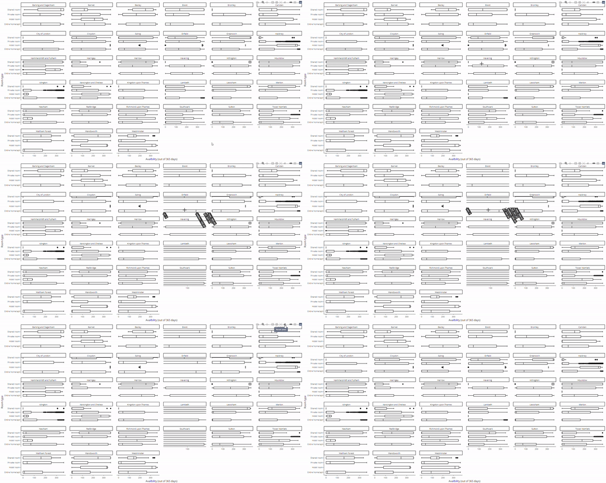
  • 如果想要水平盒鬚圖怎麼辦?
    • 加上 coord_flip()
  • 也可搭配 facet_wrap()
    • 每個分面都要夠大
ggplotly(boxV + coord_flip())
ggplotly(boxV + coord_flip() + 
    facet_wrap(~neighbourhood))

翻轉後的 plotly 盒鬚圖。

分面化的 plotly 盒鬚圖。

使用 shinydashboard 建立儀表板

一起來練習吧!

使用 shinydashboard 建立儀表板

Preparing Video For Download...