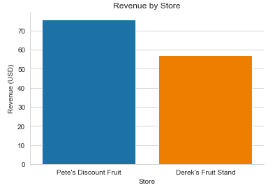
打造長條圖

給試算表使用者的 Python

Chris Cardillo

Data Scientist

前一個長條圖

sns.barplot(x='store', y='revenue', data=totals)

plt.show()
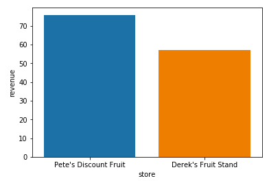
僅店別營收圖.png

給試算表使用者的 Python

加入標籤

sns.barplot(x='store', 
            y='revenue', 
            data=totals)

# 加上標題

# 加上 x 軸標籤

# 加上 y 軸標籤

plt.show()

僅店別營收圖.png

給試算表使用者的 Python

用 plt.title() 加入標題

sns.barplot(x='store', 
            y='revenue', 
            data=totals)

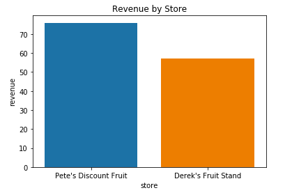
plt.title('Revenue by Store')

# 加上 x 軸標籤

# 加上 y 軸標籤

plt.show()

含標題的店別營收.png

給試算表使用者的 Python

用 plt.xlabel() 加入 x 軸標籤

sns.barplot(x='store', 
            y='revenue', 
            data=totals)

plt.title('Revenue by Store')

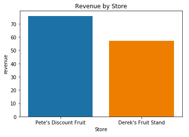
plt.xlabel('Store')

# 加上 y 軸標籤

plt.show()

含標題與 x 標籤的店別營收.png

給試算表使用者的 Python

用 plt.ylabel() 加入 y 軸標籤

sns.barplot(x='store', 
            y='revenue', 
            data=totals)

plt.title('Revenue by Store')

plt.xlabel('Store')

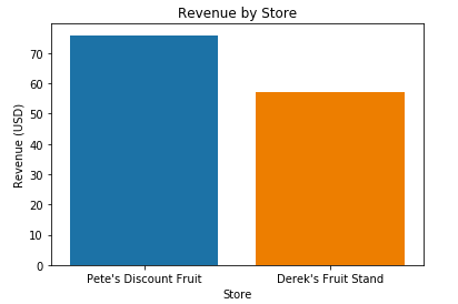
plt.ylabel('Revenue (USD)')

plt.show()

含所有標籤的店別營收.png

給試算表使用者的 Python

用 sns.despine() 去除多餘邊框

sns.barplot(x='store', 
            y='revenue', 
            data=totals)

plt.title('Revenue by Store')

plt.xlabel('Store')

plt.ylabel('Revenue (USD)')

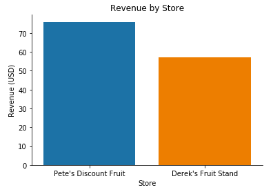
sns.despine()

plt.show()

移除邊框的店別營收.png

給試算表使用者的 Python

用 sns.set_style() 設定樣式

sns.set_style('whitegrid')

sns.barplot(x='store', 
            y='revenue', 
            data=totals)

plt.title('Revenue by Store')

plt.xlabel('Store')

plt.ylabel('Revenue (USD)')

sns.despine()

plt.show()

最終版店別營收.png

給試算表使用者的 Python

前後對照

僅店別營收圖.png

最終版店別營收.png

給試算表使用者的 Python

換你了!

給試算表使用者的 Python

Preparing Video For Download...