用視覺化探索你的資料

行銷分析:用 Python 預測客戶流失

Mark Peterson

Director of Data Science, Infoblox

在 Python 中視覺化資料

  • seaborn 函式庫可輕鬆建立資訊清楚又美觀的圖表

  • 建構於 matplotlib 之上

行銷分析:用 Python 預測客戶流失

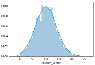
視覺化帳戶長度的分佈

  • 了解變數的分佈很重要


import matplotlib.pyplot as plt
import seaborn as sns

sns.distplot(telco['Account_Length'])
plt.show()
行銷分析:用 Python 預測客戶流失

帳戶長度分佈

行銷分析:用 Python 預測客戶流失

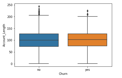
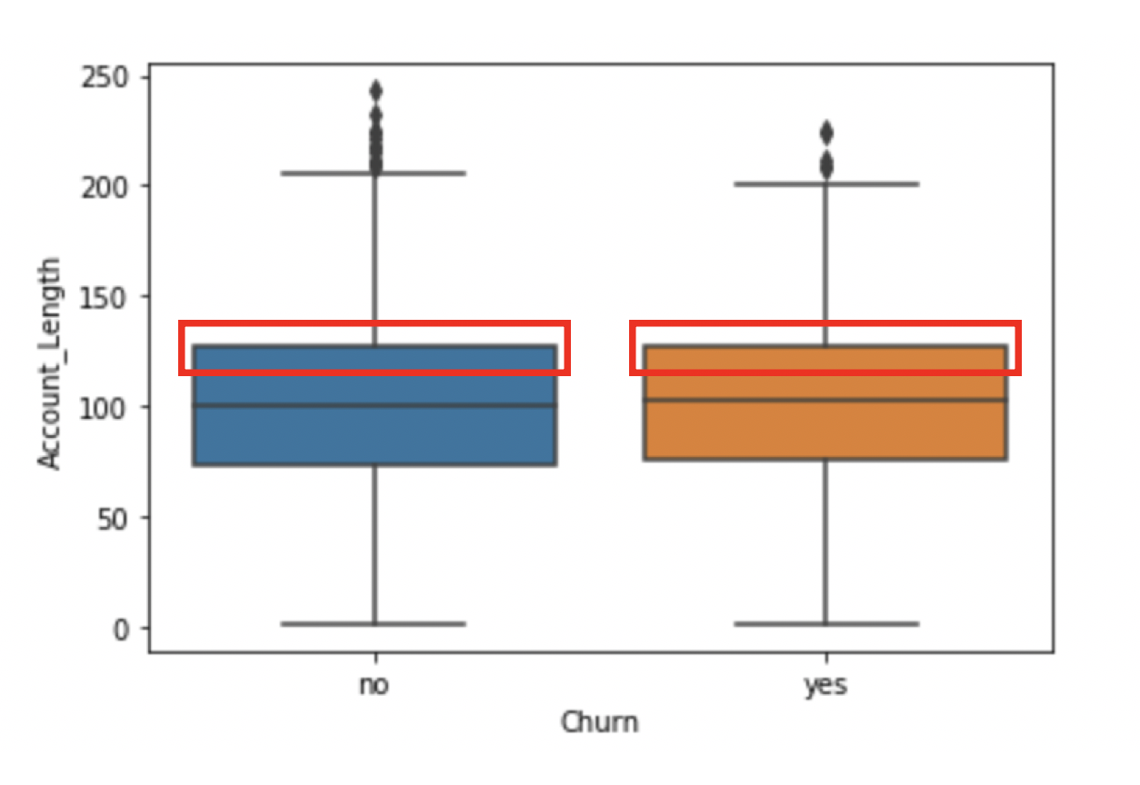
帳戶長度的差異

  • 盒鬚圖


sns.boxplot(x = 'Churn',
            y = 'Account_Length',
            data = telco)

plt.show()

螢幕擷圖 2019-05-10 11.25.40

行銷分析:用 Python 預測客戶流失

帳戶長度的差異

  • 盒鬚圖


sns.boxplot(x = 'Churn',
            y = 'Account_Length',
            data = telco)

plt.show()

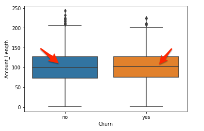
中位線

行銷分析:用 Python 預測客戶流失

帳戶長度的差異

  • 盒鬚圖


sns.boxplot(x = 'Churn',
            y = 'Account_Length',
            data = telco)

plt.show()

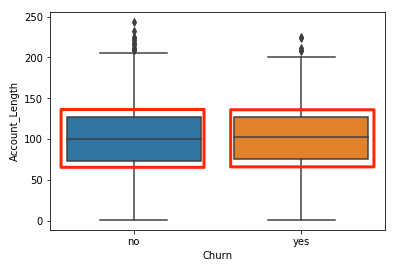
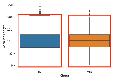
著色盒鬚圖

行銷分析:用 Python 預測客戶流失

帳戶長度的差異

  • 盒鬚圖


sns.boxplot(x = 'Churn',
            y = 'Account_Length',
            data = telco)

plt.show()

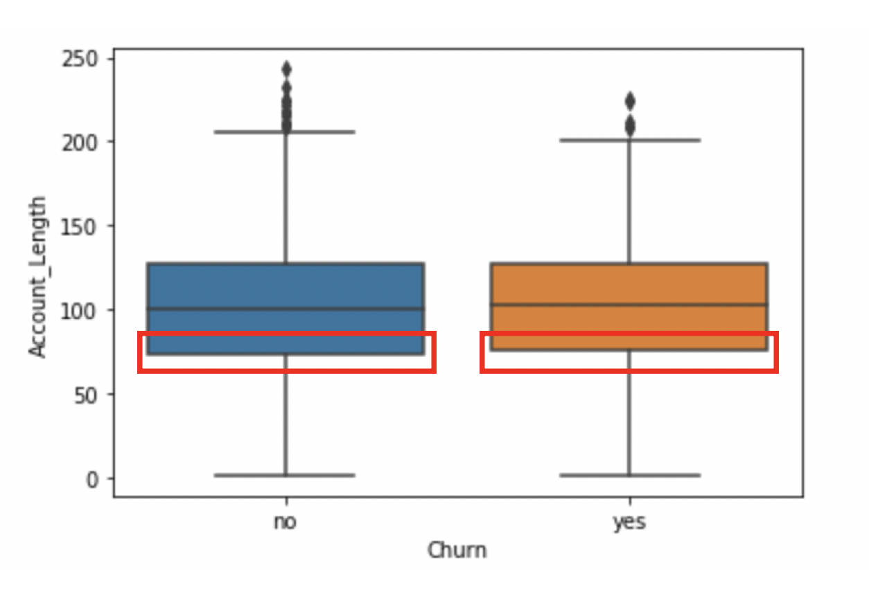
第 25 百分位

行銷分析:用 Python 預測客戶流失

帳戶長度的差異

  • 盒鬚圖


sns.boxplot(x = 'Churn',
            y = 'Account_Length',
            data = telco)

plt.show()

第 75 百分位

行銷分析:用 Python 預測客戶流失

帳戶長度的差異

  • 盒鬚圖


sns.boxplot(x = 'Churn',
            y = 'Account_Length',
            data = telco)

plt.show()

分散程度

行銷分析:用 Python 預測客戶流失

帳戶長度的差異

  • 盒鬚圖


sns.boxplot(x = 'Churn',
            y = 'Account_Length',
            data = telco)

plt.show()

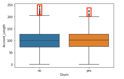
離群值

行銷分析:用 Python 預測客戶流失

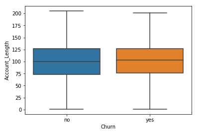
帳戶長度的差異

  • 盒鬚圖


sns.boxplot(x = 'Churn',
            y = 'Account_Length',
            data = telco,
            sym="")

plt.show()

螢幕擷圖 2019-05-10 11.30.18

行銷分析:用 Python 預測客戶流失

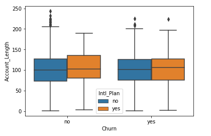
加入第三個變數

sns.boxplot(x = 'Churn',
            y = 'Account_Length',
            data = telco,
            hue = 'Intl_Plan')

plt.show()

螢幕擷圖 2019-05-10 11.41.29

行銷分析:用 Python 預測客戶流失

來畫幾張圖吧!

行銷分析:用 Python 預測客戶流失

Preparing Video For Download...