計算時間序列之間的相關性

使用 Python 視覺化時間序列資料

Thomas Vincent

Head of Data Science, Getty Images

就業資料的趨勢

print(trend_df)
datestamp  Agriculture  Business services  Construction

2000-01-01          NaN                NaN           NaN   
2000-02-01          NaN                NaN           NaN   
2000-03-01          NaN                NaN           NaN   
2000-04-01          NaN                NaN           NaN   
2000-05-01          NaN                NaN           NaN   
2000-06-01          NaN                NaN           NaN   
2000-07-01     9.170833           4.787500      6.329167   
2000-08-01     9.466667           4.820833      6.304167   
...
使用 Python 視覺化時間序列資料

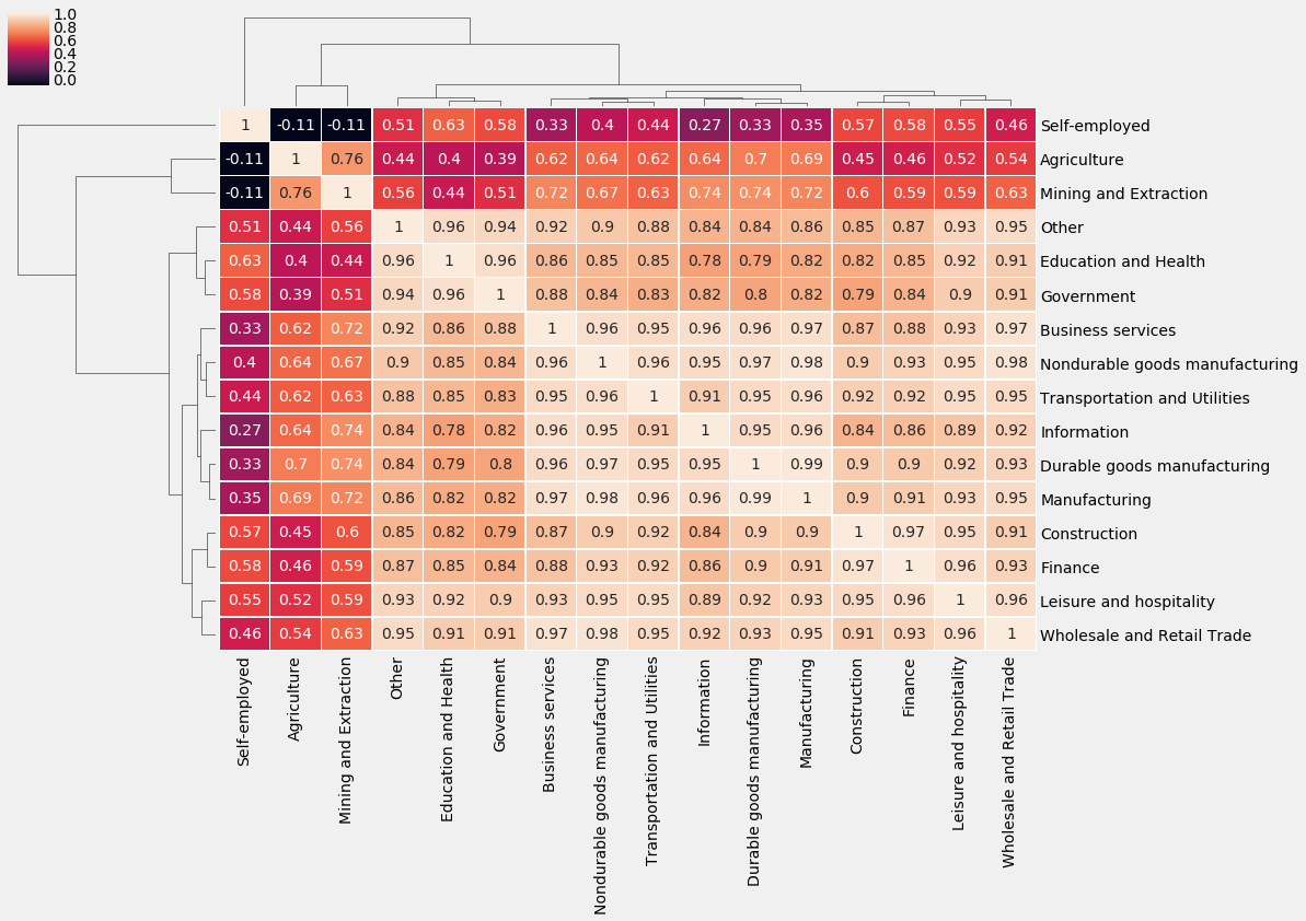
繪製就業相關矩陣的叢集熱圖

# Get correlation matrix of the seasonality_df DataFrame
trend_corr = trend_df.corr(method='spearman')

# Customize the clustermap of the seasonality_corr
correlation matrix
fig = sns.clustermap(trend_corr, annot=True, linewidth=0.4)

plt.setp(fig.ax_heatmap.yaxis.get_majorticklabels(),
rotation=0)

plt.setp(fig.ax_heatmap.xaxis.get_majorticklabels(),
rotation=90)
使用 Python 視覺化時間序列資料

就業相關矩陣

就業相關矩陣

使用 Python 視覺化時間序列資料

一起來練習吧!

使用 Python 視覺化時間序列資料

Preparing Video For Download...