繪製你的第一個時間序列

使用 Python 視覺化時間序列資料

Thomas Vincent

Head of Data Science, Getty Images

Matplotlib 函式庫

  • 在 Python 中,matplotlib 是用來繪圖的強大套件
  • matplotlib 的子模組 pyplot 通常以別名 plt 匯入
import matplotlib.pyplot as plt
使用 Python 視覺化時間序列資料

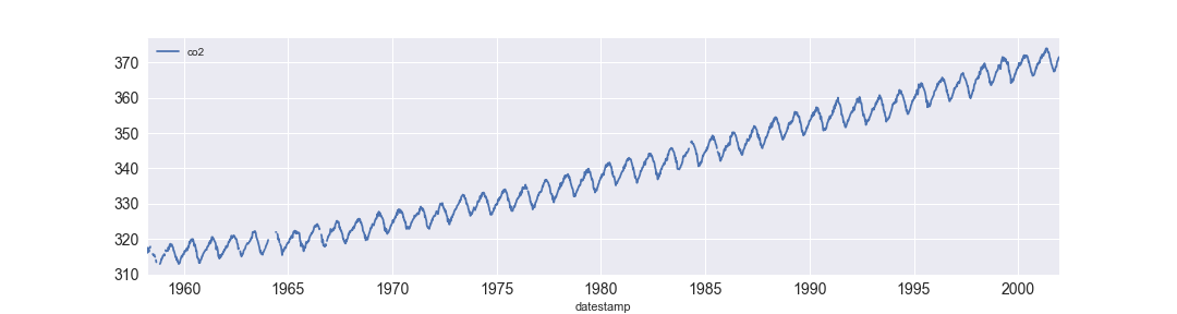
繪製時間序列資料

你的第一個時間序列

使用 Python 視覺化時間序列資料

繪製時間序列資料

import matplotlib.pyplot as plt
import pandas as pd

df = df.set_index('date_column')
df.plot()
plt.show()
使用 Python 視覺化時間序列資料

為圖表加入樣式

plt.style.use('fivethirtyeight')
df.plot()
plt.show()
使用 Python 視覺化時間序列資料

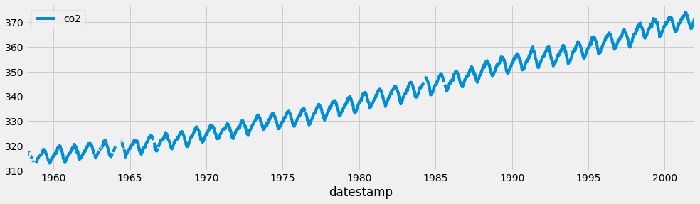
FiveThirtyEight 樣式

使用 fivethirtyeight 樣式的範例

使用 Python 視覺化時間序列資料

Matplotlib 樣式表

print(plt.style.available)
['seaborn-dark-palette', 'seaborn-darkgrid', 
'seaborn-dark', 'seaborn-notebook', 
'seaborn-pastel', 'seaborn-white', 
'classic', 'ggplot', 'grayscale', 
'dark_background', 'seaborn-poster', 
'seaborn-muted', 'seaborn', 'bmh', 
'seaborn-paper', 'seaborn-whitegrid', 
'seaborn-bright', 'seaborn-talk', 
'fivethirtyeight', 'seaborn-colorblind', 
'seaborn-deep', 'seaborn-ticks']

使用 Python 視覺化時間序列資料

用標籤描述圖表

ax = df.plot(color='blue')
ax.set_xlabel('Date')
ax.set_ylabel('The values of my Y axis')
ax.set_title('The title of my plot')
plt.show()

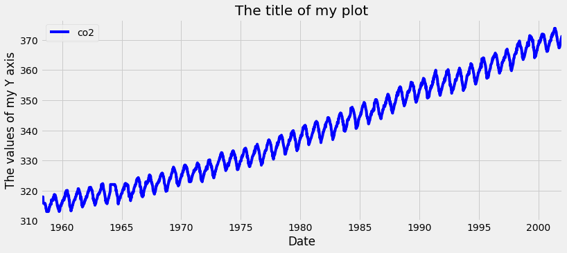
為圖表加上標籤

使用 Python 視覺化時間序列資料

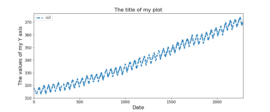
圖尺寸、線寬、線型與字級

ax = df.plot(figsize=(12, 5), fontsize=12,
             linewidth=3, linestyle='--')
ax.set_xlabel('Date', fontsize=16)
ax.set_ylabel('The values of my Y axis', fontsize=16)
ax.set_title('The title of my plot', fontsize=16)
plt.show()

使用 Python 視覺化時間序列資料

一起來練習吧!

使用 Python 視覺化時間序列資料

Preparing Video For Download...