繪製多條時間序列

使用 Python 視覺化時間序列資料

Thomas Vincent

Head of Data Science, Getty Images

清楚最重要

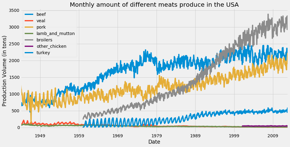
在這張圖中,matplotlib 的預設配色讓 beefturkey 的時間序列用了相同顏色。

matplotlib 中的色彩循環

使用 Python 視覺化時間序列資料

colormap 參數

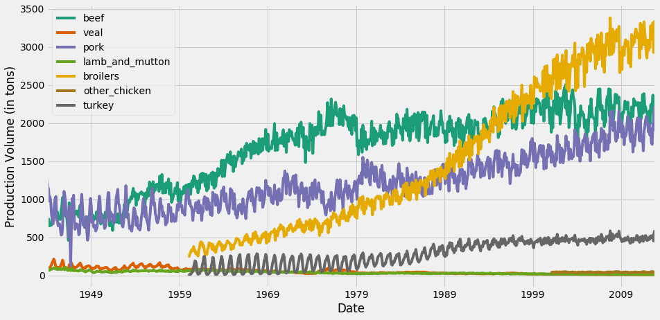
ax = df.plot(colormap='Dark2', figsize=(14, 7))
ax.set_xlabel('Date')
ax.set_ylabel('Production Volume (in tons)')

plt.show()

若要查看所有可用的色彩映射,請按一下這裡

使用 Python 視覺化時間序列資料

用 colormap 更改線條顏色

為時間序列視覺化更換配色

使用 Python 視覺化時間序列資料

用資訊強化你的圖表

ax = df.plot(colormap='Dark2', figsize=(14, 7))

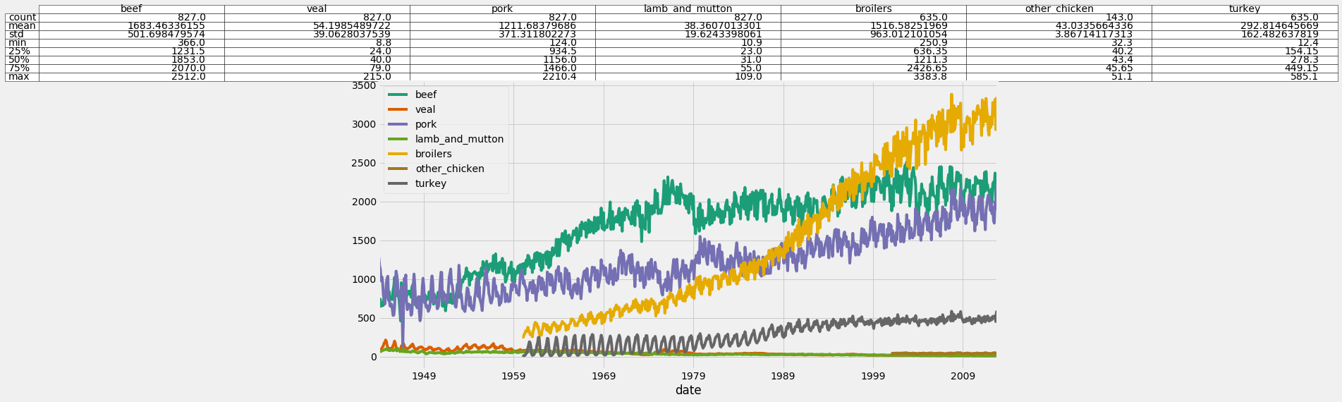
df_summary = df.describe() # Specify values of cells in the table ax.table(cellText=df_summary.values, # Specify width of the table colWidths=[0.3]*len(df.columns), # Specify row labels rowLabels=df_summary.index, # Specify column labels colLabels=df_summary.columns, # Specify location of the table loc='top') plt.show()
使用 Python 視覺化時間序列資料

在圖上加入統計摘要

在圖上加入統計摘要

使用 Python 視覺化時間序列資料

處理不同尺度

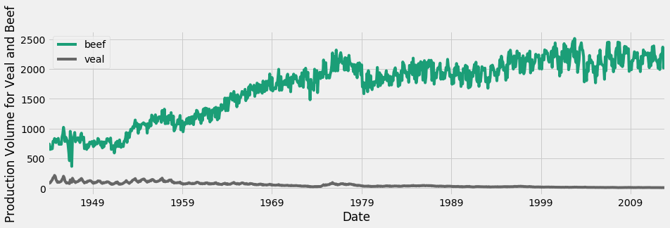
beef 與 veal 的時間序列

使用 Python 視覺化時間序列資料

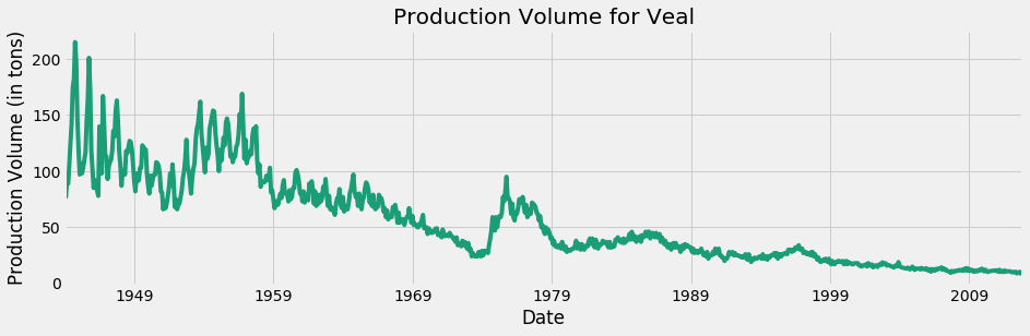
僅 veal

僅顯示 veal 的時間序列

使用 Python 視覺化時間序列資料

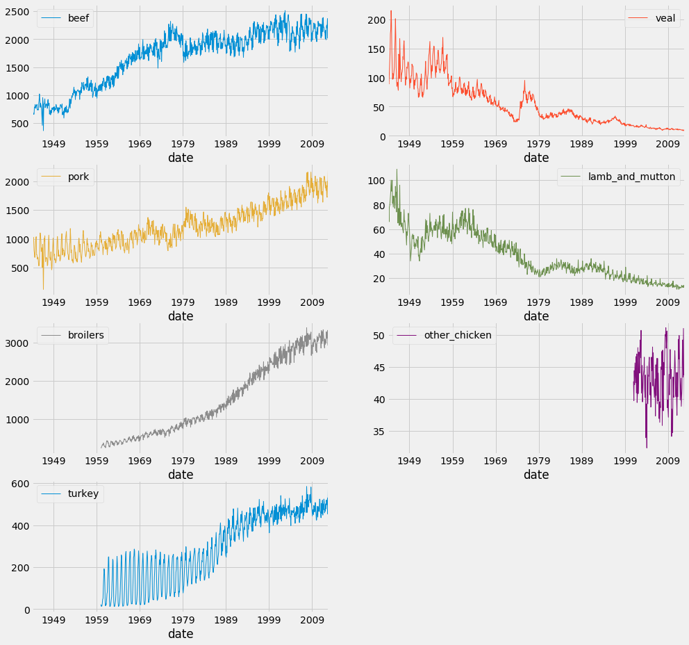
分面圖(Facet)

df.plot(subplots=True,
                linewidth=0.5,
                layout=(2, 4),
                figsize=(16, 10),
                sharex=False,
                sharey=False)

plt.show()
使用 Python 視覺化時間序列資料

分面圖

使用 Python 視覺化時間序列資料

開始動手吧!

使用 Python 視覺化時間序列資料

Preparing Video For Download...