自訂時間序列圖

使用 Python 視覺化時間序列資料

Thomas Vincent

Head of Data Science, Getty Images

切片時間序列資料

discoveries['1960':'1970']
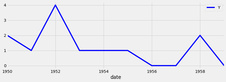
discoveries['1950-01':'1950-12']
discoveries['1960-01-01':'1960-01-15']
使用 Python 視覺化時間序列資料

繪製時間序列的子集

import matplotlib.pyplot as plt
plt.style.use('fivethirtyeight')
df_subset = discoveries['1960':'1970']
ax = df_subset.plot(color='blue', fontsize=14)
plt.show()

時間序列子集範例

使用 Python 視覺化時間序列資料

加入標記線

ax.axvline(x='1969-01-01', 
           color='red', 
           linestyle='--')
ax.axhline(y=100, 
           color='green', 
           linestyle='--')
使用 Python 視覺化時間序列資料

使用標記線:完整程式碼

ax = discoveries.plot(color='blue')
ax.set_xlabel('Date')
ax.set_ylabel('Number of great discoveries')

ax.axvline('1969-01-01', color='red', linestyle='--') ax.axhline(4, color='green', linestyle='--')
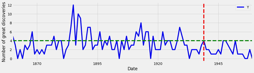
在圖上加入標記線

使用 Python 視覺化時間序列資料

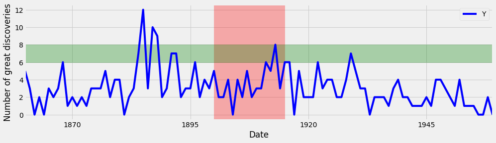
凸顯關注區域

ax.axvspan('1964-01-01', '1968-01-01', 
           color='red', alpha=0.5)
ax.axhspan(8, 6, color='green',
           alpha=0.2)
使用 Python 視覺化時間序列資料

凸顯關注區域:完整程式碼

ax = discoveries.plot(color='blue')
ax.set_xlabel('Date')
ax.set_ylabel('Number of great discoveries')
ax.axvspan('1964-01-01', '1968-01-01', color='red',
alpha=0.3)
ax.axhspan(8, 6, color='green', alpha=0.3)

在圖上加入關注區域

使用 Python 視覺化時間序列資料

一起來練習吧!

使用 Python 視覺化時間序列資料

Preparing Video For Download...