探索模式

用 Python 改善你的資料視覺化

Nick Strayer

Instructor

更深入挖掘
  • 檢視相關性
  • 相關性是否由混雜因素驅動?
  • 有沒有意外發現?

鏟子挖進地面

用 Python 改善你的資料視覺化

目標受眾

  • 與同儕分享
  • 聰明做設計決策
  • 記得他們對資料沒那麼熟

卡通人物向同儕做一般性簡報

用 Python 改善你的資料視覺化
sns.regplot('NO2', 'CO', ci=False, data=pollution,

# Lower opacity of points scatter_kws={'alpha':0.2, 'color':'grey'} )
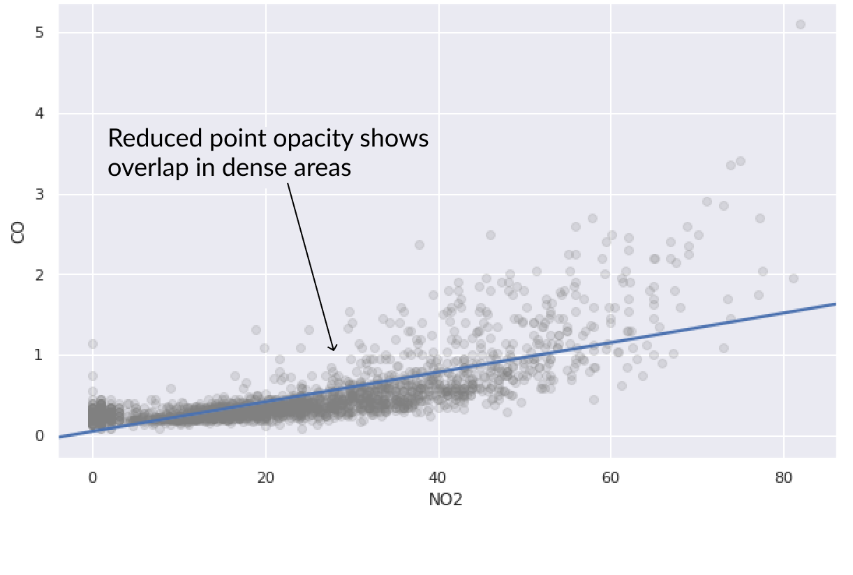
NO2 與 CO 污染值的散點圖,覆蓋一條基本的最佳擬合線

用 Python 改善你的資料視覺化

模式剖析

  • 在資料中發現有趣模式
  • 如何快速探索並說明?
  • 用文字!

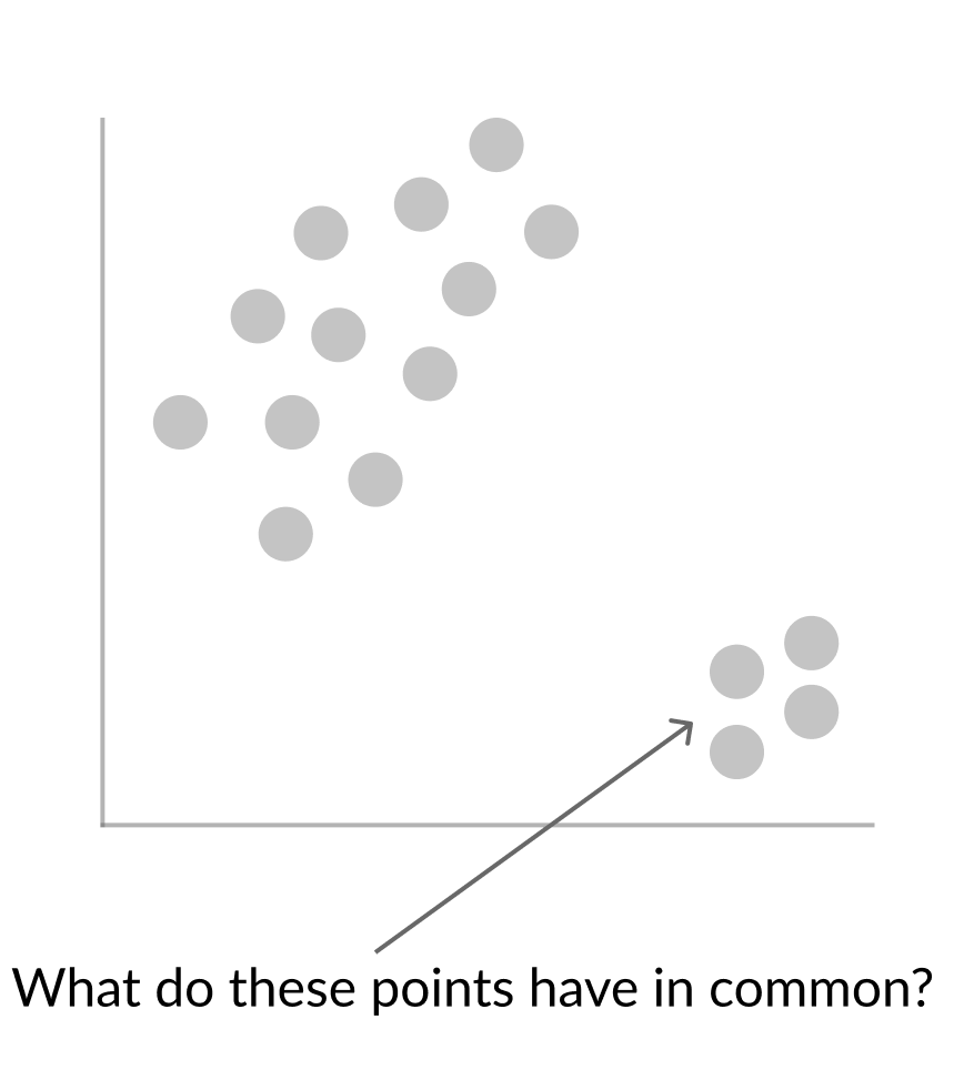
無標籤散點圖中的兩個明顯叢集

用 Python 改善你的資料視覺化

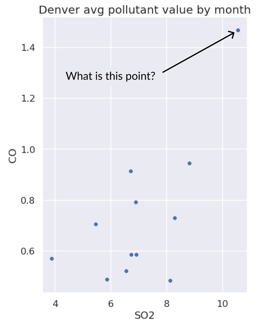
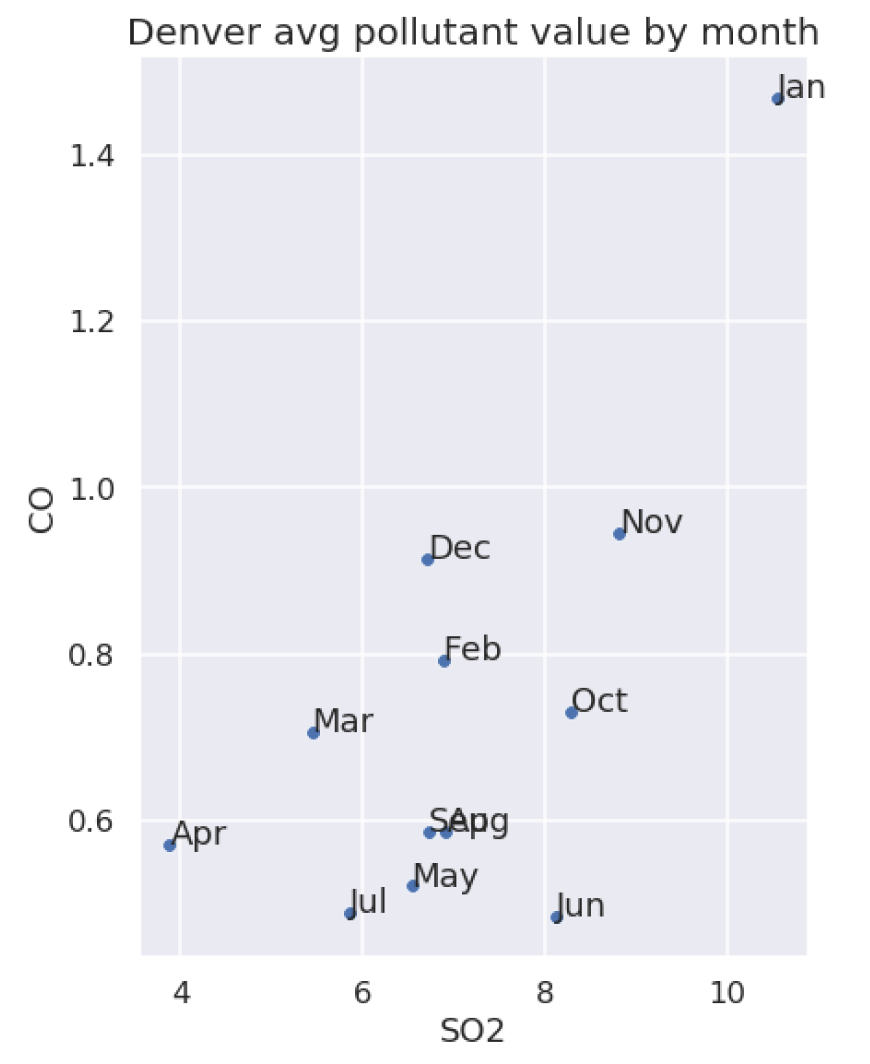
用文字散點找離群值

丹佛平均 SO2 與 CO 的無標籤散點圖,右上方有明顯離群值

丹佛平均 SO2 與 CO 的標註散點圖,右上方離群值標為 January

用 Python 改善你的資料視覺化
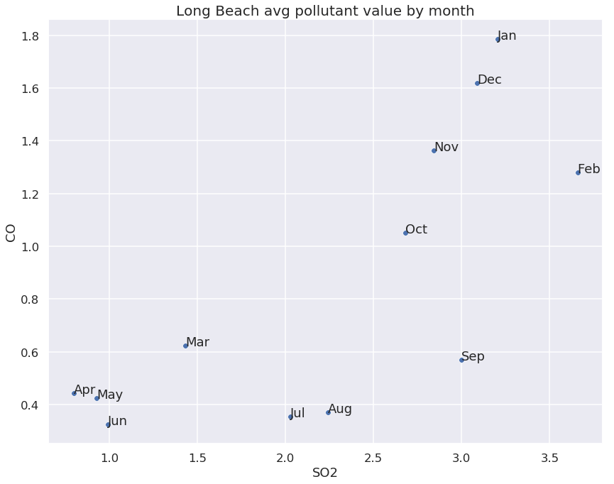
g = sns.scatterplot("SO2","CO", data=long_beach_avgs)

# Iterate over the rows of our data
for _, row in long_beach_avgs.iterrows():
    # Unpack columns from row
    month, SO2, CO = row

# Draw annotation in correct place g.annotate(month, (SO2,CO))
plt.title('Long Beach avg SO2 by CO')
用 Python 改善你的資料視覺化

長灘市各月份平均 SO2 與 CO 的標註散點圖

用 Python 改善你的資料視覺化

開始深入

用 Python 改善你的資料視覺化

Preparing Video For Download...