標註
用 Python 改善你的資料視覺化

Nick Strayer
Instructor
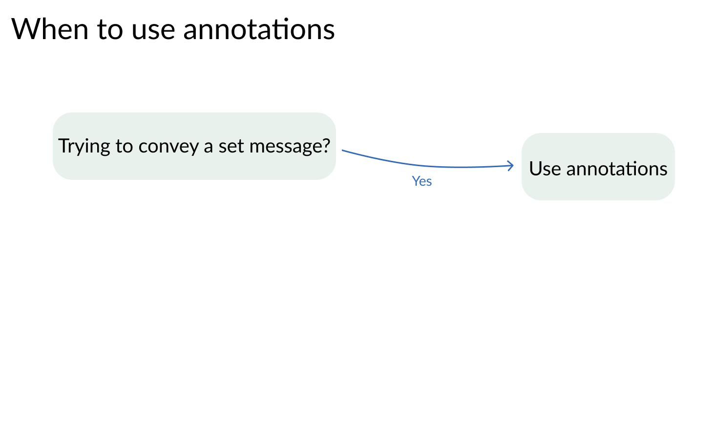
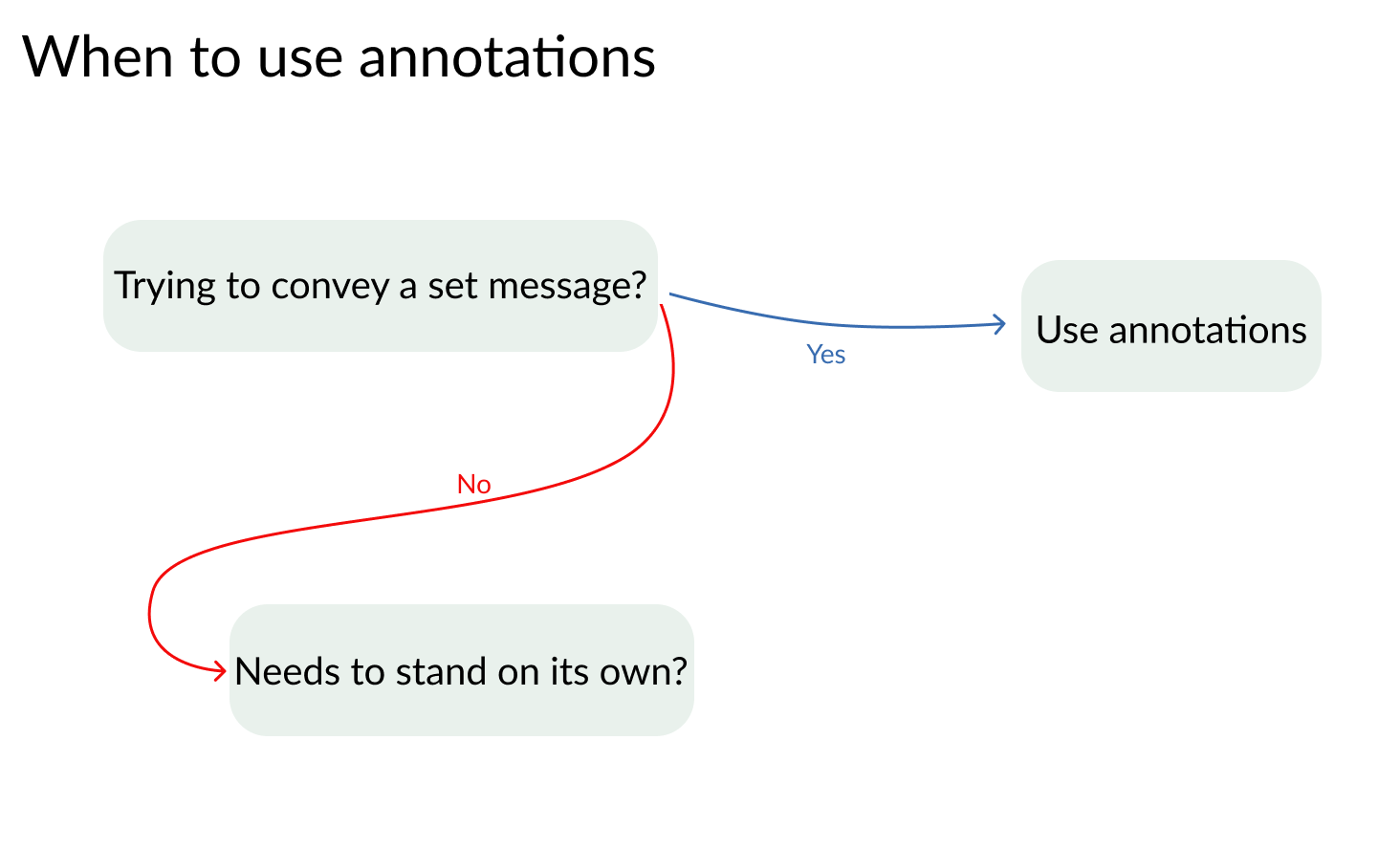
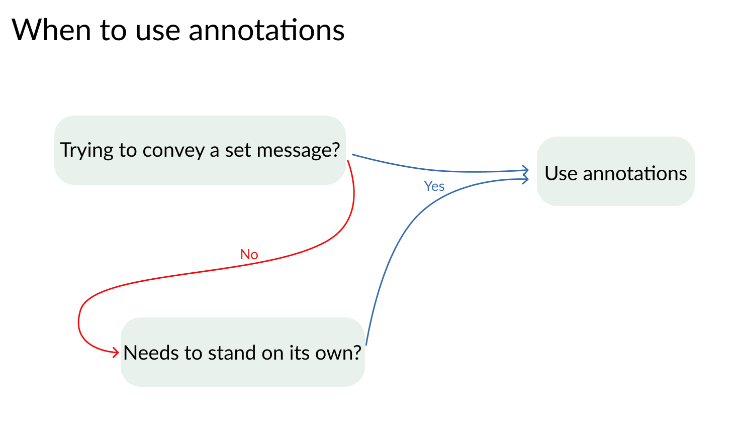
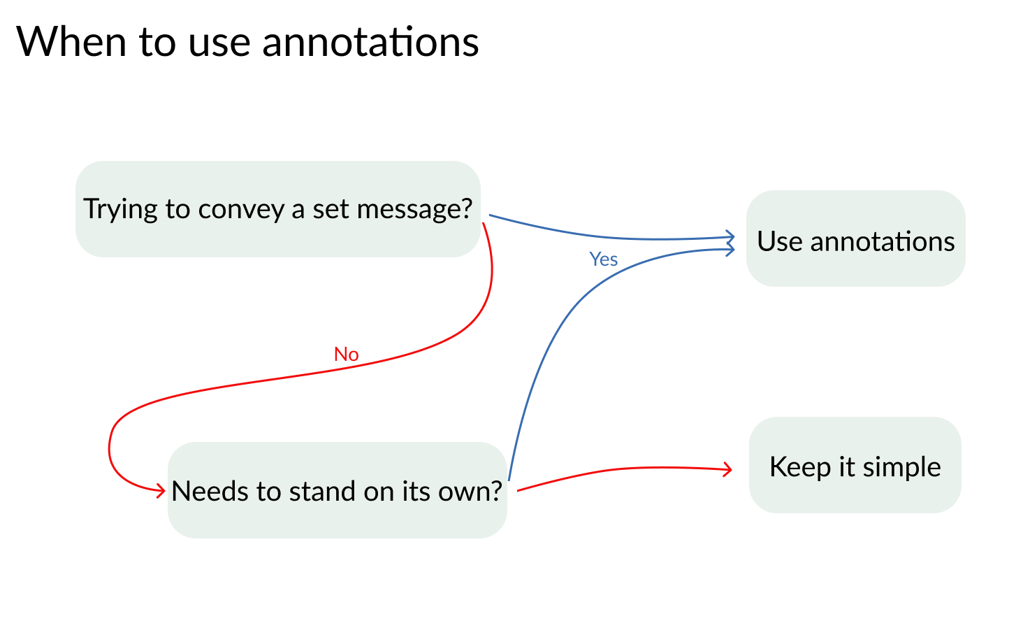
標註帶來什麼
- 溝通精簡有效
- 可對資料提供更深入的洞見
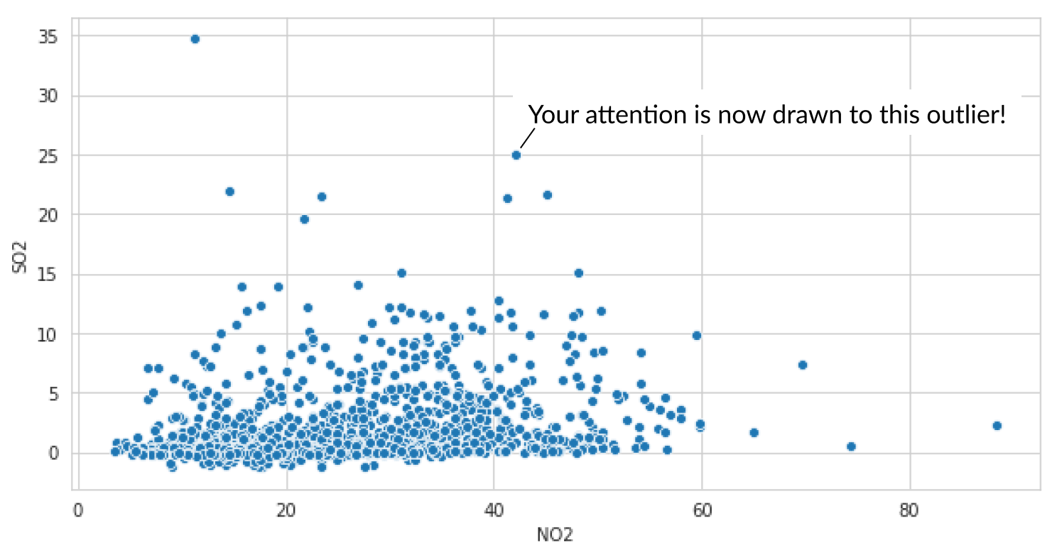
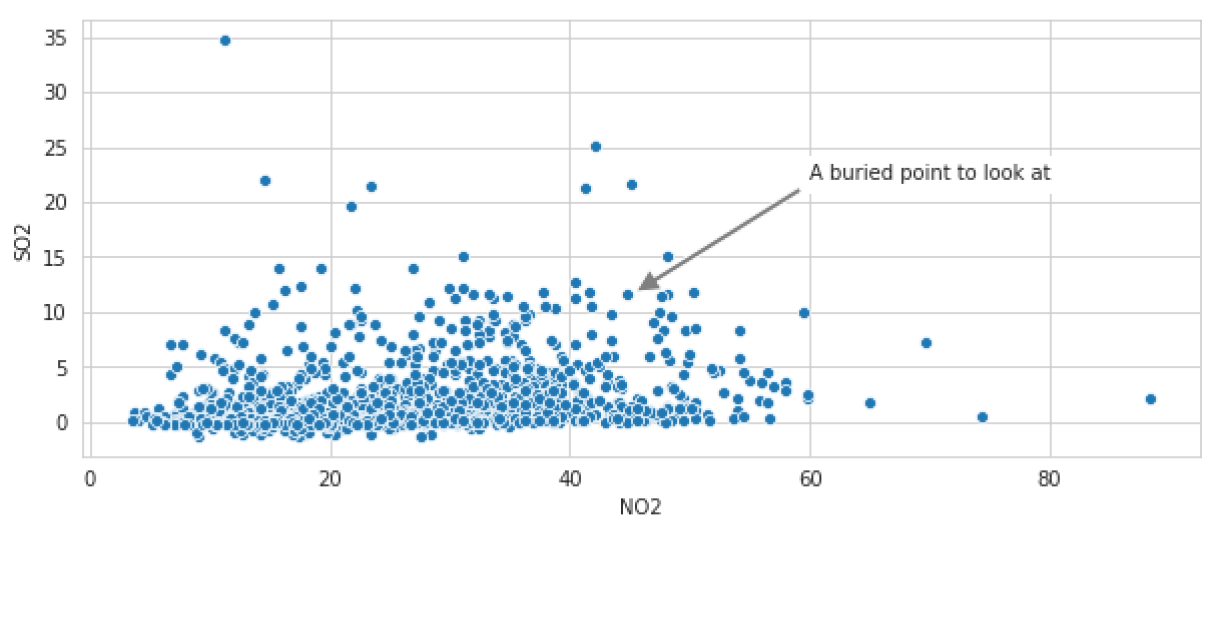
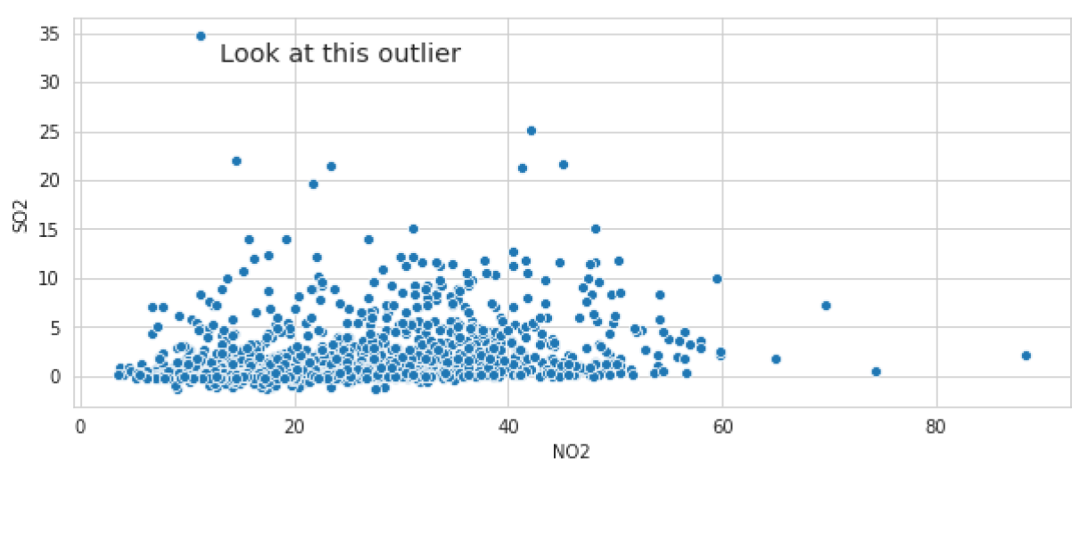
sns.scatterplot(x='NO2', y='SO2', data = houston_pollution)# X 與 Y 的離群值位置與文字 plt.text(13,33,'Look at this outlier', # 文字對齊與大小設定 fontdict = {'ha': 'left', 'size': 'x-large'})
sns.scatterplot(x='NO2', y='SO2', data = houston_pollution)# 箭頭起點與標註位置 plt.annotate('A buried point to look at', xy=(45.5,11.8), xytext=(60,22), # 箭頭設定與背景框 arrowprops={'facecolor':'grey', 'width': 3}, backgroundcolor = 'white' )