視覺化中的色彩
用 Python 改善你的資料視覺化

Nick Strayer
Instructor
色彩的用法

色彩可以很美
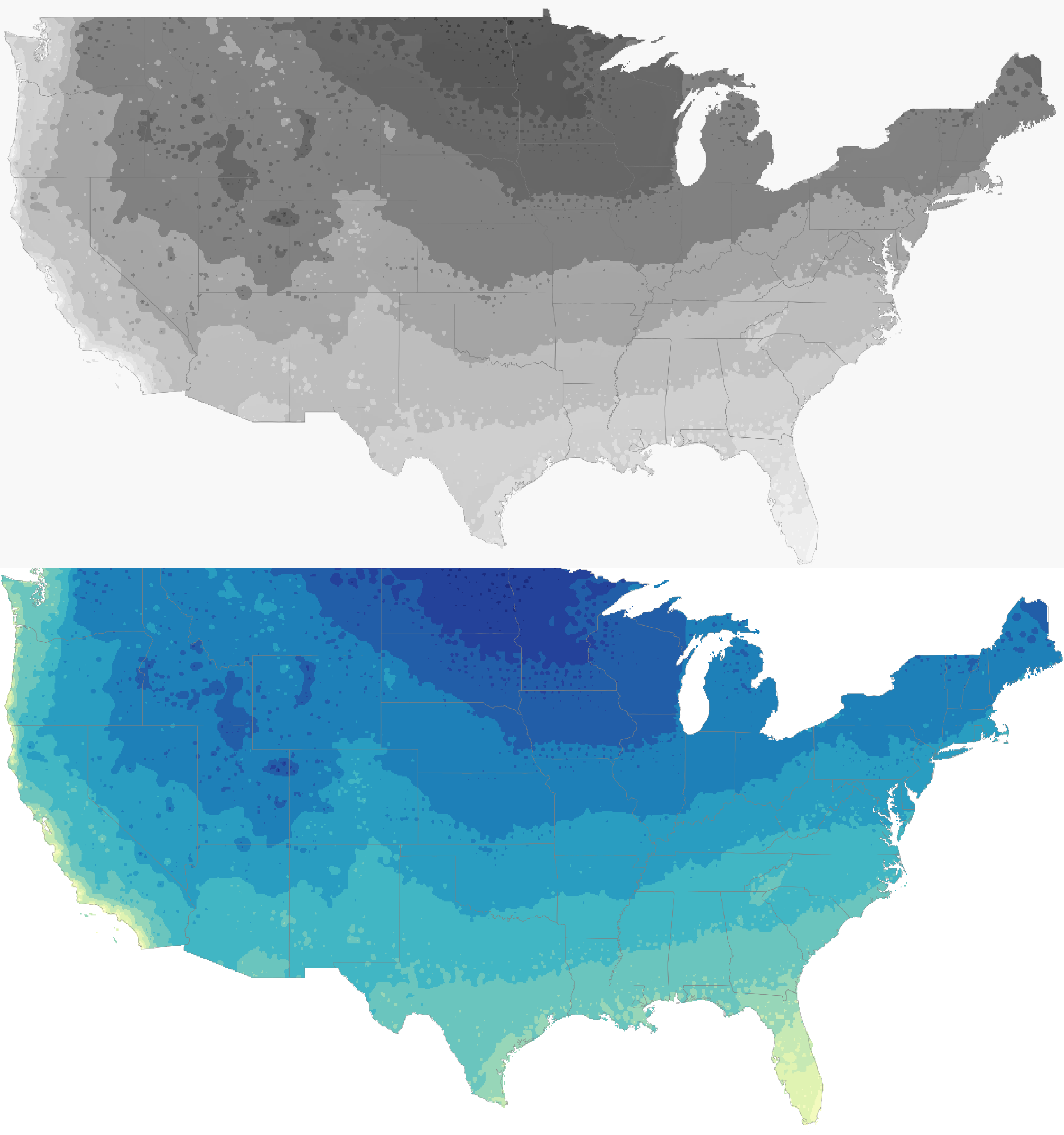
- 色彩的意義常受文化與個人經驗影響
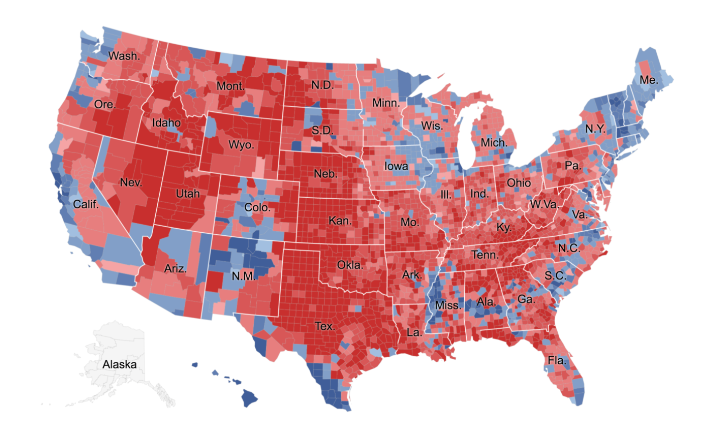
1 Parlapiano, A. (2016 November 1) There are many ways to map election results. We've tried most of them. New York Times. Retrieved from https://www.nytimes.com/
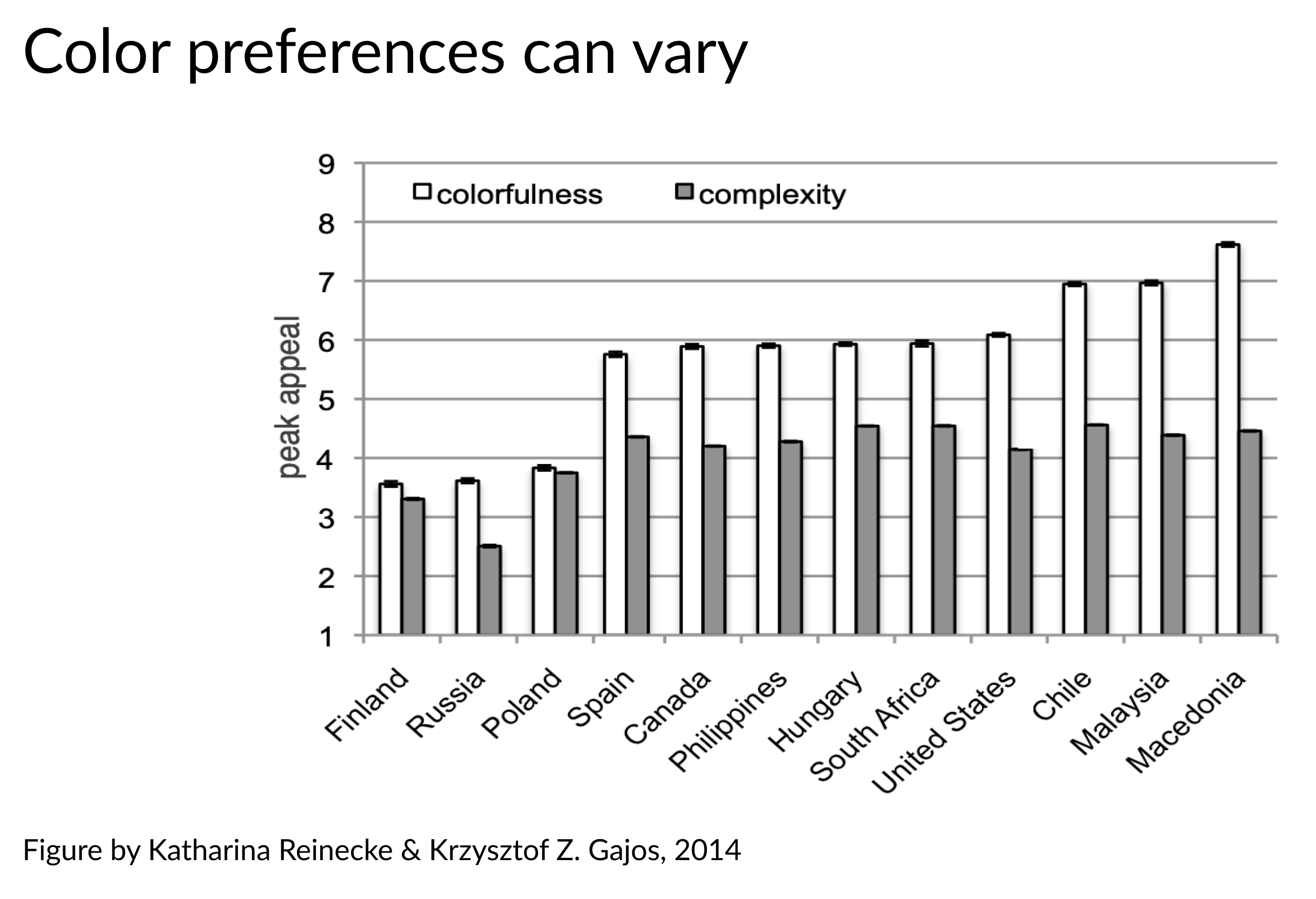
色彩可能誤導…
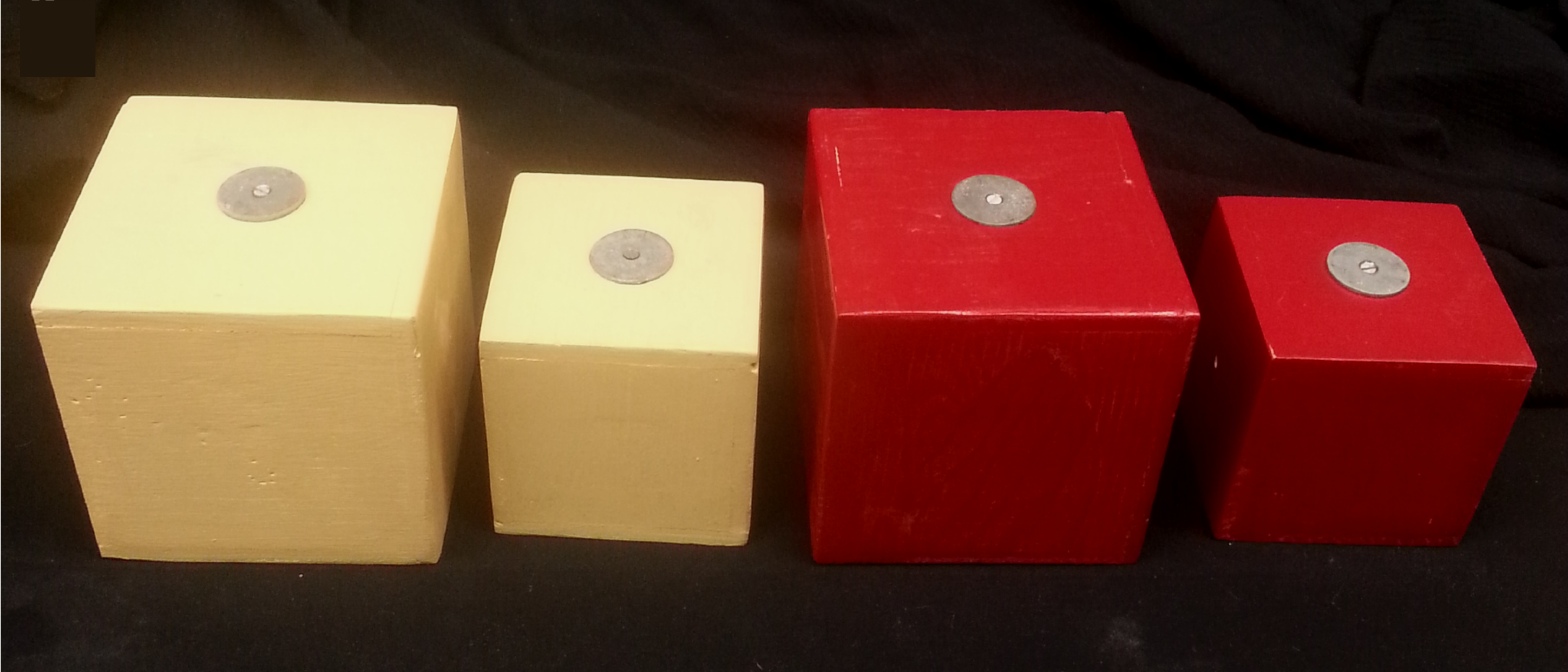
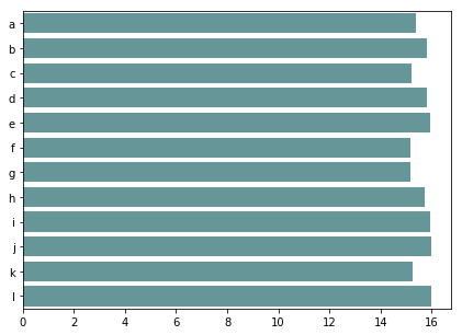
修正色彩—尺寸錯覺的方法
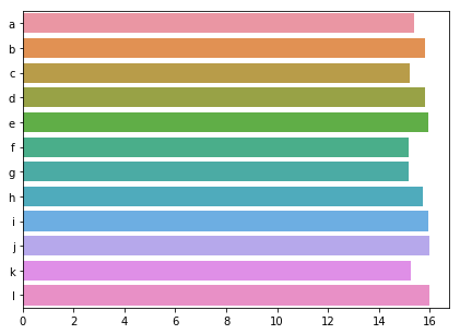
sns.barplot(x = values, y = ids)
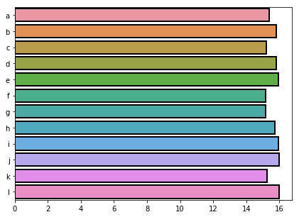
sns.barplot(x = values, y = ids,
            edgecolor = 'black')
sns.barplot(x = values, y = ids, color = 'cadetblue')