超越 95%

用 Python 改善你的資料視覺化

Nick Strayer

Instructor

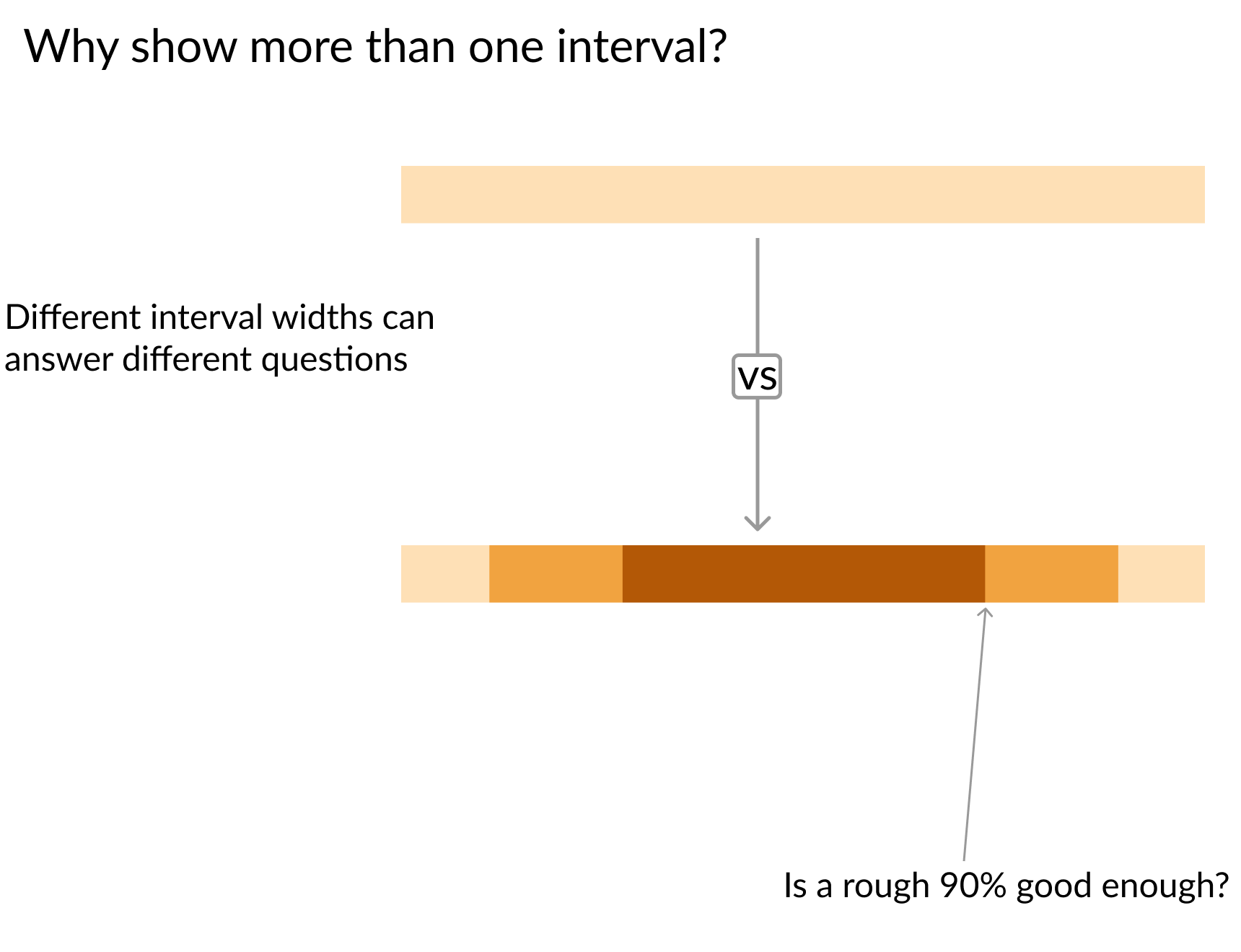
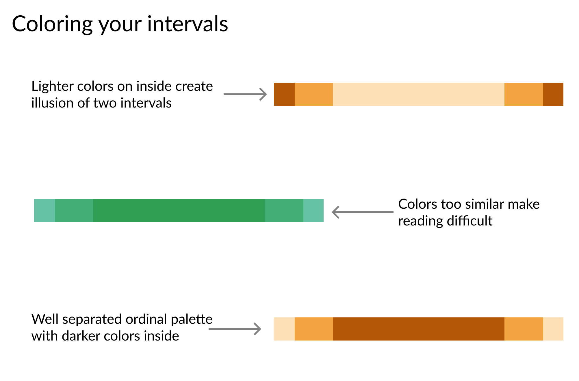
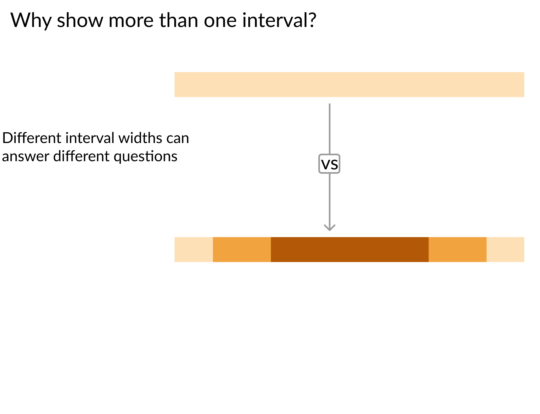
上方單層信賴帶,箭頭指向下方三層信賴帶

用 Python 改善你的資料視覺化

上方單層信賴帶,箭頭指向下方三層信賴帶,另有箭頭指向下方帶的 90% 層級

用 Python 改善你的資料視覺化

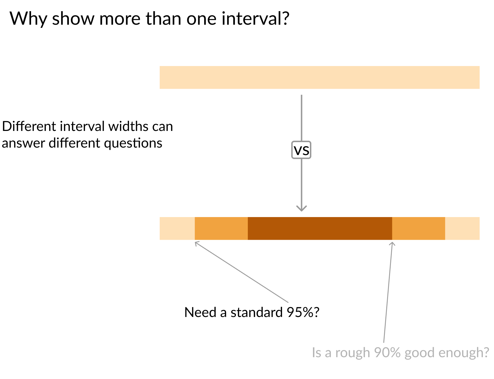
上方單層信賴帶,箭頭指向下方三層信賴帶,另有箭頭指向下方帶的 95% 層級

用 Python 改善你的資料視覺化

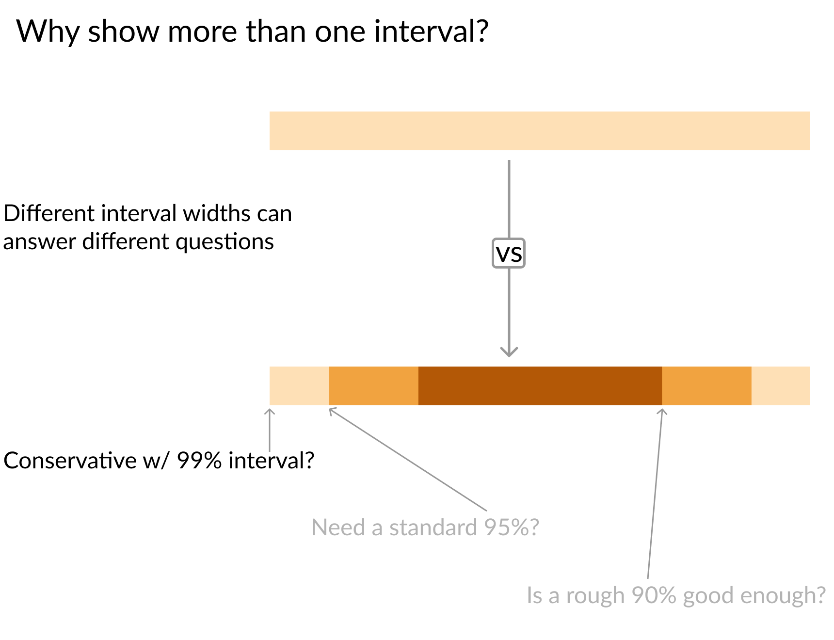
上方單層信賴帶,箭頭指向下方三層信賴帶,另有箭頭指向下方帶的 99% 層級

用 Python 改善你的資料視覺化

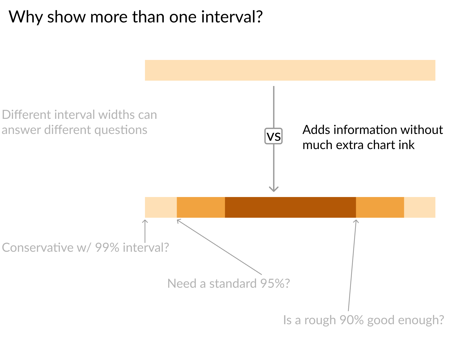
上方單層信賴帶,箭頭指向下方三層信賴帶

用 Python 改善你的資料視覺化
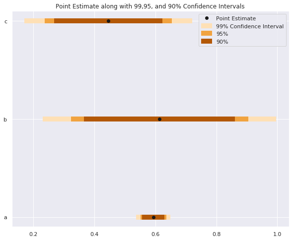
# Interval size setup
sizes    = ['99%', '95%', '90%']
Z_scores = [2.58,   1.96,  1.67]
colors   = ['#fee0b6','#f1a340', '#b35806']


for size, z, color in zip(sizes, Z_scores, colors): plt.hlines(y = data.y, # Calculate lower and upper boundaries xmin = data['est'] - z*data['std_err'], xmax = data['est'] + z*data['std_err'], # Color by interval size color = color,
# Make line thicker for visibility linewidth = 7,
# Label line so legend text is clear label = size)
plt.plot('est', 'y', 'ko', data = data, label = 'Point Estimate') plt.legend()
用 Python 改善你的資料視覺化

三條水平信賴帶,顏色分別表示 90%、95%、99% 信賴區間

用 Python 改善你的資料視覺化

三個信賴區間:上方以外側區間用較深色,中間用相近色調,最後以內側區間用較深色

用 Python 改善你的資料視覺化
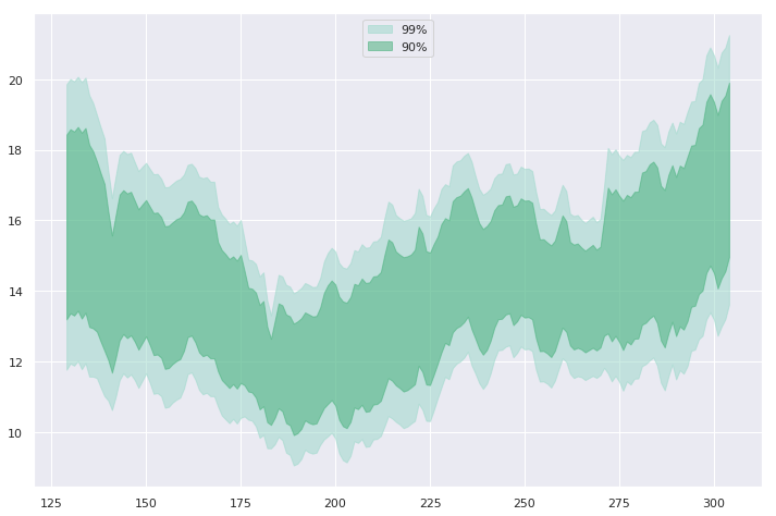
widths   = [    '99%',     '90%']
z_scores = [     2.58,      1.67]
colors   = ['#99d8c9', '#41ae76']

for percent, Z, color in zip(widths, z_scores, colors):
    # Set color to distinquish bands
    plt.fill_between(
        x=data.day, 
        y1=data['mean'] - Z*data['std_err'],
        y2=data['mean'] + Z*data['std_err']
        color=color,

# Lower opacity so grid can show through alpha=0.5,
# Give each band id for the legend label=percent)
用 Python 改善你的資料視覺化

兩條信賴帶重疊,較小且較深色的帶內嵌於較大且較淺色的帶內

用 Python 改善你的資料視覺化
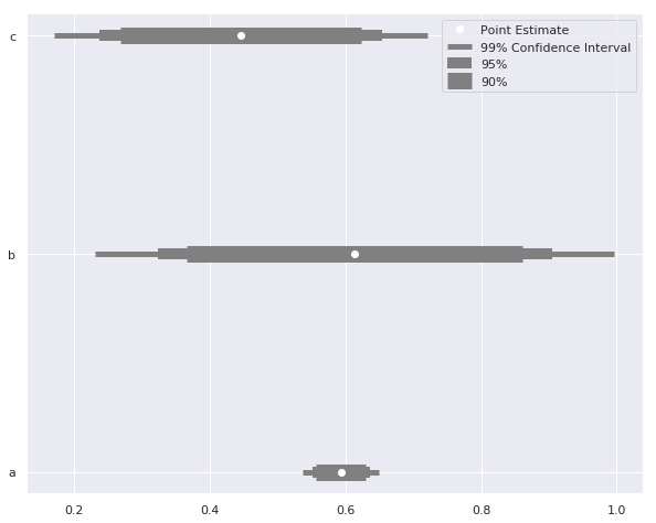
sizes = ['99% Confidence Interval', '95%', '90%']

# Set up different line widths for intervals
widths   = [   5,     10,    15]
Z_scores = [2.58,   1.96,  1.67]

for size, z, width in zip(sizes, Z_scores, widths):
    plt.hlines(
        y = data.y, label = size,
        xmin = data['est'] - z*data['std_err'], 
        xmax = data['est'] + z*data['std_err'], 
        color = 'grey'

# Adjust line thickness by interval linewidth = width)
plt.plot('est', 'y', 'wo', data = data, label = 'Point Estimate') plt.legend()
用 Python 改善你的資料視覺化

三組三層信賴區間,內層為最厚的帶,往外層逐漸變薄

用 Python 改善你的資料視覺化

一起擴大視野!

用 Python 改善你的資料視覺化

Preparing Video For Download...