點估計區間
用 Python 改善你的資料視覺化

Nick Strayer
Instructor
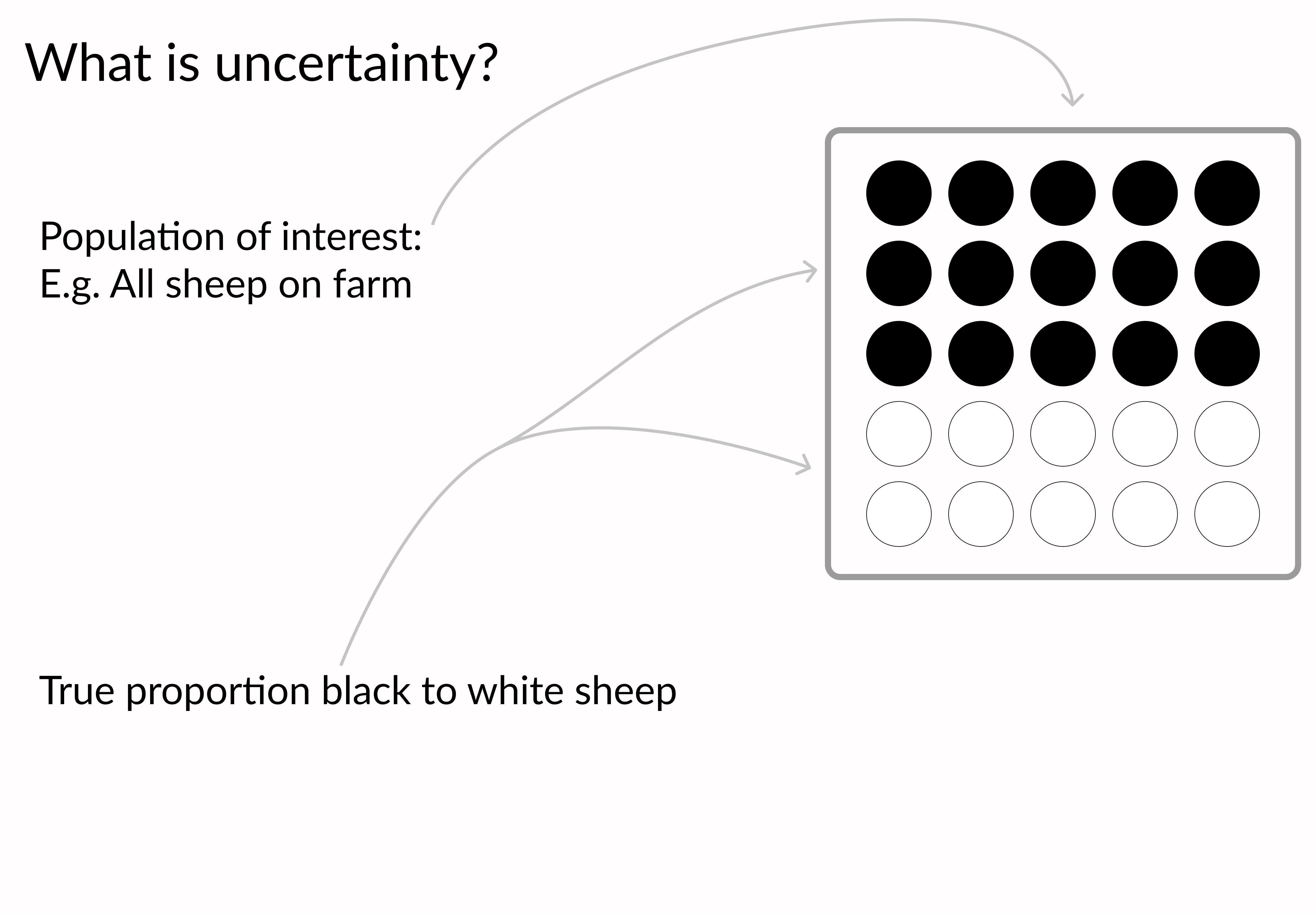
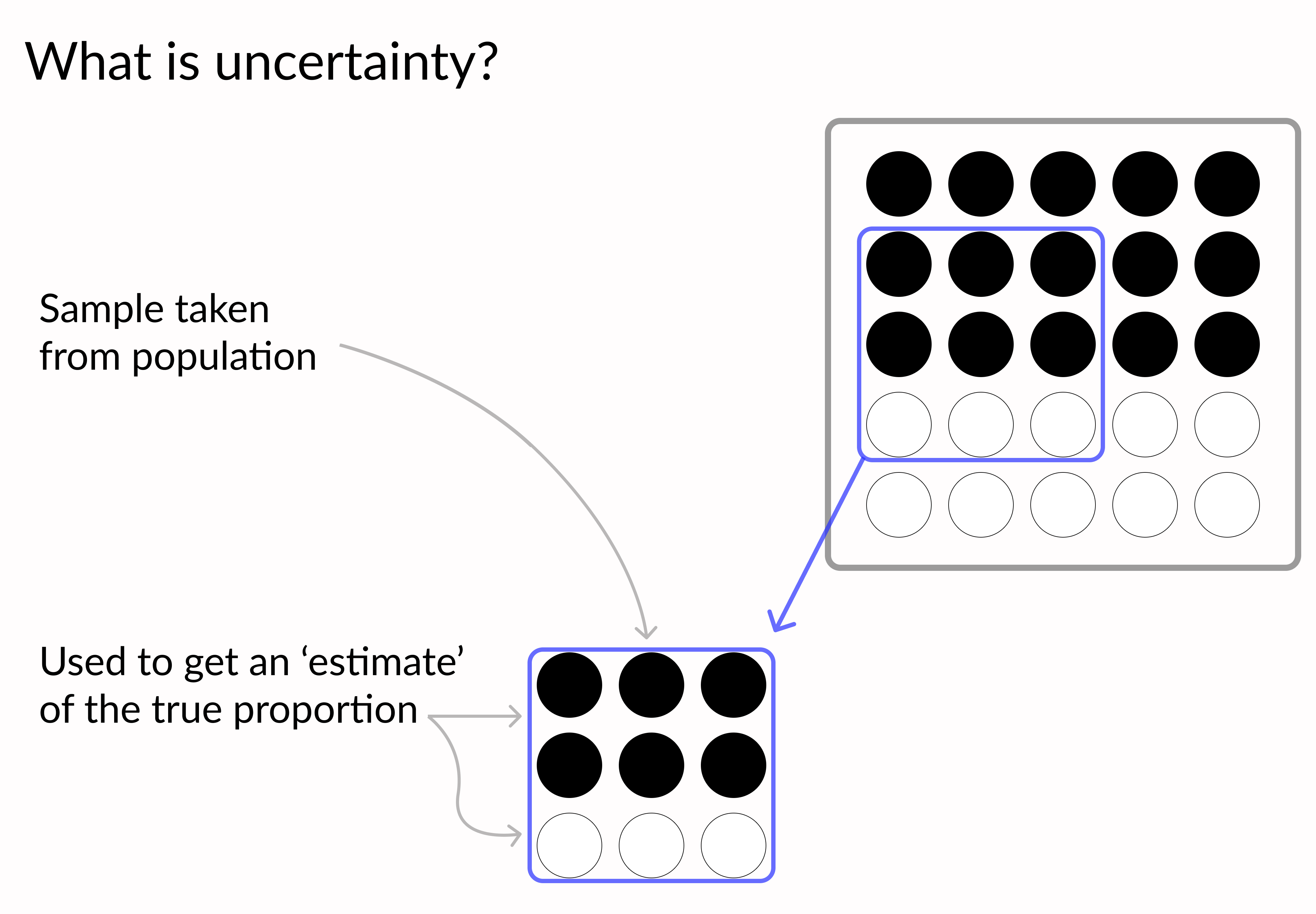
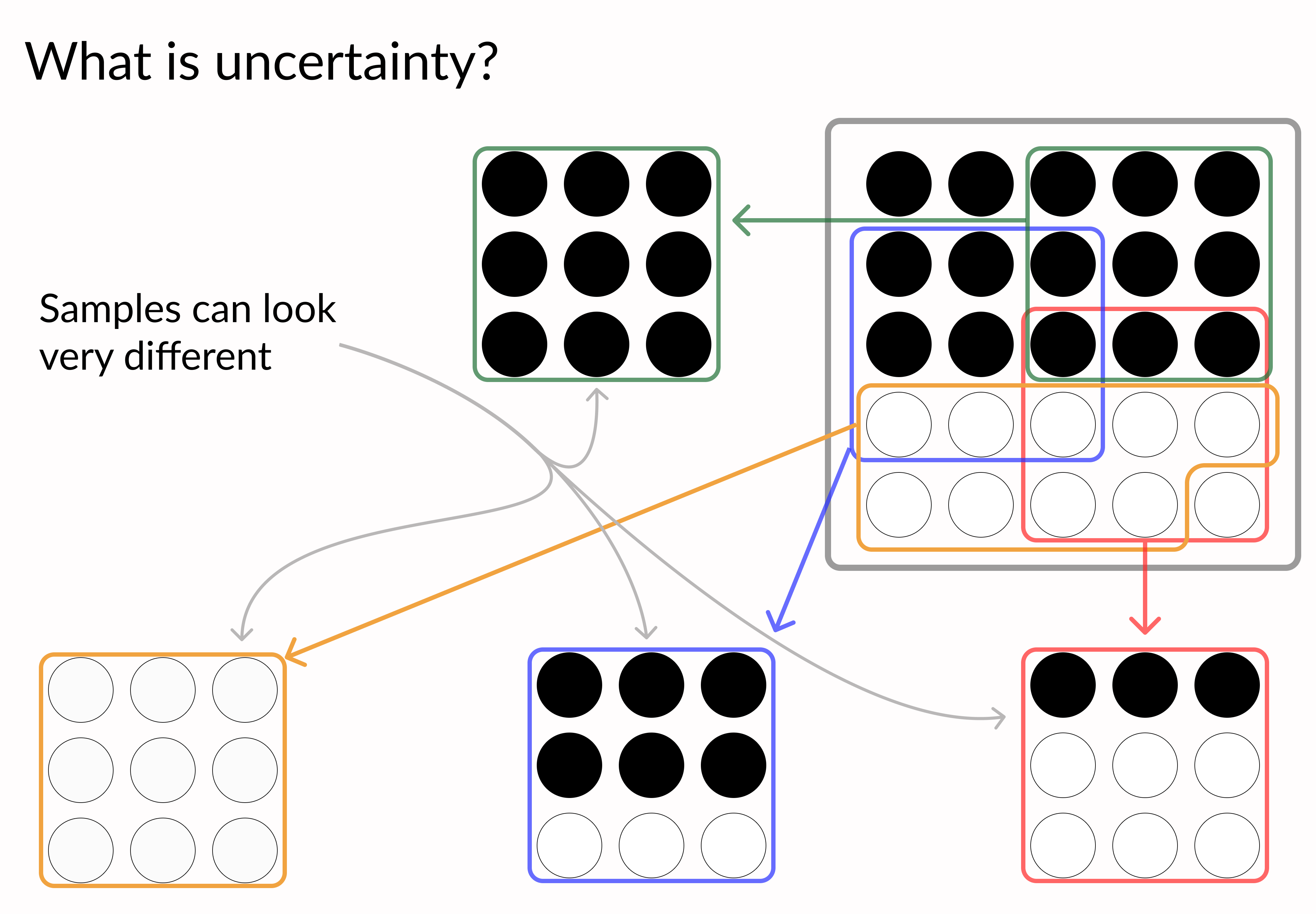
為什麼不確定性重要?

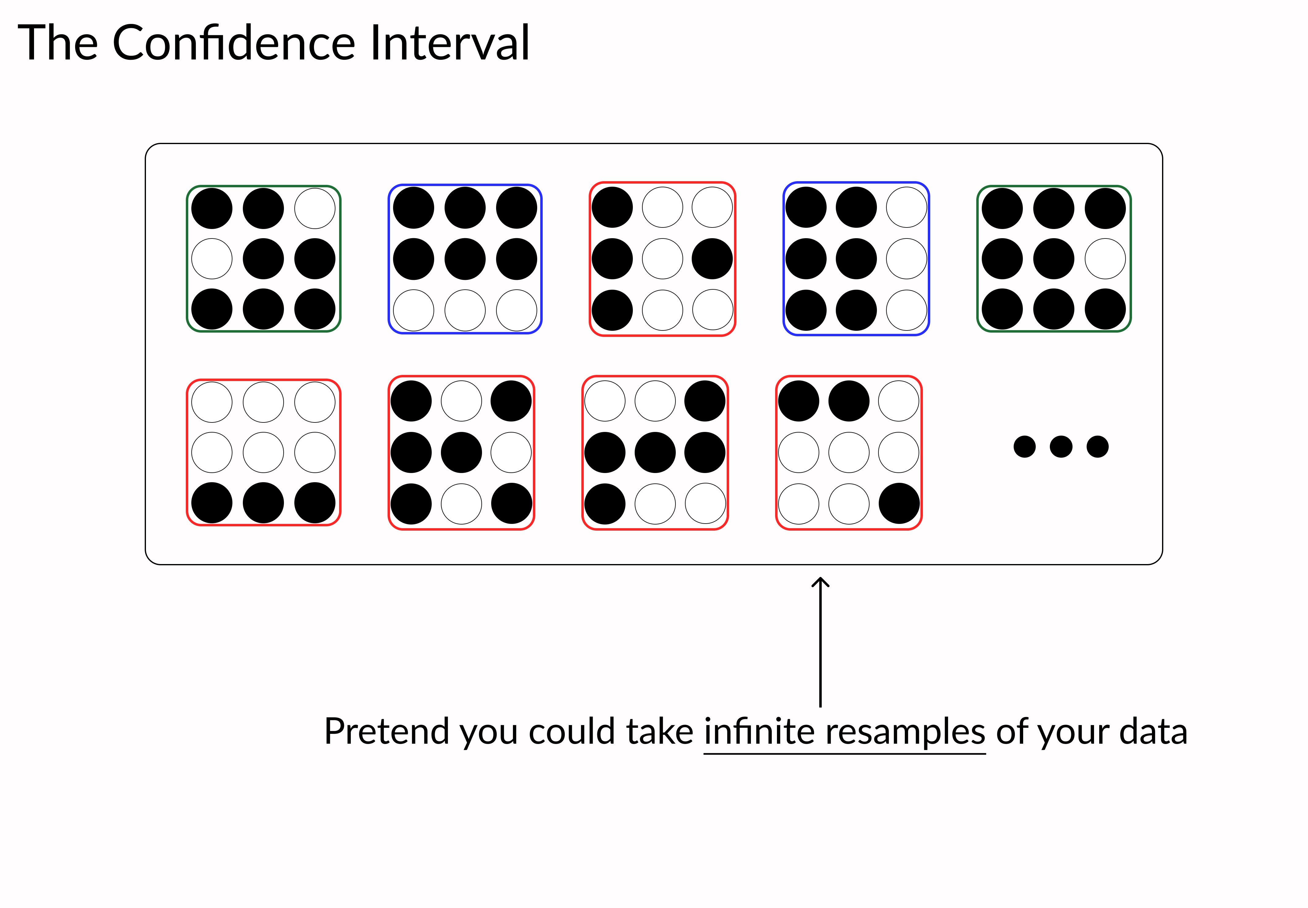
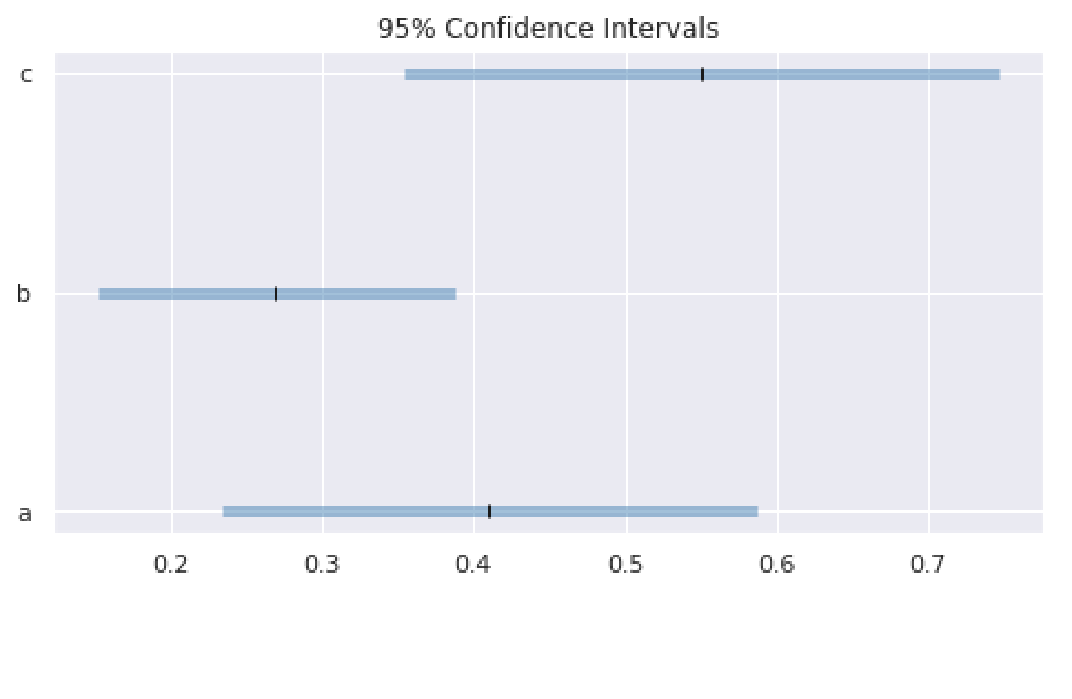
plt.hlines(xmin='lower', xmax='upper', y='y', data=data, linewidth=5, color='steelblue', alpha=0.5)# Point-estimate for reference plt.plot('est', 'y', 'k|', data = data)
用 Python 改善你的資料視覺化
Nick Strayer
Instructor
plt.hlines(xmin='lower', xmax='upper', y='y', data=data, linewidth=5, color='steelblue', alpha=0.5)# Point-estimate for reference plt.plot('est', 'y', 'k|', data = data)

