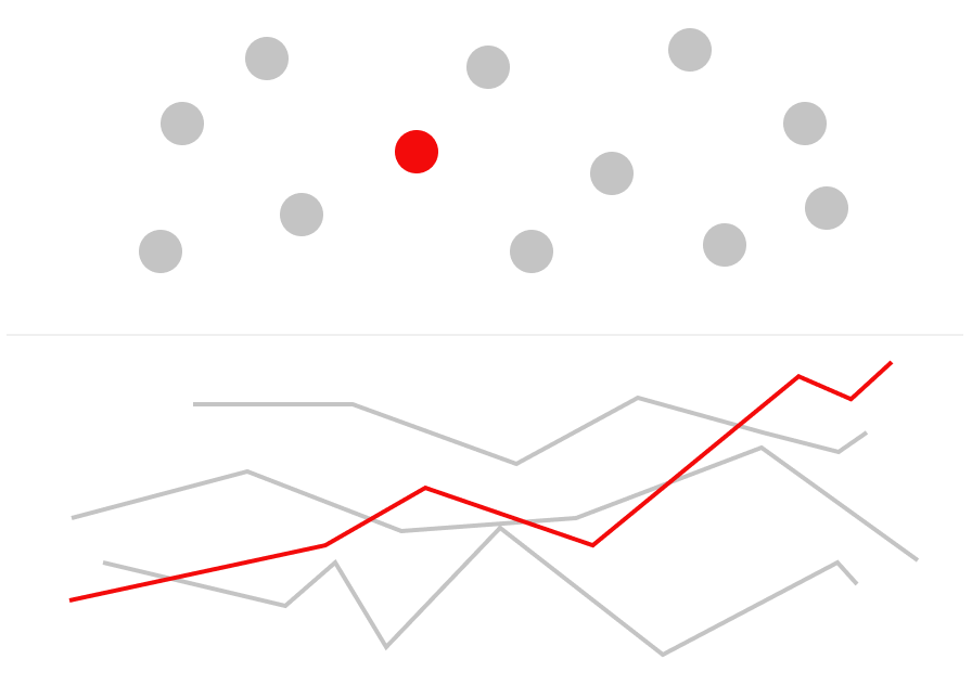
重點標示資料

用 Python 改善你的資料視覺化

Nick Strayer

Instructor

關於我

用 Python 改善你的資料視覺化

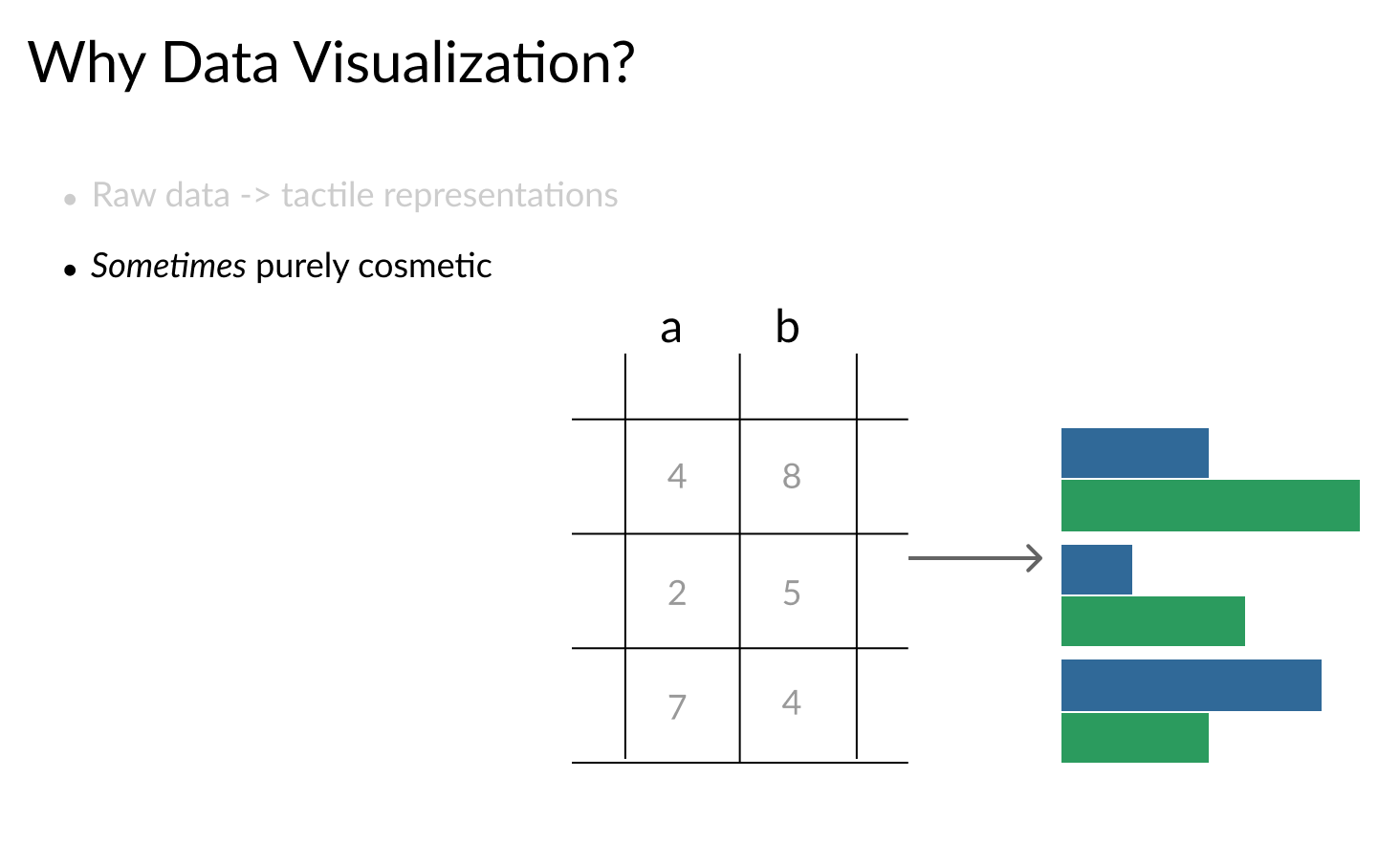
表格到視覺化

用 Python 改善你的資料視覺化

表格到視覺化(續)

用 Python 改善你的資料視覺化

表格到視覺化(其三)

用 Python 改善你的資料視覺化

課程所需工具

用 Python 改善你的資料視覺化

先備知識

用 Python 改善你的資料視覺化

不同視覺化工具

用 Python 改善你的資料視覺化
pollution.head()
         city  year  month  day     CO   NO2     O3    SO2
0  Cincinnati  2012      1    1  0.245  20.0  0.030   4.20
1  Cincinnati  2012      1    2  0.185   9.0  0.025   6.35
2  Cincinnati  2012      1    3  0.335  31.0  0.025   4.25
3  Cincinnati  2012      1    4  0.305  25.0  0.016  17.15
4  Cincinnati  2012      1    5  0.345  21.0  0.016  11.05
pollution.city.unique()
[ 'Boston',    'Cincinnati',     'Denver',       'Des Moines', 
  'Fairbanks', 'Houston',        'Indianapolis', 'Long Beach', 
  'New York',  'Salt Lake City', 'Vandenberg Air Force Base' ]
用 Python 改善你的資料視覺化

基本散佈圖(含強調點)

用 Python 改善你的資料視覺化

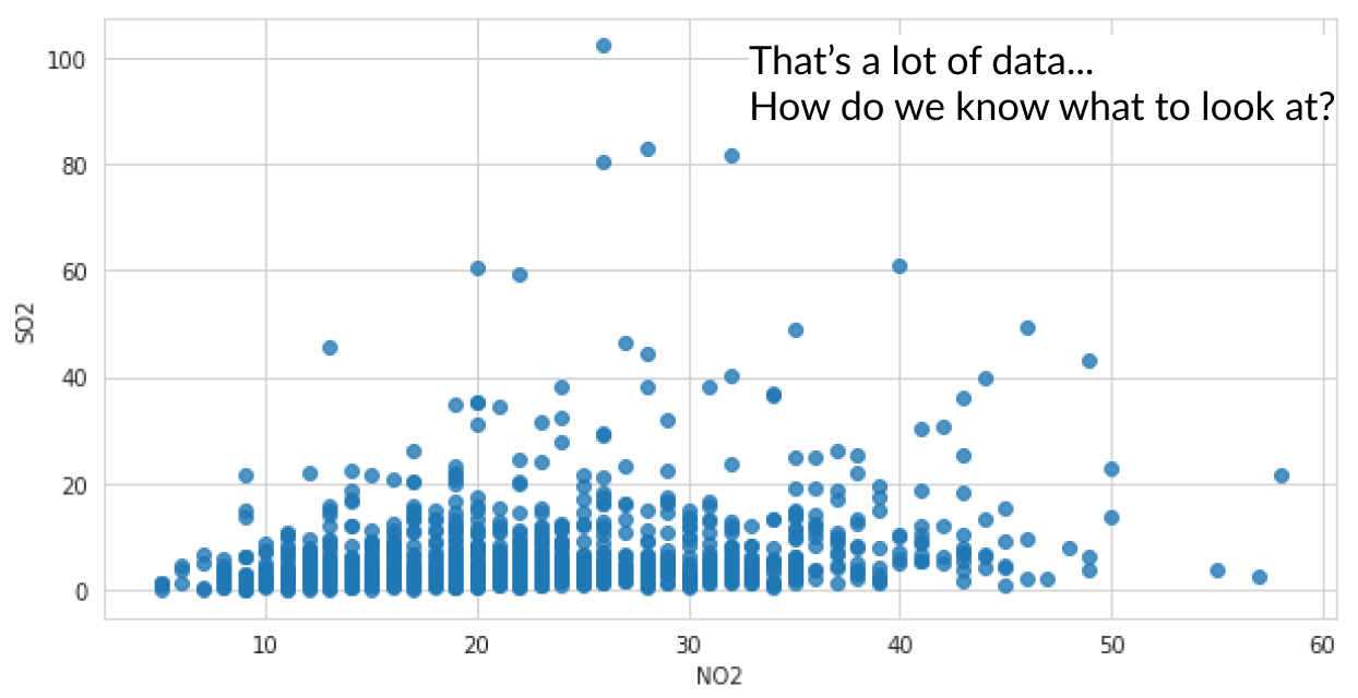
未標註離群點的散佈圖

用 Python 改善你的資料視覺化
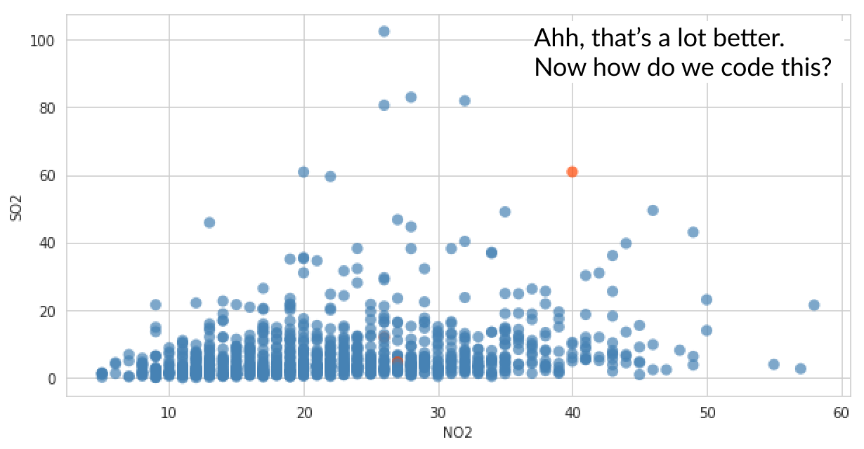
cinci_pollution = pollution[pollution.city == 'Cincinnati']

# 依特定日期建立顏色陣列 cinci_colors = ['orangered' if day == 38 else 'steelblue' for day in cinci_pollution.day]
# 使用額外引數 facecolors 作圖 p = sns.regplot(x='NO2', y='SO2', data = cinci_pollution, fit_reg=False, scatter_kws={'facecolors': cinci_colors,'alpha': 0.7})
用 Python 改善你的資料視覺化

已標註離群點的散佈圖

用 Python 改善你的資料視覺化

來做些重點標示!

用 Python 改善你的資料視覺化

Preparing Video For Download...