信賴帶

用 Python 改善你的資料視覺化

Nick Strayer

Instructor

連續估計函式
  • 連續軸上的估計
  • 常見於時間
  • 存在不確定性,應如此繪製。

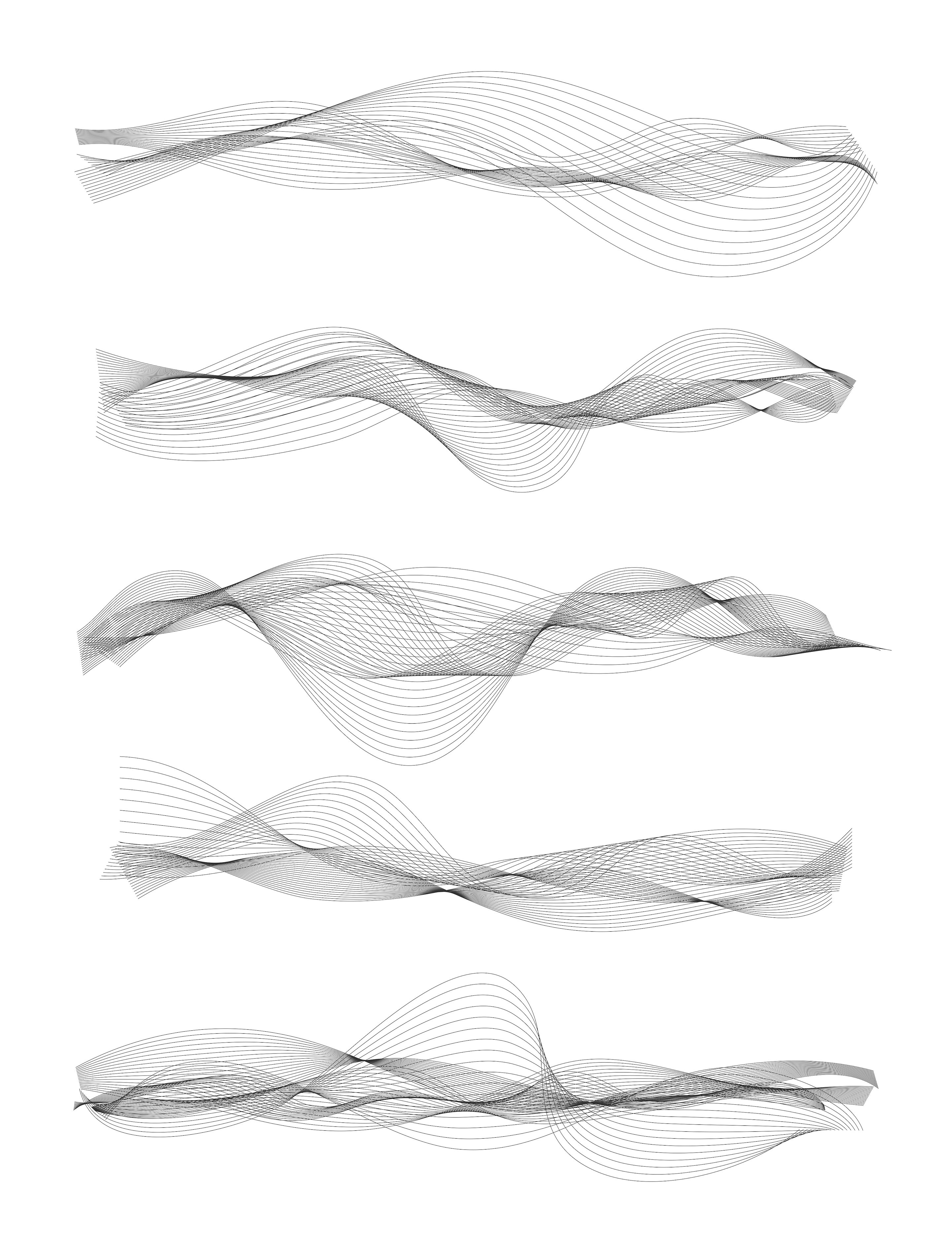
聲波

用 Python 改善你的資料視覺化

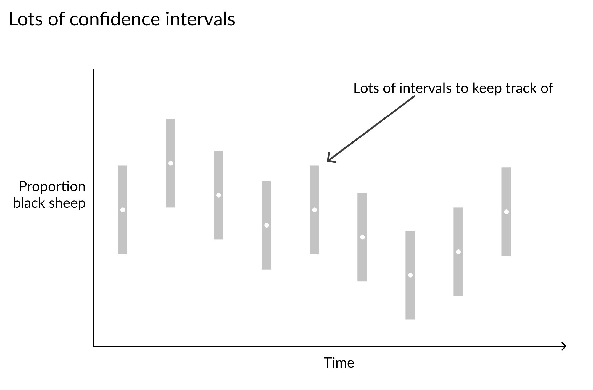
時間 x 軸上反覆呈現的灰色信賴區間波浪序列

用 Python 改善你的資料視覺化

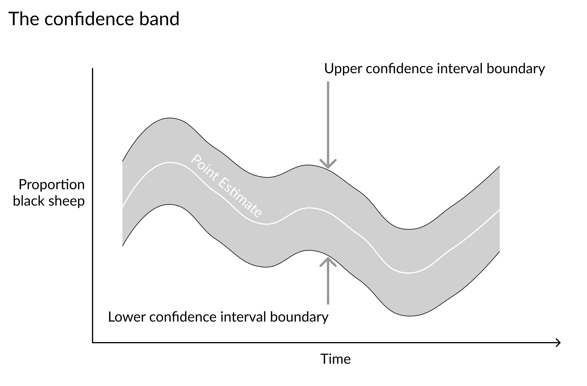
時間 x 軸上的連續絲帶式信賴區間

用 Python 改善你的資料視覺化
# Set lower and upper bounds of ribbon
plt.fill_between(x='day', y1='lower', y2='upper', data=cinci_so2)

# Add point-estimate reference line plt.plot('day', 'mean', 'w-', alpha=0.5, data=data)
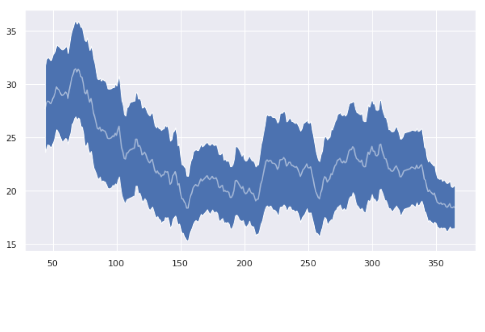
鋸齒狀藍色信賴帶,中央有白色參考線

用 Python 改善你的資料視覺化

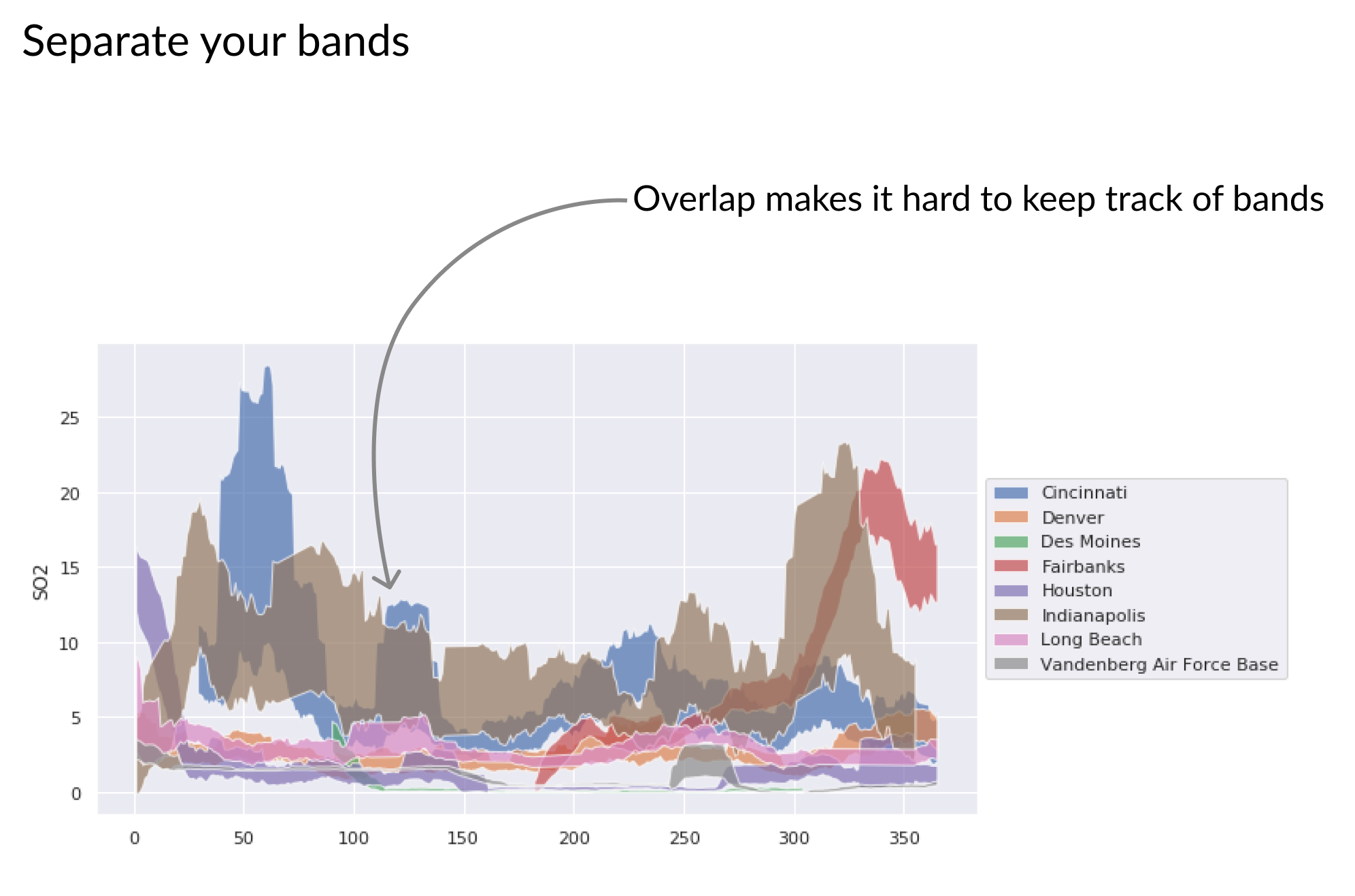
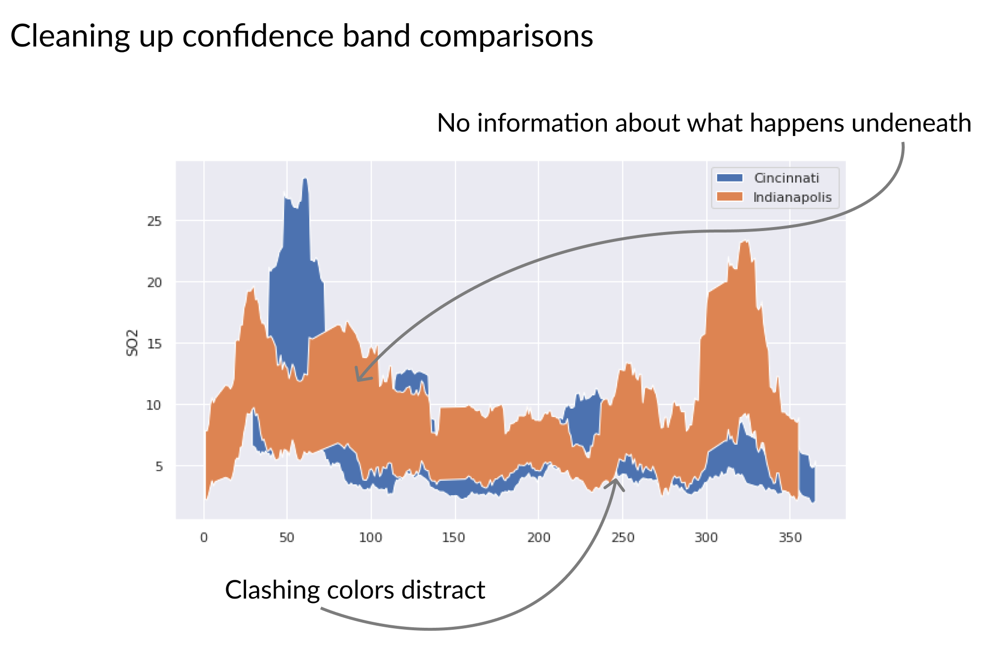
多條彩色信賴帶重疊,難以閱讀

用 Python 改善你的資料視覺化

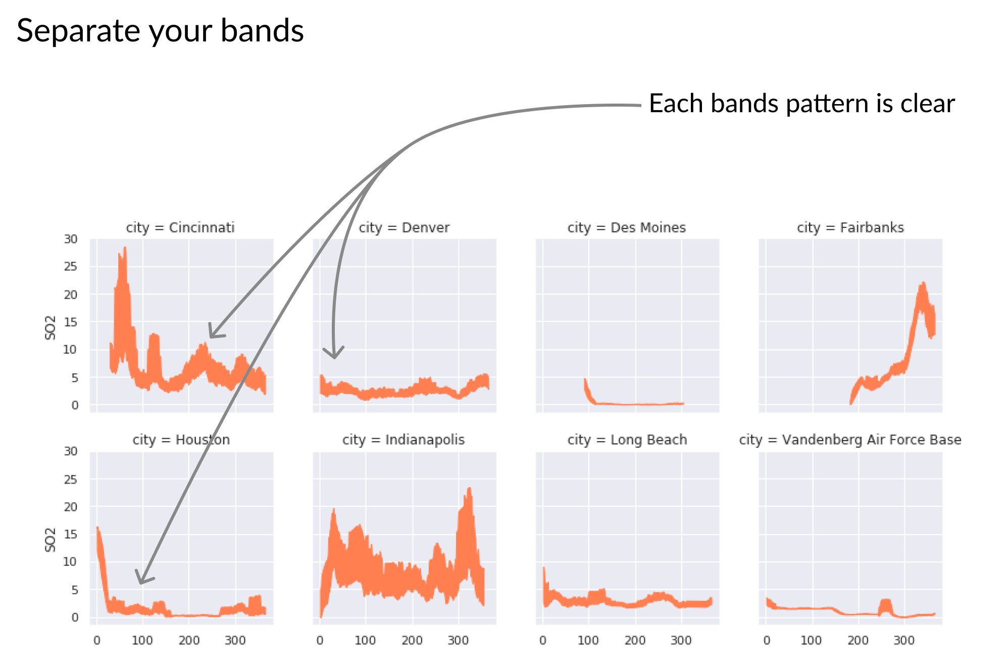
多條彩色信賴帶分成網格圖,每圖一條帶

用 Python 改善你的資料視覺化

兩條實心帶重疊,上方覆蓋下方的變化

用 Python 改善你的資料視覺化

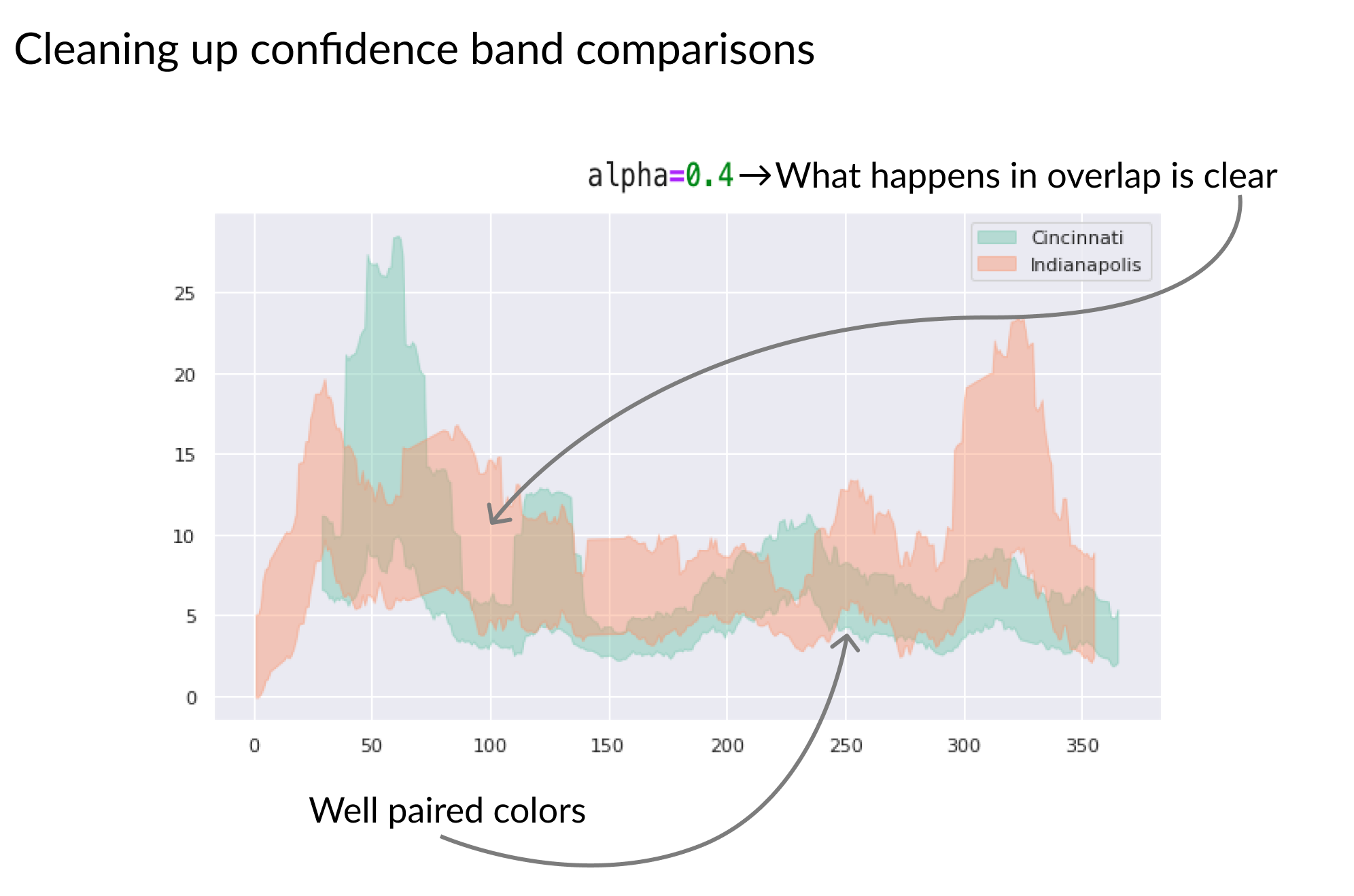
兩條半透明帶重疊,可看到下方帶的變化

用 Python 改善你的資料視覺化

一起來畫信賴帶!

用 Python 改善你的資料視覺化

Preparing Video For Download...