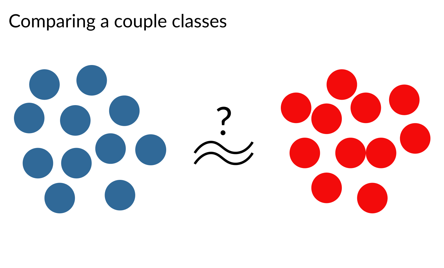
比較群組
用 Python 改善你的資料視覺化

Nick Strayer
Instructor
這代表什麼?

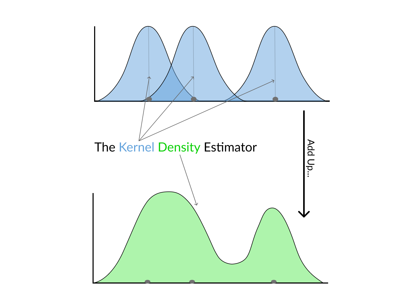
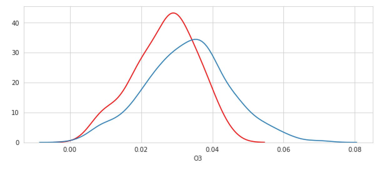
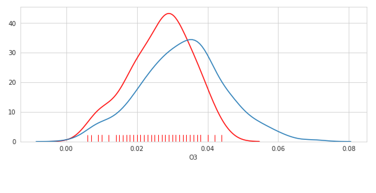
pollution_nov = pollution[pollution.month == 10]sns.kdeplot(pollution_nov[pollution_nov.city == 'Denver'].O3, color = 'red') sns.kdeplot(pollution_nov[pollution_nov.city != 'Denver'].O3)
# Enable rugplot
sns.kdeplot(pollution_nov[pollution_nov.city == 'Denver'].O3, color='red')
sns.rugplot(pollution_nov[pollution_nov.city == 'Denver'].O3, color='red')
sns.kdeplot(pollution_nov[pollution_nov.city != 'Denver'].O3)
pollution_nov = pollution[pollution.month == 10]

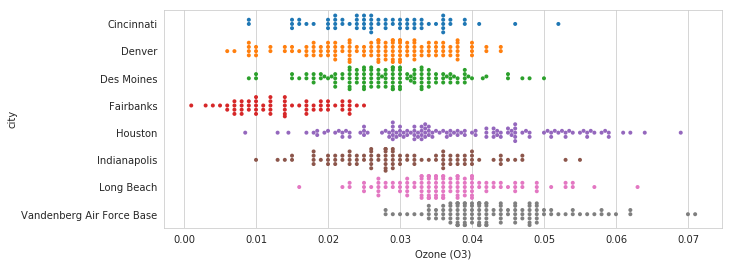
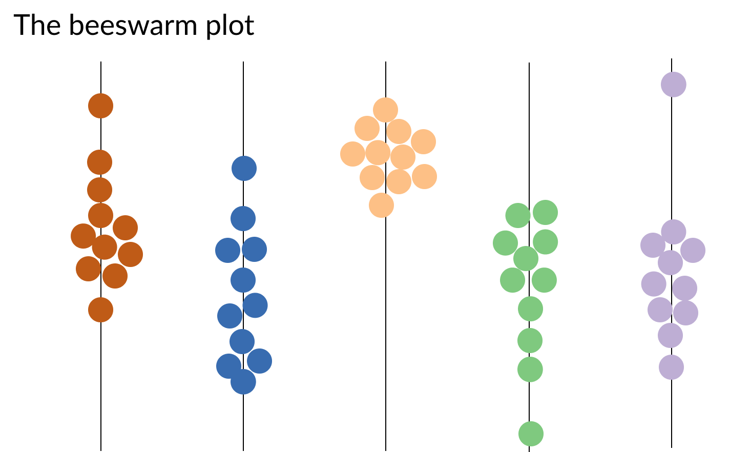
sns.swarmplot(y="city", x="O3", data=pollution_nov, size=4)
plt.xlabel("Ozone (O3)")