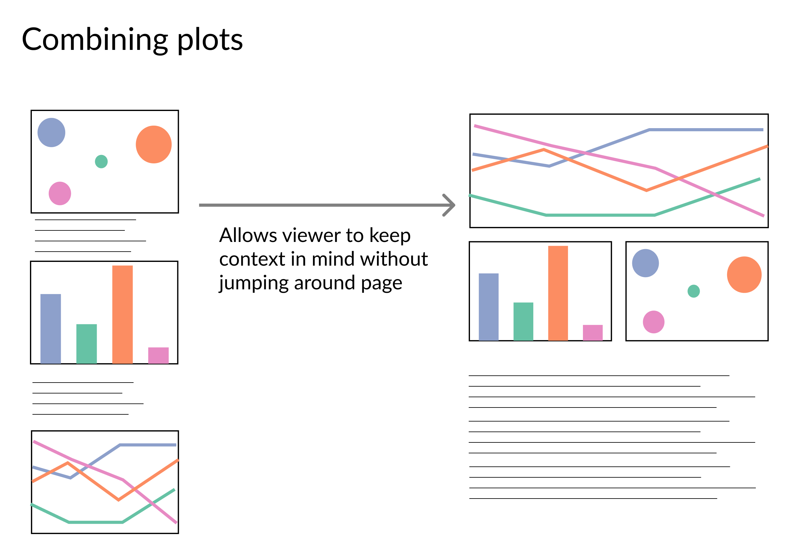
提升視覺化的效率
用 Python 改善你的資料視覺化

Nick Strayer
Instructor
什麼是高效率?
- 降低讀懂故事的負擔
- 重新編排圖表以聚焦
- 提升「墨水」與資訊比
- 不犧牲核心訊息

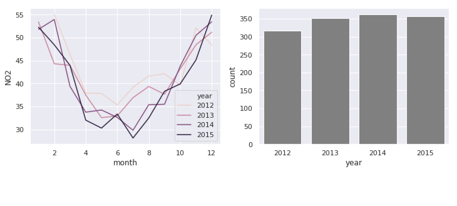
# Create a subplot w/ one row & two columns. f, (ax1, ax2) = plt.subplots(1, 2)# Pass each axes to respective plot sns.lineplot('month', 'NO2', 'year', ax=ax1, data=pol_by_month)sns.barplot('year', 'count', ax=ax2, data=obs_by_year)
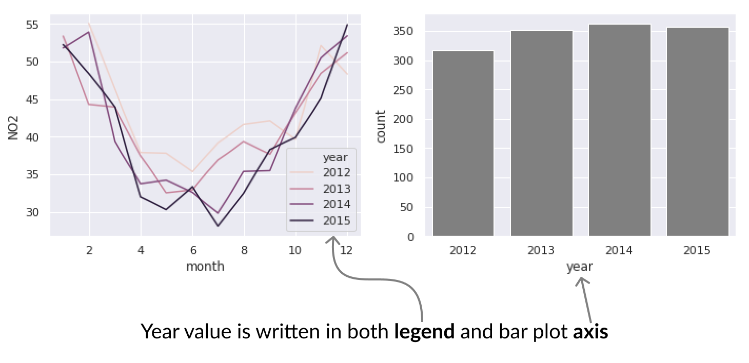
移除不必要的圖例
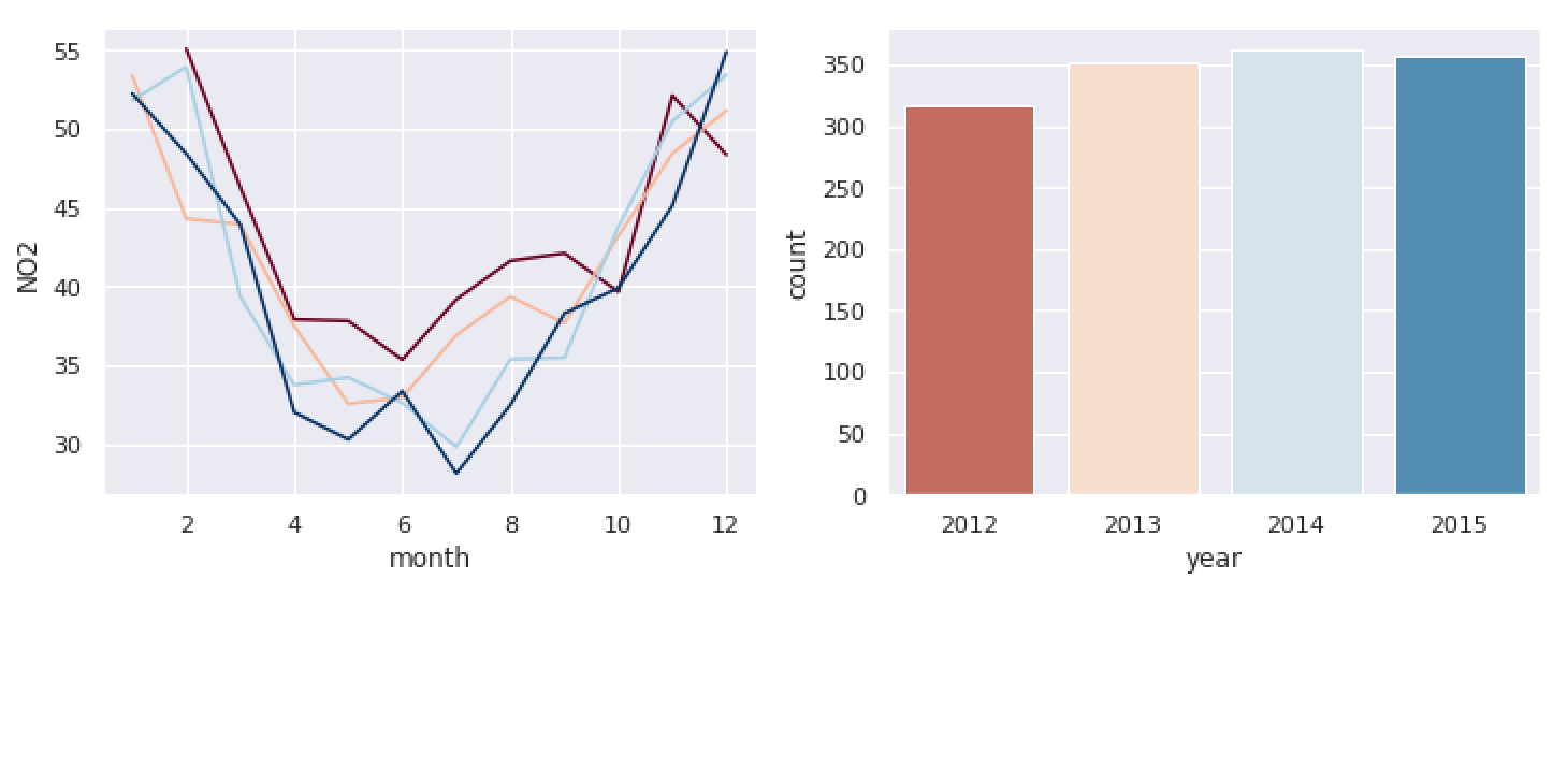
sns.lineplot('month', 'NO2', 'year', ax=ax1, data=pol_by_month, palette='RdBu',)sns.barplot('year', 'count', 'year', ax=ax2, data=obs_by_year, palette='RdBu', dodge=False)# Remove legends for both plots ax1.legend_.remove() ax2.legend_.remove()