視覺化財務比率以便比較
使用 Python 分析財務報表

Rohan Chatterjee
Risk Modeler
繪製兩家公司的比率
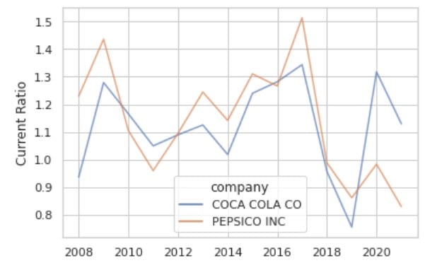
使用 sns.lineplot() 容易擁擠
這張圖在有限空間放入過多資訊,導致畫面擁擠
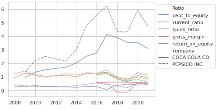
介紹 sns.relplot()
第一步,將 DataFrame 轉為長格式(melt),取得縱向資料。
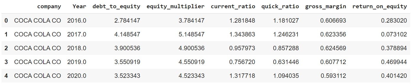
「未 melt」的 DataFrame:
plot_df.head()
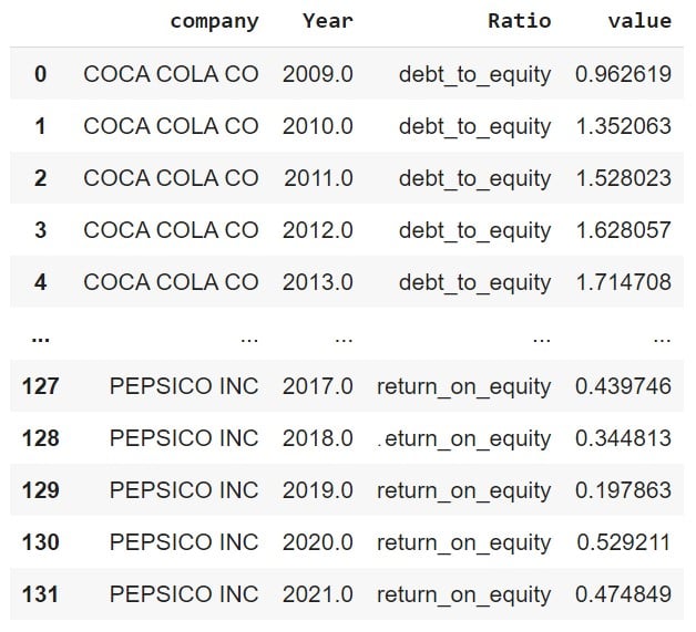
現在將 DataFrame melt
plot_df_melt = plot_df.melt(id_vars = ['company','Year'], var_name = "Ratio")
用 sns.relplot() 繪出比率
ax = sns.relplot(data=df_melt, x="Year",
                 y="value", hue="Ratio",
                 alpha=0.7,
                 col='company',
                 kind='line')
ax.set_ylabels('')
ax.set_xlabels('')
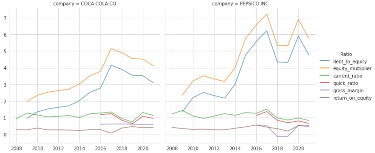
細看此圖

