以長條圖比較公司內部比率

使用 Python 分析財務報表

Rohan Chatterjee

Risk modeler

視覺化財務比率

  • 長條圖可用來:
    • 檢視公司平均財務比率,
    • 評估相對產業平均的表現

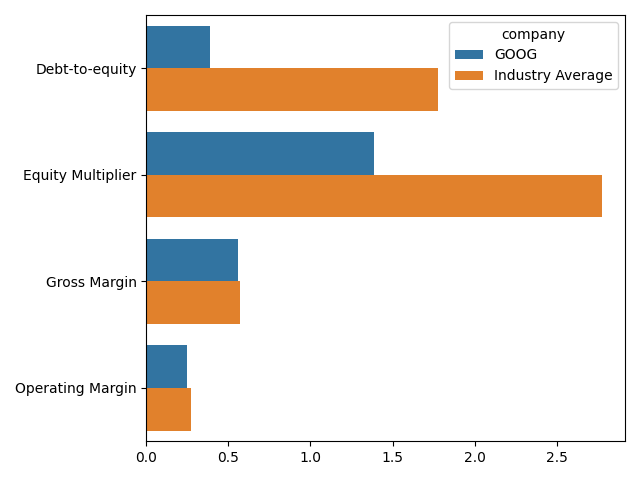
這張圖是長條圖,用來比較 Google 的財務比率與科技業的平均值。

使用 Python 分析財務報表

繪圖前的資料準備

  • 使用 pivot_table 計算各公司比率平均:
    avg_company_ratio = plot_dat.pivot_table(index=["comp_type",
                                                    "company"],
                          values=["Gross Margin", "Operating Margin",
                                  "Debt-to-equity", "Equity Multiplier"],
                                            aggfunc="mean").reset_index()
    
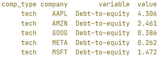
  • print(avg_company_ratio.head())

此圖顯示 DataFrame avg_company_ratio 的前五列。重點欄位是毛利率與營業利益率,呈現各公司這些比率的平均值。

使用 Python 分析財務報表

繪圖前的資料準備

  • 使用 pivot_table 計算各產業比率平均:
    avg_industry_ratio = plot_dat.pivot_table(index="comp_type",
                          values=["Gross Margin", "Operating Margin",
                                  "Debt-to-equity", 
                                  "Equity Multiplier"],
                                            aggfunc="mean").reset_index()
    
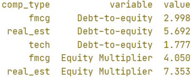
  • print(avg_industry_ratio.head())

此圖顯示 DataFrame avg_industry_ratio 的前五列。重點欄位是毛利率與營業利益率,呈現各產業這些比率的平均值。

使用 Python 分析財務報表

繪圖前的資料準備

  • seaborn 繪圖需要「長格式」資料。用 pd.meltavg_industry_ratioavg_company_ratio 轉為長格式:
    molten_plot_company = pd.melt(avg_company_ratio, id_vars=["comp_type",
                                                              "company"])
    molten_plot_industry = pd.melt(avg_industry_ratio,
                                   id_vars=["comp_type"])
    
使用 Python 分析財務報表
  • print(molten_plot_company.head())

此圖顯示 DataFrame molten_plot_industry 的前 5 列。重點在於 DataFrame 已轉為 average_industry_ratio 的長格式;欄位 variable 為比率名稱,value 為其數值。

  • print(molten_plot_industry.head())

此圖顯示 DataFrame molten_plot_industry 的前 5 列。重點在於 DataFrame 已轉為 average_company_ratio 的長格式;欄位 variable 為比率名稱,value 為其數值。

使用 Python 分析財務報表

繪圖前的資料準備

  • Seaborn 繪圖需要把要畫的資料放在同一個 DataFrame 中。
  • 使用 pd.concat 串接 molten_plot_companymolten_plot_industry
  • molten_plot_industry 沒有 company 欄,因為它代表整體產業的比率平均。
  • pd.concat 要求兩個 DataFrame 欄位相同,所以先在 molten_plot_industry 新增 company 欄。
molten_plot_industry["company"] = "Industry Average"
molten_plot = pd.concat([molten_plot_company, molten_plot_industry])
使用 Python 分析財務報表

繪製長條圖

sns.barplot(data=molten_plot, y="variable", x="value", hue="company", ci=None)
plt.xlabel(""), plt.ylabel("")
plt.show()

這張圖與本影片第 2 張投影片相同。長條圖比較 Google 的財務比率與科技業的平均值。

使用 Python 分析財務報表

一起來練習吧!

使用 Python 分析財務報表

Preparing Video For Download...