R 視覺化最佳實務
Nick Strayer
Instructor
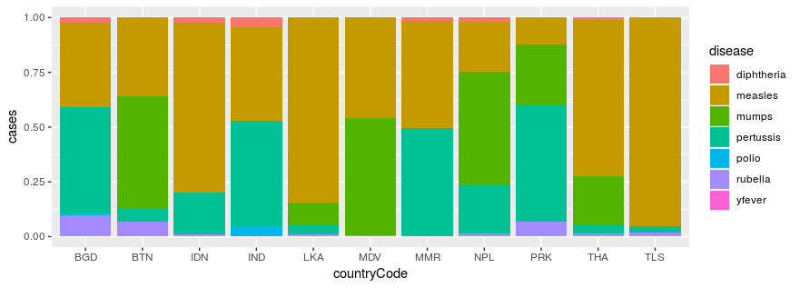
who_disease %>%
  filter(region == 'SEAR') %>%
  ggplot(aes(x = countryCode, y = cases, fill = disease)) +
    geom_col(position = 'fill')
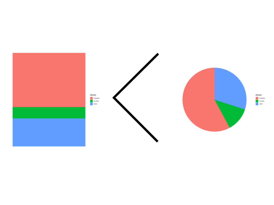
比例:
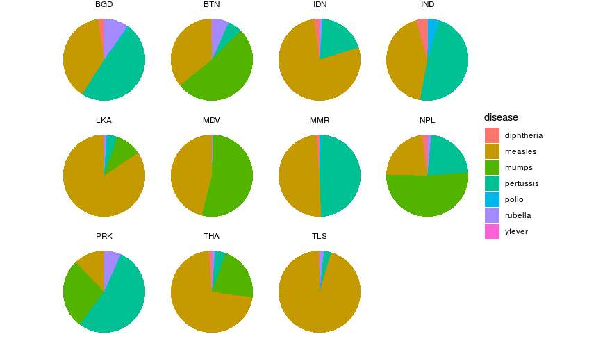
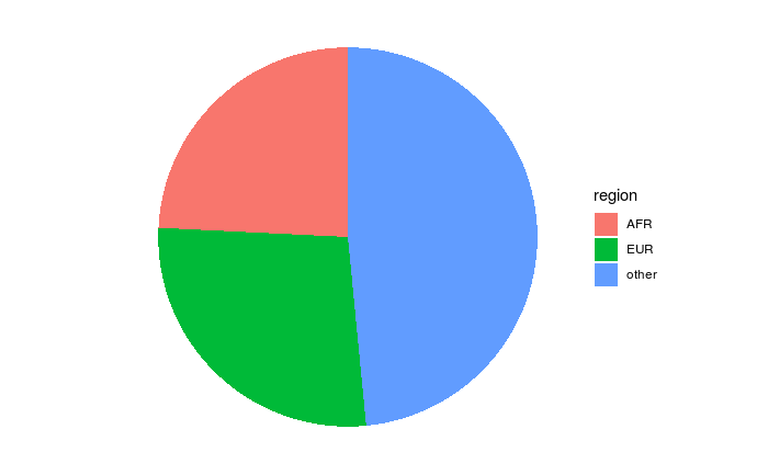
圓餅圖:
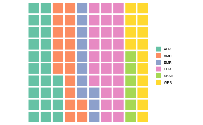
鬆餅圖:
堆疊長條圖: