R 視覺化最佳實務
Nick Strayer
Instructor
你將學到
透過深入思考手上的資料,做出更好的視覺化。

學習方式
第 1 章:整體比例

第 2 章:點狀資料

第 3 章:單一分佈

第 4 章:多重(或條件)分佈

主題不像其他程式主題那麼一刀切
每條規則都有例外
重點在於思考每個問題,幫助你遇到情況時能妥善處理
R
「Tidyverse」
Ggplot2
![]()


who_disease
# A tibble: 43,262 x 6
region countryCode country disease year cases
<chr> <chr> <chr> <chr> <int> <dbl>
1 EMR AFG Afghanistan measles 2016 638
2 EUR ALB Albania measles 2016 17.0
3 AFR DZA Algeria measles 2016 41.0
4 EUR AND Andorra measles 2016 0
5 AFR AGO Angola measles 2016 53.0
6 AMR ATG Antigua and Barbuda measles 2016 0
7 AMR ARG Argentina measles 2016 0
8 EUR ARM Armenia measles 2016 2.00
# ... with 43,254 more rows
# Filter to AMR region
amr_region <- who_disease %>%
filter(region == 'AMR')
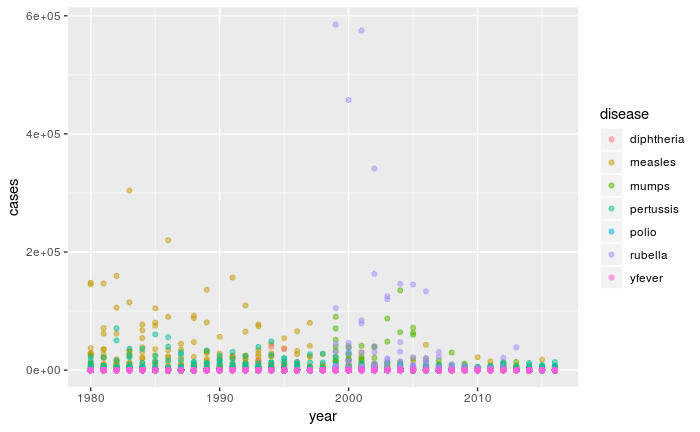
# Map x to year and y to cases, color by disease
ggplot(amr_region, aes(x = year, y = cases, color = disease)) +
geom_point(alpha = 0.5)

R 視覺化最佳實務