趨勢視覺化

在 R 中分析問卷資料

Kelly McConville

Assistant Professor of Statistics

散佈圖

年齡對頭圍的散佈圖,透明度代表權重

在 R 中分析問卷資料

加權最佳擬合線

ggplot(data = babies, mapping = aes(x = AgeMonths, y = HeadCirc,
                                    alpha = WTMEC4YR)) + 
  geom_jitter(width = 0.3, height = 0) + guides(alpha = "none") +
  geom_smooth(method = "lm", se = FALSE, mapping = aes(weight = WTMEC4YR))

年齡對頭圍的散佈圖與趨勢線,透明度代表權重

在 R 中分析問卷資料
babies <- filter(NHANESraw, AgeMonths <= 6) %>%
  select(AgeMonths, HeadCirc, WTMEC4YR, Gender)
babies
# A tibble: 484 x 4
   AgeMonths HeadCirc WTMEC4YR Gender
       <int>    <dbl>    <dbl> <fct> 
 1         3     42.7   12915. male  
 2         4     42.8   12791. female
 3         2     38.8    2359. female
 4         0     36.0    4306. female
 5         5     42.7    2922. female
 6         2     41.9    5561. male  
 7         6     44.3   10416. female
 8         3     42.0    9957. female
 9         2     41.3    4503. male  
10         1     38.9    3718. female
# ... with 474 more rows
在 R 中分析問卷資料

趨勢線

ggplot(data = babies, mapping = aes(x = AgeMonths, y = HeadCirc,
                                    alpha = WTMEC4YR, color = Gender)) + 
  geom_jitter(width = 0.3, height = 0) + guides(alpha = "none") +
  geom_smooth(method = "lm", se = FALSE, mapping = aes(weight = WTMEC4YR))
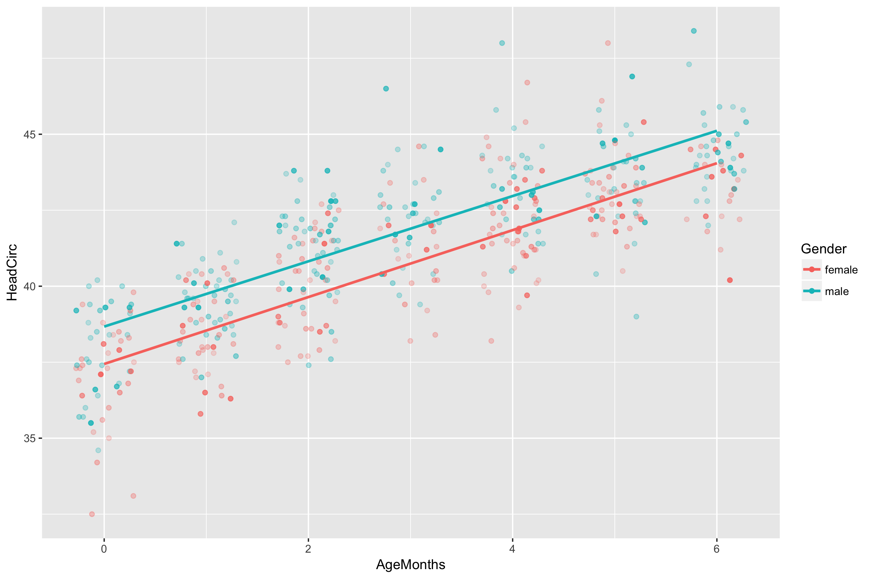
年齡與頭圍的散佈圖與趨勢線,顏色代表性別、透明度代表權重

在 R 中分析問卷資料

一起來練習吧!

在 R 中分析問卷資料

Preparing Video For Download...