重新排序因子

Tidyverse 的類別資料

Emily Robinson

Data Scientist
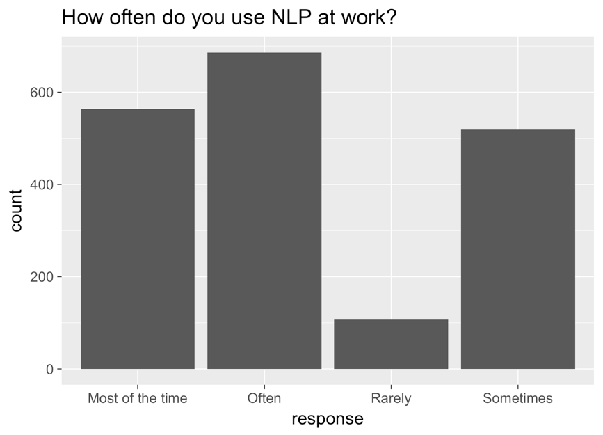
長條圖,x 軸為 response,y 軸為 count,標題為「how often do you use NLP at work?」。長條由左到右為 most of the time、often、rarely、sometimes。

Tidyverse 的類別資料

修正後的圖

ggplot(aes(nlp_frequency, 
            x = fct_relevel(response, 
            "Rarely", "Sometimes", "Often", "Most of the time"))) + 
        geom_bar()
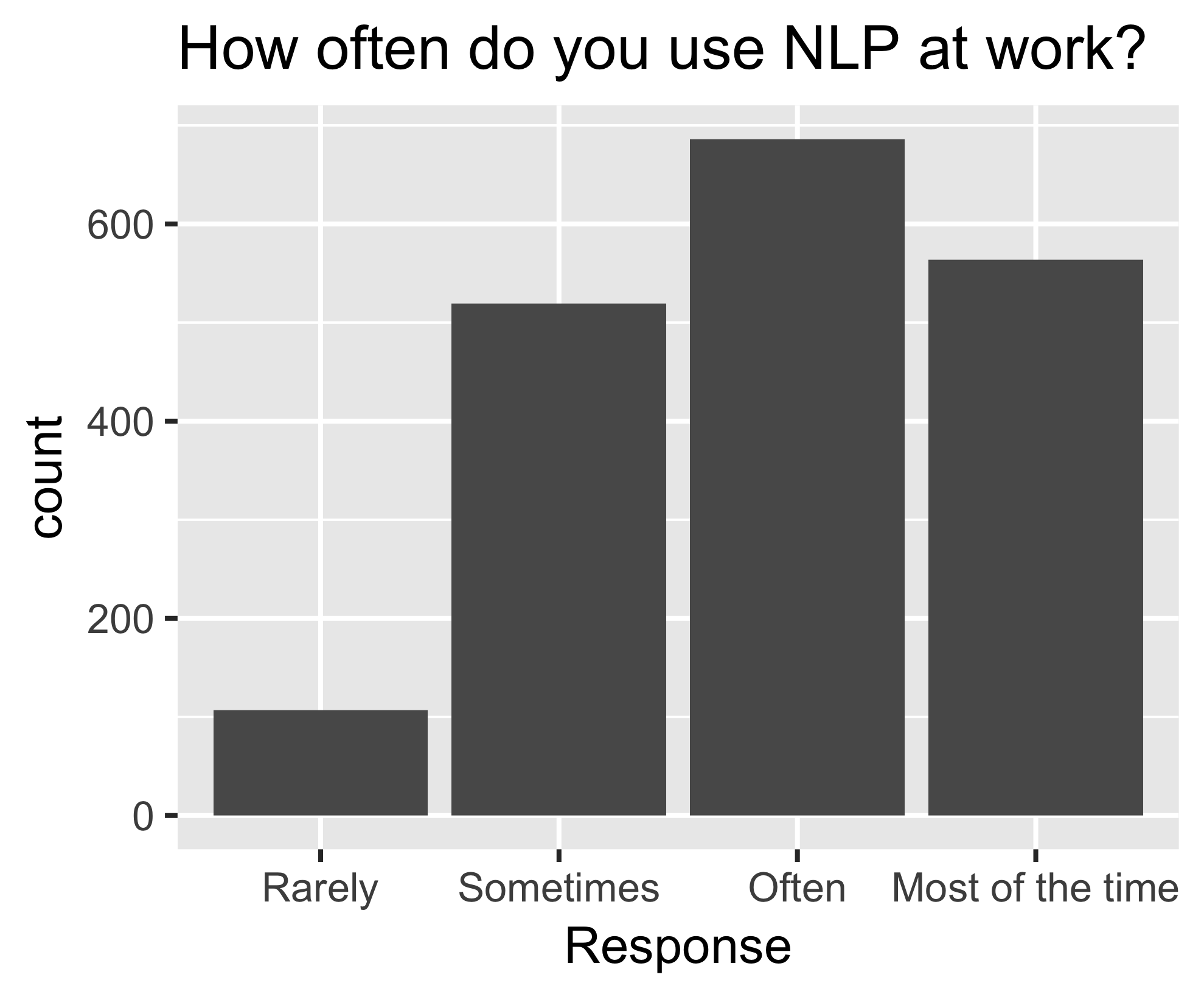
與前一張相同的長條圖,現在順序為由左到右:rarely、sometimes、often、most of the time。

Tidyverse 的類別資料

fct_reorder()

nlp_frequency %>%
    pull(response) %>%
    levels()
[1] "Most of the time" "Often" "Rarely" "Sometimes"       
nlp_frequency %>%
    mutate(response = fct_relevel(response, 
            "Often", "Most of the time")) %>%
    pull(response) %>%
    levels()
[1] "Often" "Most of the time" "Rarely" "Sometimes"
Tidyverse 的類別資料

其他參數

nlp_frequency %>%
    mutate(response = fct_relevel(response, 
            "Often", "Most of the time", after = 2)) %>%
            pull(response) %>%
            levels()
nlp_frequency %>%
    mutate(response = fct_relevel(response, 
            "Often", "Most of the time", after = Inf) %>%
    pull(response) %>%
    levels()
[1] "Rarely" "Sometimes" "Often" "Most of the time"
Tidyverse 的類別資料

一起來練習吧!

Tidyverse 的類別資料

Preparing Video For Download...