R 的特徵工程
Jorge Zazueta
Research Professor and Head of the Modeling Group at the School of Economics, UASLP
有些資料集包含常數欄或零變異欄。你可以在 recipe() 加上 step_zv() 篩掉這些特徵。

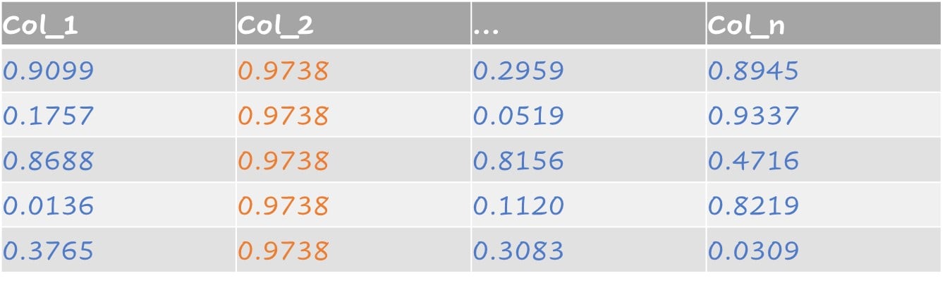
近零變異特徵包含只有單一值的預測變數,以及同時符合下列兩點的預測變數:
相對於樣本數,唯一值很少
最常見值的頻率與次常見值的頻率比值很大
近零變異範例:
step_nzv() 會找出並移除具此類特性的預測變數。
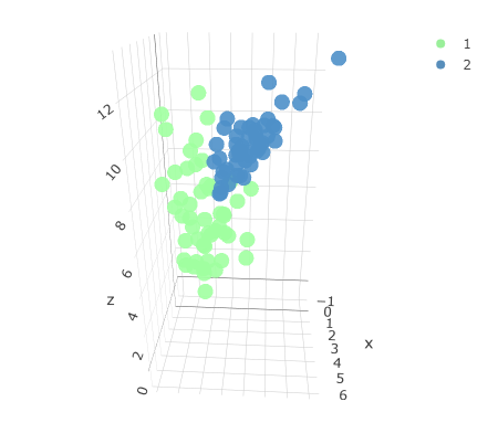
原始三維資料集,含兩個類別。

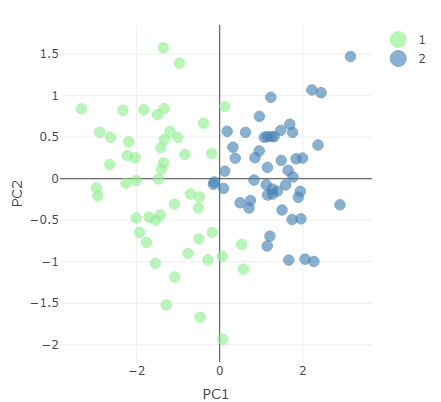
降維後的資料,以前兩個主成分呈現。

建立執行 PCA 的 recipe,並用 prep() 取得輸出。
pc_recipe <-
recipe(~., data = loans_num) %>%
step_nzv(all_numeric()) %>%
step_normalize(all_numeric()) %>%
step_pca(all_numeric())
pca_output <- prep(pc_recipe)
可以對 pca_output 呼叫 names() 檢視可用資訊。
names(pca_output)
[1] "var_info" "term_info"
[3] "steps" "template"
[5] "levels" "retained"
[7] "requirements" "tr_info"
[9] "orig_lvls" "last_term_info"
從 pca_output 物件取出標準差並計算解釋變異。
stdv <- pca_output$steps[[3]]$res$sdev
var_explained <- stdv^2/sum(stdv^2)
PCA = tibble(PC = 1:length(stdv),
var_explained = var_explained,
cumulative = cumsum(var_explained))
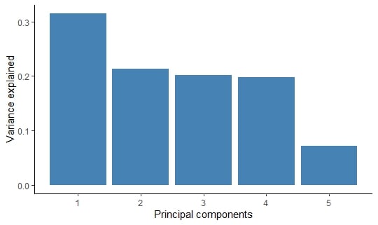
主成分的解釋變異表。
# A tibble: 5 × 3
PC var_explained cumulative
<int> <dbl> <dbl>
1 1 0.315 0.315
2 2 0.214 0.529
3 3 0.202 0.730
4 4 0.198 0.928
5 5 0.0722 1
我們可以用 ggplot2 以長條圖視覺化輸出。
PCA %>%
ggplot(aes(x = PC,
y = var_explained)) +
geom_col(fill = "steelblue") +
xlab("Principal components") +
ylab("Variance explained")
各主成分的解釋變異。

R 的特徵工程