單一變數繪圖

使用 R 的 plotly 互動式資料視覺化

Adam Loy

Statistician, Carleton College

探索葡萄酒資料

library(dplyr)
glimpse(wine)
Rows: 178
Columns: 14
$ Type            <fct> 1, 1, 1, 1, 1, 1, 1, 1, 1, 1, 1, 1, 1, 1, 1, 1...
$ Alcohol         <dbl> 14.23, 13.20, 13.16, 14.37, 13.24, 14.20, 14.3...
$ Malic           <dbl> 1.71, 1.78, 2.36, 1.95, 2.59, 1.76, 1.87, 2.15...
...
$ Hue             <dbl> 1.04, 1.05, 1.03, 0.86, 1.04, 1.05, 1.02, 1.06...
$ Dilution        <dbl> 3.92, 3.40, 3.17, 3.45, 2.93, 2.85, 3.58, 3.58...
$ Proline         <int> 1065, 1050, 1185, 1480, 735, 1450, 1290, 1295,...
使用 R 的 plotly 互動式資料視覺化

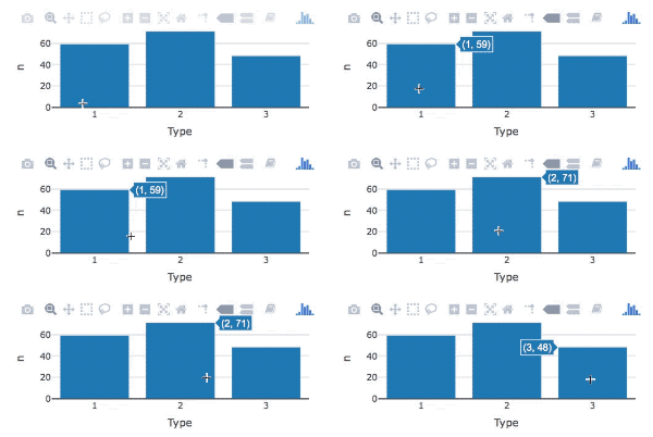
用 plotly 繪製長條圖

12_bars.gif

library(plotly)

wine %>%
   count(Type) %>%                 
   plot_ly(x = ~Type, y = ~n) %>% 
   add_bars()
  • count() 建立次數表
  • 使用 ~ 指定對應美學
  • add_bars() 加上長條圖圖層
使用 R 的 plotly 互動式資料視覺化

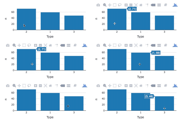
重新排序長條

12_bars_reorder.gif

library(forcats)
wine %>%
  count(Type) %>%                 
  mutate(Type = fct_reorder(Type, n, .desc = TRUE)) %>% 
  plot_ly(x = ~Type, y = ~n) %>%
  add_bars()
  • fct_reorder() 重新排序長條
  • .desc 參數設為 TRUE
使用 R 的 plotly 互動式資料視覺化

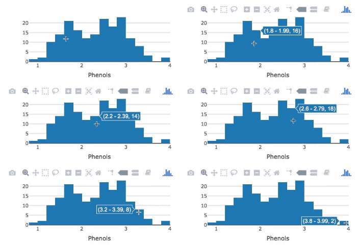
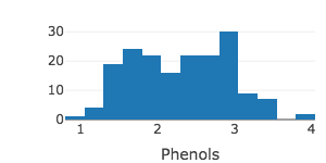
用 plotly 畫直方圖

12_histogram.gif

wine %>%
   plot_ly(x = ~Phenols) %>%  # 指定對應美學

add_histogram() # 加上直方圖圖層
使用 R 的 plotly 互動式資料視覺化

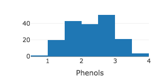
調整箱數(bins)

wine %>%
   plot_ly(x = ~Phenols) %>% 
   add_histogram(nbinsx = 10)
使用 R 的 plotly 互動式資料視覺化

調整箱寬(bin width)

wine %>%
   plot_ly(x = ~Phenols) %>% 
   add_histogram(xbins = list(start = 0.8, end = 4, size = 0.25))
使用 R 的 plotly 互動式資料視覺化

一起來練習吧!

使用 R 的 plotly 互動式資料視覺化

Preparing Video For Download...