更多 TrelliscopeJS 功能

使用 R 的 Trelliscope 視覺化巨量資料

Ryan Hafen

Author, TrelliscopeJS

用 Plotly 提升 ggplot 面板互動性
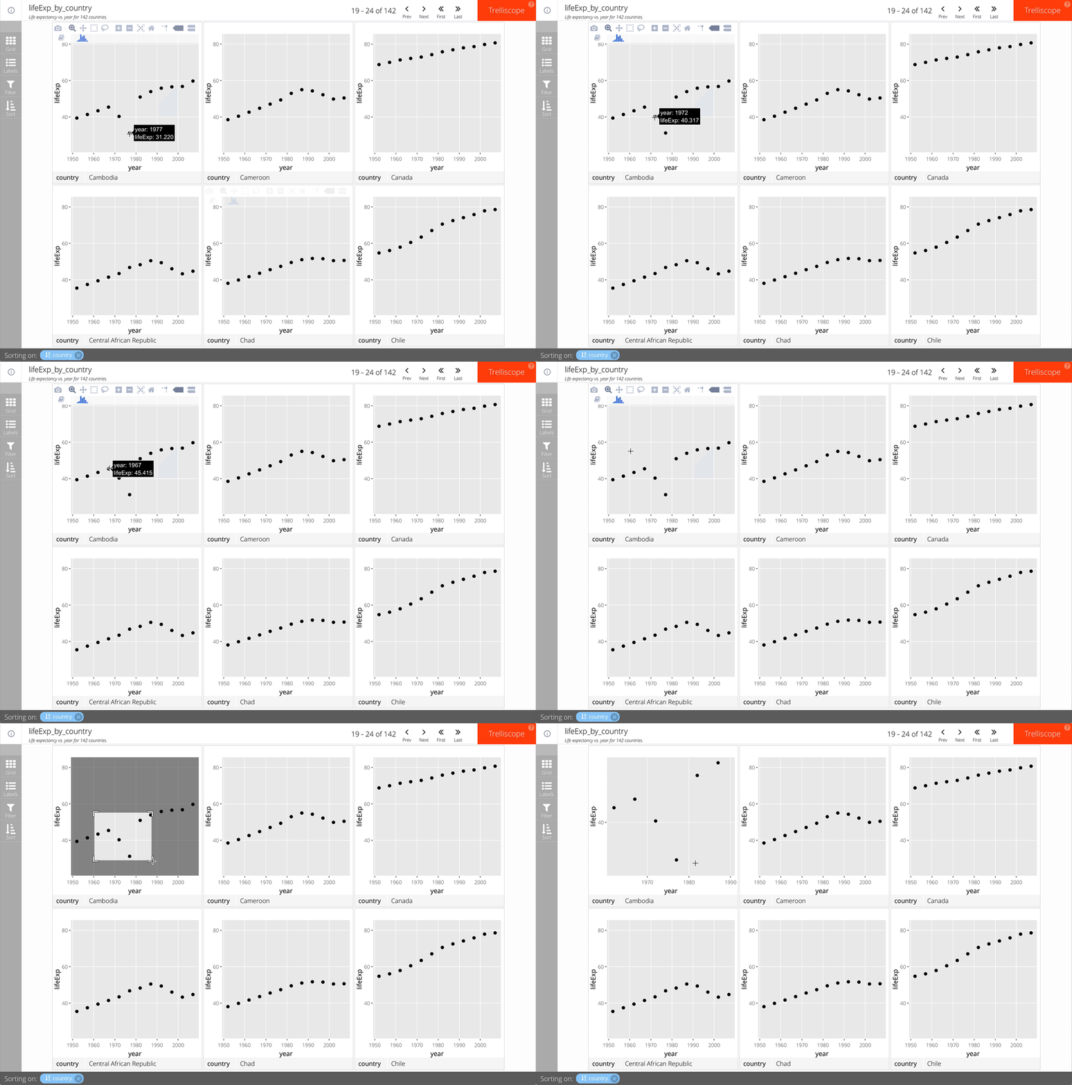
只要在 facet_trelliscope() 加上 as_plotly = TRUE 即可。

例如:

gap_life <- select(gapminder, year, lifeExp, country, continent)
ggplot(gap_life, aes(year, lifeExp)) +
  geom_point() +
  facet_trelliscope(~ country + continent,
    name = "lifeExp_by_country",
    desc = "Life expectancy vs. year for 142 countries.",
    nrow = 2, ncol = 3,
    as_plotly = TRUE)
使用 R 的 Trelliscope 視覺化巨量資料

用 Plotly 提升 ggplot 面板互動性

使用 R 的 Trelliscope 視覺化巨量資料

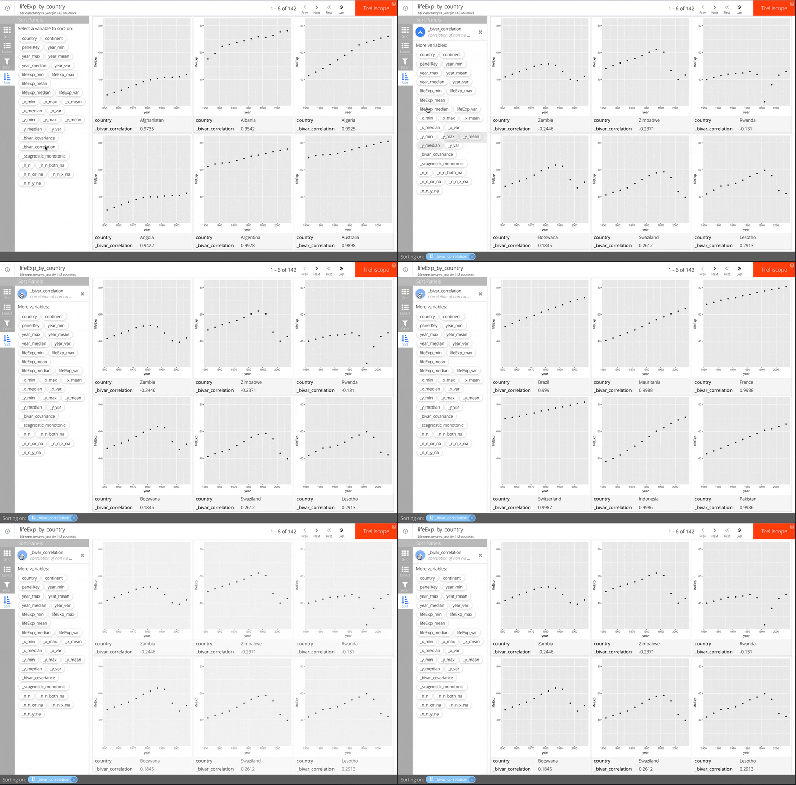
情境式自動認知統計(cognostics)

只要在 facet_trelliscope() 加上 auto_cog = TRUE 即可。

例如:

ggplot(gap_life, aes(year, lifeExp)) +
  geom_point() +
  facet_trelliscope(~ country + continent,
    name = "lifeExp_by_country",
    desc = "Life expectancy vs. year for 142 countries.",
    nrow = 2, ncol = 3,
    auto_cog = TRUE)

請參考 autocogs::autocog 的說明文件,以了解可用的自動認知統計。

使用 R 的 Trelliscope 視覺化巨量資料

情境式自動認知統計(cognostics)

使用 R 的 Trelliscope 視覺化巨量資料

座標軸範圍

可用 scales 參數控制座標軸範圍。

三種選項:

  • "same"(預設)
  • "sliced"
  • "free"
使用 R 的 Trelliscope 視覺化巨量資料

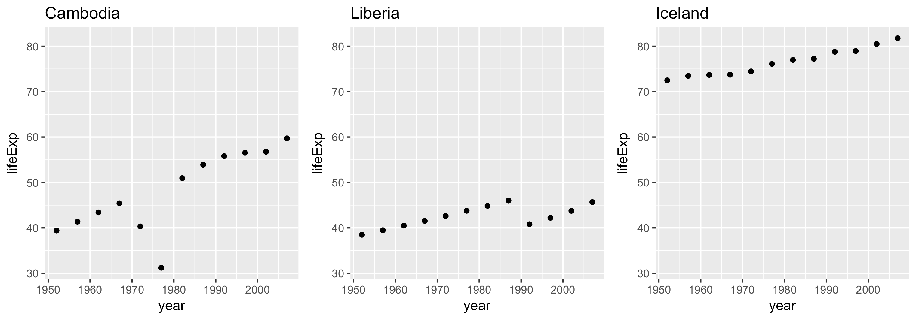
scales = "same"

所有面板的範圍相同。

可在面板間進行「同類比較」。
使用 R 的 Trelliscope 視覺化巨量資料

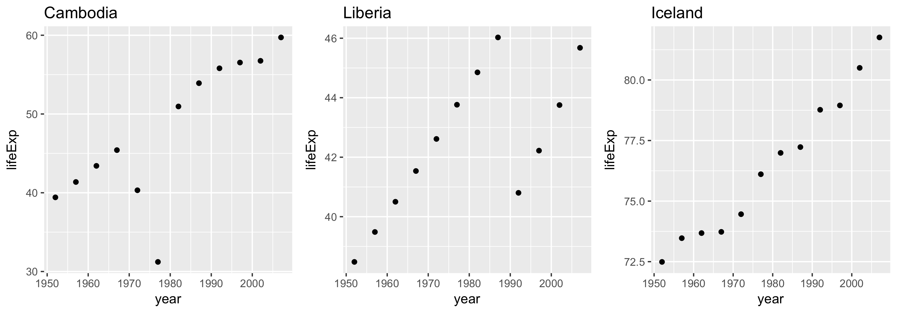
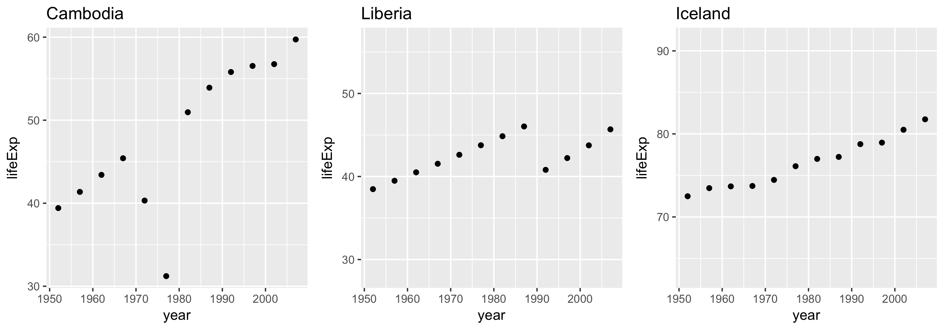
scales = "sliced"

每個面板的範圍跨度相同,但起點不一定一致。

適合比較尺度差異。
使用 R 的 Trelliscope 視覺化巨量資料

scales = "free"

每個面板的範圍依各自資料界限決定。

使用 R 的 Trelliscope 視覺化巨量資料

一起來練習吧!

使用 R 的 Trelliscope 視覺化巨量資料

Preparing Video For Download...