使用 tigris 與 tidycensus 的製圖流程

在 R 中分析美國人口普查資料

Kyle Walker

Instructor
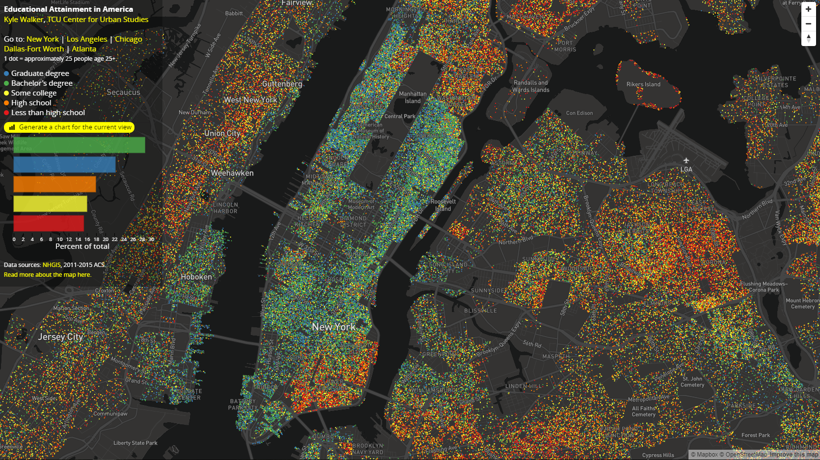
教育點狀地圖

在 R 中分析美國人口普查資料

用 sf 產生隨機點

sf 產生隨機點的關鍵函式:st_sample()

dc_dots <- map(c("White", "Black", "Hispanic", "Asian"), function(group) {
  dc_race %>%
    filter(variable == group) %>%
    st_sample(., size = .$value / 100) %>%
    st_sf() %>%
    mutate(group = group) 
}) %>%
  reduce(rbind)
在 R 中分析美國人口普查資料

產生隨機點的注意事項

想加快繪圖:

dc_dots <- dc_dots %>%
  group_by(group) %>%
  summarize()

想提高視覺準確度:

dc_dots_shuffle <- sample_frac(dc_dots, size = 1)
在 R 中分析美國人口普查資料

使用 sf 製作基本點密度地圖

plot(dc_dots_shuffle, key.pos = 1)
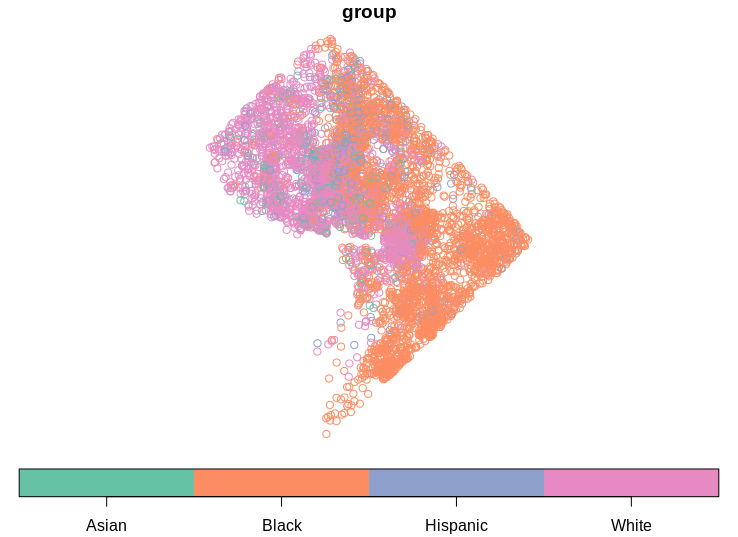
基本點密度地圖

在 R 中分析美國人口普查資料

使用 tigris 取得輔助資料

options(tigris_class = "sf")

dc_roads <- roads("DC", "District of Columbia") %>%
  filter(RTTYP %in% c("I", "S", "U"))

dc_water <- area_water("DC", "District of Columbia")
dc_boundary <- counties("DC", cb = TRUE)
在 R 中分析美國人口普查資料

使用 tigris 取得輔助資料

plot(dc_water$geometry, col = "lightblue")
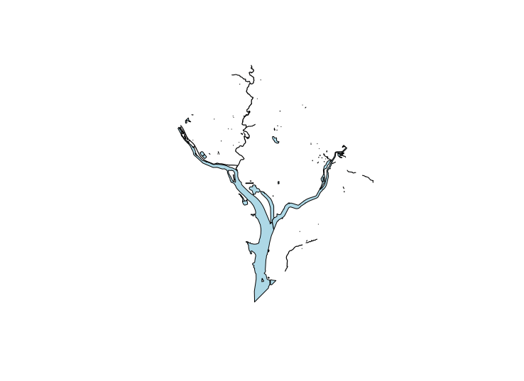
DC 水域圖

在 R 中分析美國人口普查資料

用 ggplot2 製作點密度地圖

ggplot() + 
  geom_sf(data = dc_boundary, color = NA, fill = "white") + 
  geom_sf(data = dc_dots, aes(color = group, fill = group), size = 0.1) + 
  geom_sf(data = dc_water, color = "lightblue", fill = "lightblue") + 
  geom_sf(data = dc_roads, color = "grey") + 
  coord_sf(crs = 26918, datum = NA) + 
  scale_color_brewer(palette = "Set1", guide = FALSE) +
  scale_fill_brewer(palette = "Set1") +
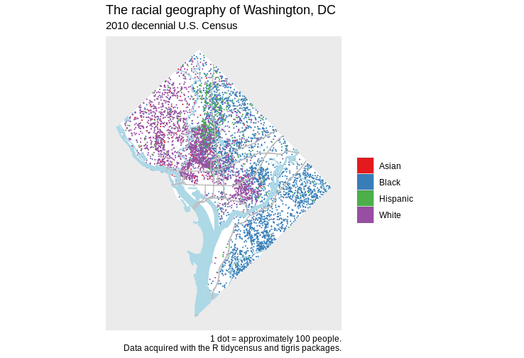
  labs(title = "The racial geography of Washington, DC", 
       subtitle = "2010 decennial U.S. Census", 
       fill = "", 
       caption = "1 dot = approximately 100 people.\nData acquired with 
                  the R tidycensus and tigris packages.")
在 R 中分析美國人口普查資料

最終點密度地圖

在 R 中分析美國人口普查資料

點密度地圖的注意事項

  • 注意點密度地圖可能的誤讀
  • 謹慎選用定性配色
  • 輔助圖層選擇需留意
在 R 中分析美國人口普查資料

一起來練習吧!

在 R 中分析美國人口普查資料

Preparing Video For Download...