用 ggplot2 製作人口統計地圖

在 R 中分析美國人口普查資料

Kyle Walker

Instructor
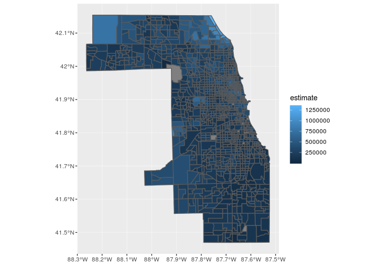
使用 geom_sf() 的基礎等值區塊圖

library(ggplot2)

ggplot(cook_value, aes(fill = estimate)) + 
  geom_sf()
在 R 中分析美國人口普查資料

第一張 Cook County ggplot

在 R 中分析美國人口普查資料

調整地圖配色

ggplot(cook_value, aes(fill = estimate, color = estimate)) + 
  geom_sf() + 
  scale_fill_viridis_c() +  
  scale_color_viridis_c()
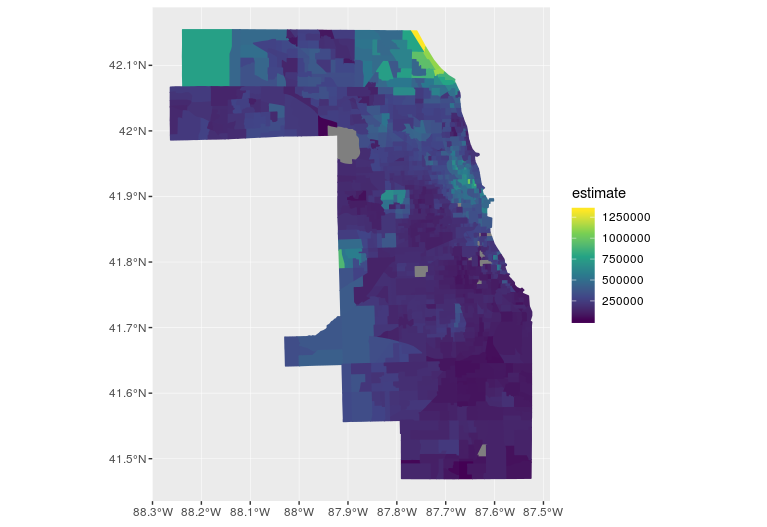
使用 viridis 的 Cook County 圖

在 R 中分析美國人口普查資料

自訂地圖輸出

ggplot(cook_value, aes(fill = estimate, color = estimate)) + 
  geom_sf() + 
  scale_fill_viridis_c(labels = scales::dollar) +  
  scale_color_viridis_c(guide = FALSE) + 
  theme_minimal() + 
  coord_sf(crs = 26916, datum = NA) + 
  labs(title = "Median home value by Census tract", 
       subtitle = "Cook County, Illinois", 
       caption = "Data source: 2012-2016 ACS.\nData acquired with the R 
                  tidycensus package.", 
       fill = "ACS estimate")
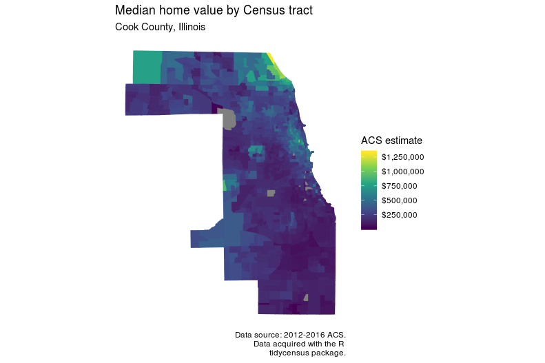
在 R 中分析美國人口普查資料

已格式化的 Cook County ggplot

在 R 中分析美國人口普查資料

一起來練習吧!

在 R 中分析美國人口普查資料

Preparing Video For Download...